


-
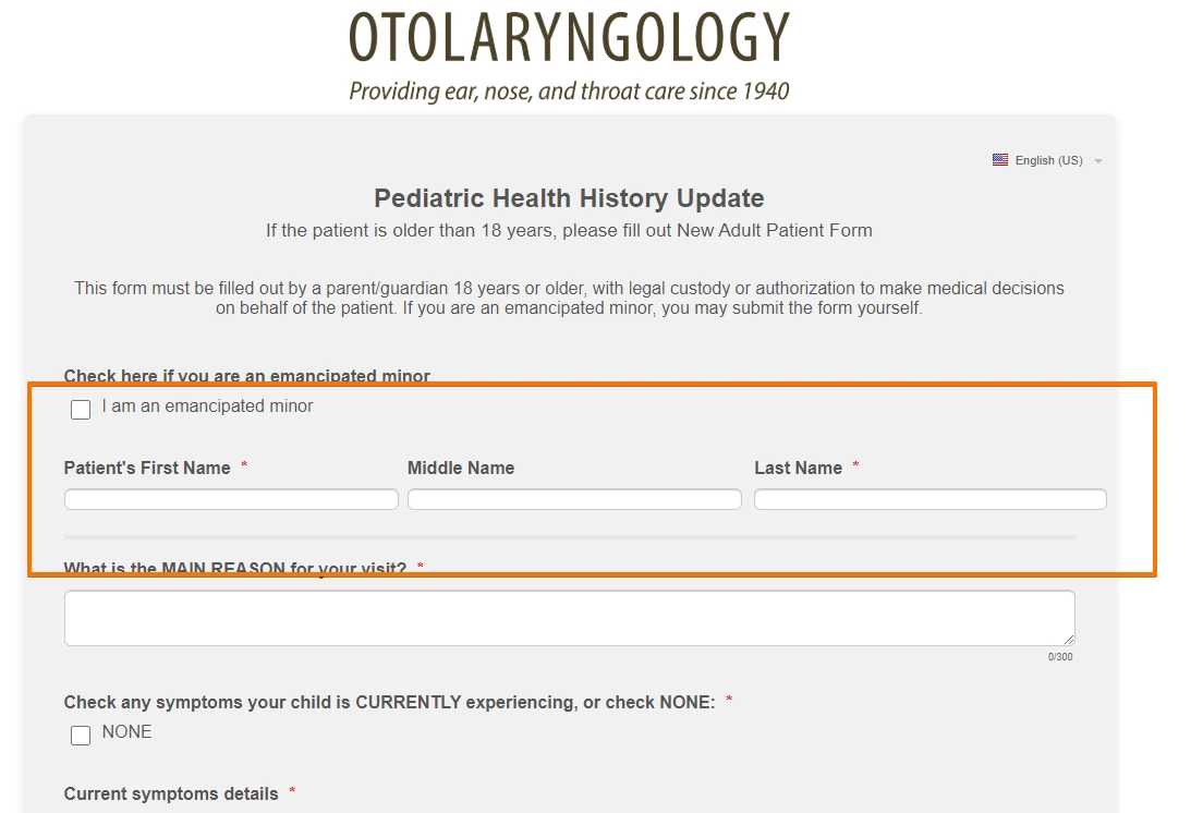
sfomgAsked on June 3, 2020 at 6:07 AMCould you help me with CSS codes to fit First, Middle, and Last name on one line with all fields equal width? I set character maximum to 40 for each of the fields. I might need a code for the @media query to make sure everything lines up properly (I needed it for the address fields that I adjusted the size of)
-
jonathanReplied on June 3, 2020 at 8:17 PM
I have added the following CSS codes on your form.
li#id_241.form-line.form-line-column.form-col-1,
li#id_242.form-line.form-line-column.form-col-3,
li#id_243.form-line.form-line-column.form-col-2 {
width : 33.33333333%;
}
#input_241,#input_243,#input_242{
width : 110%;
}
.form-line-column.form-col-3 {
padding-left: 3px;
padding-right : 36px;
}
---
result:
Kindly check again. Let us know if you need further assistance.
-
sfomgReplied on June 3, 2020 at 9:06 PM
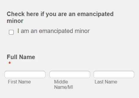
Wonderful, thanks! I tweaked it by hiding the labels and adding margins to middle and last name so now it looks like this:

The overall width of the line is wider than all the other fields on the form. I tried decreasing the input width to 105% then adjusting the .form-line-column.form-col-3 code but couldn't get middle and last name to move over

For the mobile version, the alignment is off (even before I adjusted the labels):

I would like the mobile version to look like this:

Thanks again for your help! I don't know how many of your clients are medical, but we definitely need the first, middle, and last names as separate fields, so it would be great if there were a Full Name field that did all of this automatically!
-
jherwinReplied on June 4, 2020 at 2:11 AM
How about this for the mobile view?
If you are okay with it, you can use this custom CSS Code:@media screen and (max-width:480px){
li#id_243,#id_242 {
margin-top: 58px;
}
input#input_242 {
width: 110px!important;
}
input#input_243 {
width: 110px!important;
right: 10px;
position: relative;
}
input#input_241 {
width: 110px!important;
right: 6px!important;
position: relative;
}}Guide: How-to-Inject-Custom-CSS-Codes
Please give it a try and let us know how it goes.
-
sfomgReplied on June 4, 2020 at 3:22 AM
Thanks for your response!
1) Because of the limited real estate on mobile, I prefer to have first and middle name on one line, and last name on the next line like this:

2) I currently have this @media query, so just want to make sure your solution won't conflict with what I already have:
@media screen and (max-width: 480px), screen and (max-device-width: 768px) and (orientation: portrait), screen and (max-device-width: 415px) and (orientation: landscape){
3) Any thoughts on the other problem I mentioned about the desktop version being too wide compared to the rest of the form (blue circle)?

Thank you!
-
Anita_KReplied on June 4, 2020 at 7:31 AM
Hi,
please allow some time for us to review the CSS on your form.
We will get back to you on this shortly.
-
Anita_KReplied on June 4, 2020 at 8:00 AM
Hi,
I have reviewed your CSS and made some modifications.
Please check out the clone of your form here to see if you like how it looks.
If you are happy with it, simply copy this CSS and replace the existing once with it: https://pastebin.com/0LfWk4ZA
I have kept all of your existing code including your media query (just added to it) so it should not conflict with it.
Let us know if you need any further assistance with this.
-
sfomgReplied on June 4, 2020 at 1:00 PM
Hi, thanks. Using a percentage of the width makes the overall line either too wide or too narrow compared to the form width. Is it possible to set an absolute px width to get it to fit cleanly across the whole form?
-
John Support Team LeadReplied on June 4, 2020 at 4:13 PM
Could you please try adding this code below to your existing codes?
@media screen and (max-width:480px){
li#id_243 {
margin-top: 56px;
height: 10px;
width: 180px!important;
}
li#id_241 {
width: 200px!important;
margin-left: -20px;
}
li#id_242 {
float: left;
left: -182px;
}
input#input_242 {
width: 156px!important;
}
}
This is how it will look on mobile:

-
sfomgReplied on June 4, 2020 at 5:08 PM
Ok, after tweaking what you sent, here's what I ended up with...
Desktop -

Mobile -

CSS
li#id_241 {
width: 350px!important;
margin-left: 0px;
}
li#id_243 {
margin-top: 40px;
height: 10px;
width: 350px!important;
margin-left: -17px;
}
input#input_242 {
width: 298px!important;
}
li#id_242 {
float: left;
left: 280px;
margin-top: -22px;
}
#label_243, #label_242 {
display : none;
}
#id_243, #id_242 {
margin-top:40px
}
#label_258 {
display: none;
}
#id_258 {
margin-top : 0px !important;
padding-top : 0px !important;
}
In the media query I used this:
li#id_241 {
width: 200px!important;
margin-left: 0px;
}
li#id_243 {
margin-top: 41px;
height: 10px;
width: 190px!important;
}
li#id_242 {
float: left;
left: 0px;
}
input#input_242 {
width: 163px!important;
}
-
jonathanReplied on June 4, 2020 at 7:22 PM
Please allow us some more time to figure out the needed CSS codes.
We will update you here as soon as available.
-
sfomgReplied on June 4, 2020 at 7:31 PM
I'm happy with how "Patient's Full Name" looks on both desktop and mobile, with the codes I posted in my last response.
I can't figure out what I'm doing wrong for a new name field I added, "Patient's Full Name." This is how it looks:

The codes I used are below. I need to add something like 6 more name fields, so if there is a solution that will work for all of them that would be great.
li#id_310 {
width: 400px!important;
margin-left: 0px;
}
li#id_311 {
margin-top: -55px;
height: 10px;
width: 368px!important;
margin-left: 315px;
}
input#input_312 {
width: 298px!important;
}
li#id_312 {
float: left;
left: 630px;
margin-top: -22px;
}
#label_311, #label_312 {
display : none;
}
-
sfomgReplied on June 5, 2020 at 1:10 AM
I may have figured it out - I had to set the field width in properties, and set the field to shrink. I'll let you know if I still have trouble
-
jherwinReplied on June 5, 2020 at 3:40 AM
It is good to know that you have found the solution to this issue.
Let us know if you need any further assistance. We will be happy to help.
- Templates
- Integrations
- INTEGRATIONS
- See 100+ integrations
- FEATURED INTEGRATIONS
 PayPal
- Slack
- Google Sheets
- Mailchimp
- Zoom
- Dropbox
- Google Calendar
- Hubspot
- Salesforce
- See more Integrations
- Products
- PRODUCTS
- Form Builder
- Jotform Enterprise
- Jotform Apps
- Store Builder
- Jotform Tables
- Jotform Inbox
- Jotform Mobile App
- Jotform Approvals
- Report Builder
- Smart PDF Forms
- PDF Editor
- Jotform Sign
- Jotform for Salesforce Discover Now
- Support


