


-
bellneuAsked on June 4, 2020 at 10:41 AM
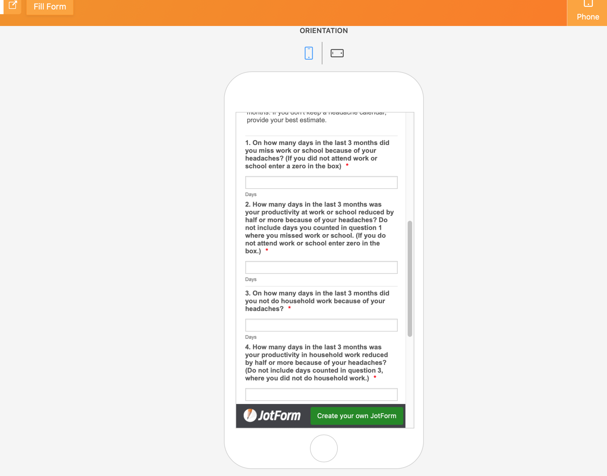
Please see attached screen shot. My fields are super wide when i look at the form on a phone in portrait mode vs landscape, iPad and desktop. Is this a bug?
-
bellneuReplied on June 4, 2020 at 10:43 AM
Same form phone in landscape mode...

-
Kiran Support Team LeadReplied on June 4, 2020 at 12:02 PM
Since the forms are mobile responsive by default, the width of the fields shall be automatically adjusted based on the screen size. Please try adding the following CSS code to the form to display the fields at the same width in the portrait mode as well.
@media screen and (min-width: 10px) and (max-width: 540px){
.form-textbox {
width: 60px !important;
}
}
Thanks!
- Templates
- Integrations
- INTEGRATIONS
- See 100+ integrations
- FEATURED INTEGRATIONS
 PayPal
- Slack
- Google Sheets
- Mailchimp
- Zoom
- Dropbox
- Google Calendar
- Hubspot
- Salesforce
- See more Integrations
- Products
- PRODUCTS
- Form Builder
- Jotform Enterprise
- Jotform Apps
- Store Builder
- Jotform Tables
- Jotform Inbox
- Jotform Mobile App
- Jotform Approvals
- Report Builder
- Smart PDF Forms
- PDF Editor
- Jotform Sign
- Jotform for Salesforce Discover Now
- Support

