


-
rwaldenjrAsked on June 15, 2020 at 11:51 AM
I've been struggling with our Contact Us form for quite some time, as you may see in our history. We had a similar issue with the form on our Sellers page. (See "Membership Groups|Sellers" at the URL, attached.) Your colleagues were finally able to center the form. But, I have no idea what they did. We moth balled the Weebly site for a year. But, now we're attempting to link the Weebly pages with our primary site (on a different platform). And, this Contact Us form is once again an issue.
The Contact Us form is contained in an iFrame on the page. And, its unresponsive to settings adjustments I make to center it. It keeps bleeding past the right margin no matter how wide I make the form, or whether I position it Flush Left in the iFrame. What's causing this to happen, and how do I fix it?
Thanks for your help,
- Robert[Note1: research seems to indicate that there's a problem when a form is contained in an iFrame that's also positioned inside another iFrame. (The contact info is contained inside a separate iFrame. When positioning the JotForm beside the Contact Info, a larger iFrame is automatically created to contain both smaller iFrames. Apparently, that may cause a coding problem!?!]
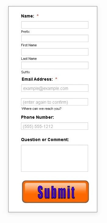
[Note2: the current positioning of the JotForm, as shown, is not the intended position. Its only a temporary placement to show what the form is supposed to look like. The actual position should be horizontal with the Contact Info and to the right (see screenshot, attached).]
.JPG)
-
Sam_GReplied on June 15, 2020 at 2:20 PM
Hi Rwaldenjr,
Thank you for contacting Support.
To fix that, please increase the height of your iframe embed code:

You can set the height from 801px to 900px to show all the content of your form.
May we confirm how you want the form to be positioned?
Upon checking your webpage, it shows that the form is centered.
 Or if you want the form to be right beside the contacts?
 If yes, kindly use this CSS code:
div#273068395487360513.wcustomhtml{
position: absolute;
margin-top: -610px;
display: block;
}
Let us know if this worked for you.
-
rwaldenjrReplied on June 17, 2020 at 2:40 AM
Sam_G -
Thanks for your suggestions. Unfortunately, setting the iFrame height had no affect on the visibility of the bottom of the form. I struggled with the height adjustments (as you suggested), as well as using "!important", and also vertical padding. But, nothing seems to affect the form's position inside the iFrame. Its as if something is overriding any settings made to correct the problem.
The bottom of the JotForm remains cut off. It seems like there's a top padding that's forcing it down toward the bottom of the frame. Is that possible? I'm not aware of any such CSS setting. Is there a way to center the form vertically inside the frame?
Also, I see the right side of the form when the frame is centered on the page. But, when I position it inline with the Contact Info (as you see it now), the right side of the form stretches all the way outside the frame, no matter how wide I make it! And, the bottom remains cut off too. Interestingly, if I change the frame's scroll setting to "Yes", then all 4 sides of the form become visible upon scrolling.
This is the only form I'm having this type of trouble with. Frankly, I have to admit that I'm stumped!
- Robert
:-/ -
Vick_W Jotform SupportReplied on June 17, 2020 at 5:39 AM
Hi Rwaldenjr,
Thanks for writing back to us.
I'm currently looking into this for you and will get back to you shortly.
Thanks
-
Vick_W Jotform SupportReplied on June 17, 2020 at 6:24 AM
Hi Robert,
Thanks for writing back to us.
I checked your contact us page and I can see that the for is on the right side of the contact us information. But the right side of the form is stretching out of the frame. Here is how you can fix that.
.form-all {
padding-top: 0% !important;
padding-left: 0% !important;
}
For the bottom section for some reason, anything I tried was not working. So I reduced the height of the question or comment section and it got fixed as you can see in the screenshot.
.form-textarea {
height: 44px;
}

Hope this helps. Let us know if you need further assistance.
Thanks.
-
rwaldenjrReplied on June 17, 2020 at 4:20 PM
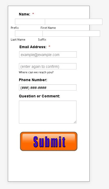
Thanks for your efforts Vick! Your code didn't work completely. It did reveal the right-hand side of the form (even though its still too wide; can't seem to narrow it). But, it didn't reveal the bottom. You gave me an idea though, and I played around with reducing the .form-all height. Voila! The entire length of the form is now visible (see screenshot, attached).
I'm still trying to center the form inside the iFrame. (That's not essential, if we can't figure it out.) And, I'm trying to narrow the overall form width so that there's one vertical column of fields plus the Submit button centered on the form with a uniform margin all around. I was able to adjust the bottom margin. But, I haven't been able to adjust the top one above Name:, or reduce the extra space to the right. I'm spinning my wheels.
Any suggestions?
- Robert
;-)
-
Amin JotForm SupportReplied on June 17, 2020 at 7:55 PM
To center the iFrame, try injecting the following HTML code into your webpage source code:
Result:

As per you second inquiry, is what you're after reducing the blank space above the "Name" field? Because I can see it's already reduced as shown above.
We would be so much grateful if you could just further elaborate and provide more information, so that we can better assist you.
-
Amin JotForm SupportReplied on June 17, 2020 at 9:22 PM
Seems like my HTML code was rendered. You can get it by clicking here.
-
rwaldenjrReplied on June 17, 2020 at 10:15 PM
Thanks Amin -
I'm using the Weebly platform to build my site. So, I don't have direct access to the Head section. I put your code in the Head field of the SEO tab for that page. (It should work just the same.....the Head is the Head, I assume!?!) Unfortunately, nothing happened.
I also tried transposing your code from Internal CSS to Inline CSS. And again, nothing happened. I'm stumped! Its like this form and the fields in it are glued to their current positions and refuse to move!
As for your question in the second half of your reply, I'm trying to add more space above the "Name:" label to match that at the bottom of the form. Once again, I've tried adding "margin-top" to all the selectors in that part of the form, and nothing seems to increase the margin.
-
rwaldenjrReplied on June 17, 2020 at 10:48 PM
Amin -
Upon further trial-and-error, I think we're on the right track! I removed your last code for the page (from the SEO Header field) and began experimenting with "min-width", "max-width" and "width" style settings, as well as inserting the original "height:675px" which worked previously, as opposed to "100%". (For some reason, JotForm's Imbed code keeps defaulting to "579".) Amazingly, the width is narrower now and nearly centered in the iFrame (close enough) using pixels instead of percentage. I just hope its responsive when resized for different display dimensions!?!
Now, I need to re-justify all the fields and the Submit button, and we're in business. I think this is where we started yesterday. All though, now we have a single column that's not bleeding out of the frame. So, I guess we're making progress! LoL
I'll play with "margin-left:auto" and "margin-right:auto" for each element of the form to see if I can align their left and right sides. If you have any tips to speed me along in that process, or to globally align them all, I'd appreciate it! (Can't believe how long this has taken!)
Thanks for your help,
:-) -
rwaldenjrReplied on June 17, 2020 at 11:19 PM
- ADDENDUM -
This is driving me nuts, and isn't working out like it should. I get all the fields nice and neatly aligned in Advanced Designer. But when I go into Builder view, the Name fields are all over the place. That's understandable, since I've forced them into a single column, which they're not by default. But when I embed the code in my web page, all the input blocks are aligned differently, as you can see in the current version of the page. I feel like I'm shooting in the dark! Am I missing something here?!? I wish this editor was truly WYSIWYG!
-
Vick_W Jotform SupportReplied on June 18, 2020 at 12:51 AM
Hey there,
I'm currently looking into this for you and will get back to you shortly.
Thanks.
-
Vick_W Jotform SupportReplied on June 18, 2020 at 1:40 AM
Hi there,
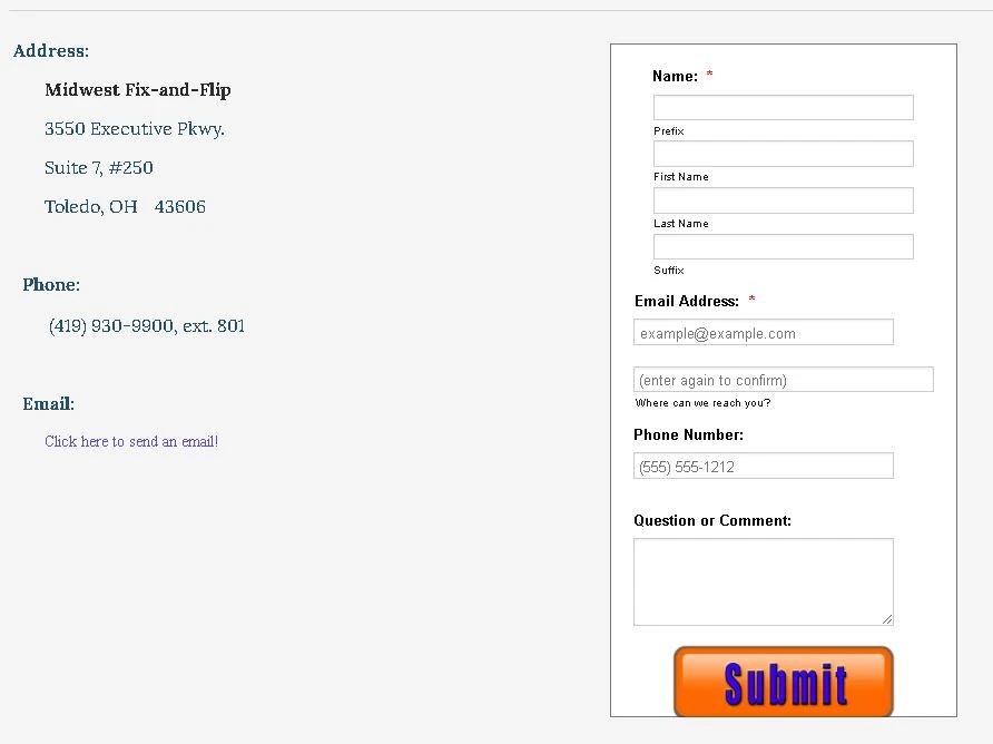
I've cloned your form and it seems to be properly center-aligned after adding all the provided CSS. I also checked it on Weebly and it is showing exactly as it is on Jotform. As you can see in the screenshot below.

Will appreciate it if you can provide screenshots of the issues you referring to so we can further investigate.
Here is how you can include screenshots on our support system.
https://www.jotform.com/help/438-How-to-Post-Screenshots-to-Our-Support-Forum
Looking forward to your reply.
Thanks.
-
rwaldenjrReplied on June 18, 2020 at 1:43 AM
Thanks Vick for your help! I've been working on it all evening. And, I've pretty much got it looking sweet in Advance Designer! However, I'm not sure how to keep it looking that way in Build mode, or once its embedded on the web page!?!
-
rwaldenjrReplied on June 18, 2020 at 2:02 AM
Vick, et.al -
I'm as puzzled as you guys must be!?! You keep telling me things look good on your end. But, they don't look the same on my end!?! As I said previously, I've finally got the form looking good in JotForm's Advanced Designer mode. It still looks pretty much the same in Build mode. (All though, the Name module blows up. For some reason, the CSS doesn't apply to this module in Build mode, and it defaults to its normal 2-line configuration.) However, once the Embed code is applied to iFrame on the web site, and I make the two minor modifications to the iFrame style settings (width and height), as we discussed earlier, the page alignment blows up! (See 3 screenshots: a. Advanced Designer, b. Build mode, c. iFrame on my website.) As you can see, even the cut-off at the bottom has returned. And, increasing the height of the iFrame style setting doesn't seem to be affecting it this time.
I honestly don't know what else to do here!?! Why doesn't the form look the same in the iFrame?
-
rwaldenjrReplied on June 18, 2020 at 2:27 AM
- UPDATE -
I opened the page in a different browser window, and all of the form elements are properly aligned (see add'l. screenshot). However, there's still that big white space to the right. I have NO idea what's going on. And, I feel like a dog chasing his tale trying to figure all this out. Sorry that this has been such an issue. its actually been unresolved for over a year. (I just got tired of trying to fix it, and archived the page.)
-
Vick_W Jotform SupportReplied on June 18, 2020 at 3:50 AM
Hi,
Thanks for writing back to us.
Here is how currently the form is looking on your website on Chrome and Firefox.
%202020-06-18%2012-36-01.png)
Please apply the following CSS and everything should get back to its place. You adjust the width by changing the width in the CSS below to make it fit as you like.
#cid_3 div span, #prefix_3, #first_3, #last_3, #suffix_3 {
width: 205px !important;
}
#input_4 {
width: 249px !important;
}
#input_5_full {
width: 249px !important;
}
#input_6 {
width: 249px !important;
}
I hope this helps. Looking forward to your reply.
Thanks.
-
rwaldenjrReplied on June 19, 2020 at 3:01 AM
Vick -
Thanks for the code. However, I already had variations on these same styles from a fix you (or one of your colleagues) sent previously. And, it still didn't work. However, you gave me some ideas. I noticed that there were a number of duplicate and conflicting styles in various selectors throughout the style sheet; probably from various attempts to fix the form by a number of your colleagues and myself. I exported the sheet to Notepad++, cleaned it up by organizing the various selectors and consolidating them where possible; deleting the duplicates, and then reinserting it back into JotForm.
I also noticed that there were some conflicts between the width and height specifications of the form as coded in JotForm, and also in the iFrame. I tried deleting them in JotForm, and keeping them in the iFrame. That didn't work. So, I deleted them in iFrame, and kept them in JotForm. That showed some promise.
We've also been testing width, min-width and max-width styles in iFrame. So, it occurred to me that maybe we should allow iFrame to display the form at 100% of whatever JotForm sends it, and reduce the width of what JotForm sends. I restored the original 310px width of the form using the ".form-all" selector in JotForm, and added a "max-width" style to it as well (set at 63%). And voila! The form aligned perfectly with a nice neat justified column of fields, and uniform borders all around.
The only thing that's still a problem is that the form blows up in portrait mode on the mobile device simulator. (Maybe I can find some code to place in the Head section that presents a modal message indicating that the site is best viewed in Landscape mode, or else that automatically turns the picture on its side for the viewer the way YouTube does.)
One other observation I noticed..... some of the styles don't play well with others in the same selector (e.g., "margin-top:20px !important;" doesn't work when listed along with other styles for "#input_4_confirm". Is that a bug in JotForm, or by design with CSS?
Nevertheless, I can't believe its finally fixed..... after two years, and a ton of work by you, me, and your colleagues at JotForm!! Thank-you all for your hard work, patience and continued support! JotForm techs are the best!
- Robert
:-) -
Patrick_RReplied on June 19, 2020 at 5:19 AM
Hi Robert! Allow me some time to look into it. I'll get back to you shortly with an update.
Thank you!
-
Patrick_RReplied on June 19, 2020 at 7:11 AM
Hello Robert! Can you please paste the following code into your custom CSS box: https://pastebin.com/K3aG7GPF
Make sure to paste it at the end of your existing CSS code. This code is to fix your form issues on Mobile Portrait mode.
Let us know how it goes.
-
rwaldenjrReplied on June 19, 2020 at 2:52 PM
Patrick -
Thanks for your response. Unfortunately, that didn't work. Your code brought the form fields back inside right-hand edge of the form in Portrait mode of a cell phone. But, it misaligned the four Name fields again that we just fixed last night, and restored all that extra white space to the right on every other device other than a cell phone in Portrait mode. Plus, it created a shadowed frame inside the border that wasn't there before. This code seems like we're taking a step backward from where we were a few hours ago.
-
Amin JotForm SupportReplied on June 19, 2020 at 4:01 PM
The thing about mobile is that we can test your form on our end and find nothing wrong with it, although you're still experiencing the issue. That's why we tent to ask our users about specifications of their mobile devices used to view and test form.
That said, could you please provide us with your device name and used browser so we can be on the same table and give it a test using the same device type you use?
-
rwaldenjrReplied on June 19, 2020 at 5:33 PM
Amin -
I completely understand your reservations about trying to resolve differences between various mobile device displays. That's why I didn't want to blow up the work we've put into finally getting a functional form on every other display type just to solve a problem with mobile phones (even though phones are fast becoming the #1 display medium for online viewing). To answer your question, I use a Samsung Galaxy S9 for testing. I first noticed that there was a problem with cell phones when testing with your JotForm device simulator.
Most of the problems have tended to involve one or both of these two issues:
a. additional white space added between the right side of the fields and the border, and
b. the four Name fields being pushed to the right and not flush-left with the other fields (i.e., Email, Phone and Comments).Obviously, the Name module was written as two rows of two fields each. And, we're forcing them into 4 rows of one field. When we do get them aligned correctly, one additional tweak elsewhere in the style sheet tends to misalign them again. We finally got everything working in harmony early this morning, with the exception of the cell phone display. That seems to be a responsiveness problem in that medium only. And, its less pronounced in Landscape mode than Portrait.
Attached, please find a screenshot of what the form looks like on a desktop after inserting Patrick's code. Note the beveled frame inside the border that hasn't been there before.

-
jonathanReplied on June 19, 2020 at 7:54 PM
We apologize for inconvenience. I also checked on your from from the website and it appears like this on my test.
On mobile browser:


on desktop:

From what I have checked so far, the issue is with the Full Name field not being aligned to the left side similar to all the other fields after it. I was able to see the misalignment when I test both on mobile browser and desktop. You can check on the screenshot images I included.
Can you please confirm first that the problem remaining was about the misalignment of the Full Name field. The discussion had been very long, and there was no mentioned anymore of what exactly was the remaining issue on the latest responses.
Hopefully we can get a finality on the resolution after clearing again what are the remaining issues.
Thank you for your patience and understanding.
-
Patrick_RReplied on June 19, 2020 at 11:12 PM
Hi @rwaldenjr! I've just checked your form in which you've implemented the CSS code that I provided. There is a lot of difference in what I provided and what you've implemented (screenshots attached for your reference). Please re-implement the correct version of the code so that it could give the desired results.
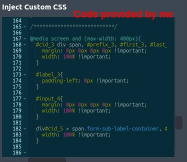
Custom CSS code: https://pastebin.com/K3aG7GPF
In case, you find that this code (provided by me) is not doing what you intended it to do, you can remove it so only your previous CSS code remains in your custom CSS box. This also means that you'll get the form layout that you previously had before implementing my code.
If you have any questions, let us know.
-
rwaldenjrReplied on June 19, 2020 at 11:28 PM
Patrick -
I tried using your code exactly as you wrote it, but it didn't work. I noticed that it contained selectors that were duplicated elsewhere in the stylesheet (along with several others). So, I cleaned up the code, removing redundant/conflicting styles. The only thing different between your version and mine is that I removed your first style, starting with "#cid_3 div span". Those selectors appear together in that same order elsewhere in the code, as provided by one of your colleagues. I'll re-insert the line you wrote it. But, it may cause a conflict with the previous instance of that same selector!?!
-
rwaldenjrReplied on June 19, 2020 at 11:46 PM
Okay, I restored your original code without touching the redundant variations elsewhere in the stylesheet. Here's what it looks like on my desktop (live website)....
And, here's a screenshot of how it appears on a cell phone, using the JotForm simulator....
As you can see, the Name fields still aren't right. Also, where did the beveled frame come from? I didn't implement that!?!
-
Patrick_RReplied on June 19, 2020 at 11:57 PM
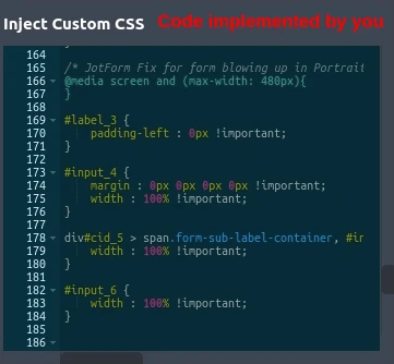
Hi! Thanks a lot but I think there are still differences. For example the first line of code i.e.
@media screen and (max-width: 480px){
}This line of code is actually useless because the closing curly brace have been added by you here which should have been at the end of my code (as you can see in my code). This part of the code is for running further code for mobile screens, which you changed. This small change make a big difference.
Also, if there would have been any conflict, I won't have provided you the code in the first place. CSS code in itself cannot cause any issues if overwritten, so it is completely okay if as per different screen sizes the code overwrites the previous version.
You're required to use the exact version (copy/paste) of the code provided by us. If this doesn't work, you can simply remove it and you'll get back your previous layout back.
If you have more questions, let us know.
-
rwaldenjrReplied on June 20, 2020 at 1:21 AM
With all due respect, I didn't change anything from your code this time! Why would I edit it, if you told me to use it "as is", and we're trying to test whether or not your code works!?! I copied the Raw Paste Data field in its entirety from your Pastebin screen, and pasted it over top of the previous entry.
However, since you pointed out the discrepancy in the first line, and the premature curly brace, I paid special attention to that character. It appears that the JotForm editor edits the code, on its own, and returns a version slightly different than what I entered! What you see now for my form is how your code looks after Save & Publish (see Before and After screenshots of your code, attached).
I thought I caught the editor doing something similar earlier in the week. But, I figured maybe one of your colleagues was editing my code at the same time I was. [Please note that I correct all syntax errors (that the editor identifies) before saving.] So, I'm not sure why this is happening. But, it seems maybe we've both been correct, and yet not working off the same playbook. Could it be we've uncovered a bug of some sort!?! Am I not understanding something about how the editor works after all these years of using it?!?
BEFORE Saving and Publishing....

AFTER Saving and Publishing....

-
Vanessa_TReplied on June 20, 2020 at 1:49 AM
Our apologies for the inconvenience you have experienced and thank you for your patience as we resolve this issue.
The issue usually occurs when a form uses a theme, plus some changes in advanced designer and a couple of CSS that sometimes contradicts each other.
As per checking, your form is quite simple, but the CSS is already very lengthy. Please allow me some time to create a form from scratch and hopefully apply a minimal and clean CSS. Will get back to you afterwards.
-
rwaldenjrReplied on June 20, 2020 at 2:14 AM
Thank-you Vanessa! I knew I wasn't crazy. Your colleagues kept telling me their code worked. But, it didn't on my end. And apologies to Patrick. I think he was starting to get testy, thinking I was screwing up his code. I only edited it when it didn't work for me. Now we know why. Wonder why nobody checked for this possibly being the case on your end before now?!? Anyway, thanks for taking the time to rebuild the code! I look forward to receiving it....
-
Vanessa_TReplied on June 20, 2020 at 2:38 AM
Hello Robert,
Kindly check out my demo form here:
https://form.jotform.com/201710781765052

I also created a Weebly account and embedded it here:
https://vanessajotform.weebly.com/

I used the simple embed code below:

Please note that I myself cannot guarantee that this will work on your end since I am not sure what other customizations are in your website. However, you can see that the form alone has no display issues within the builder or when viewing using it's direct link.
I also tested it using Samsung Galaxy S9 simulator, as well as on a real Android device and they both look just the same:

You can clone the form and use the cloned form to embed on your website.
How-to-Clone-an-Existing-Form-from-a-URL
I also suggest clearing your form cache and completely clearing your browser cache since continuously testing your form previously might have hard cached your website.
-
rwaldenjrReplied on June 20, 2020 at 3:45 AM
Thank-you Vanessa!!! Your CSS is much simpler than what had evolved over many months and numerous people working on the previous version. I cleared both caches, as you recommended, and cloned your form. I used the simplified embed method, also as you suggested, as opposed to the iFrame-specific code that I'd been using. It seems to be working okay in the iFrame on my site. All of the device simulators on JotForm's preview page work correctly. It holds up live on my desktop, as well as my Samsung phone. Its late and I can't see straight. So, I'll test it more tomorrow. But, I think we have a winner!
I notice you used the default email and phone fields, as opposed to them being left and right justified on mine. Was that for ease of creating a quick demo, or is there some reason that the lengthened fields cause the form to break? My version was purely for aesthetics anyway. For all the trouble this form has caused, I can live without it.
So am I able to edit it safely (e.g., add an edge stroke and shadow to match my other forms, and eliminate the funky line beneath the Submit button)? Also, when is it better to use the more complex iFrame embed code in a site's iFrame, as opposed to the simple embed code like you did?)
-
Vick_W Jotform SupportReplied on June 20, 2020 at 5:20 AM
Hey there,
Let me check this for you and I'll get back to you shortly.
Thanks.
-
Vick_W Jotform SupportReplied on June 20, 2020 at 6:05 AM
Hi Robert,
Thanks for writing back to us.
As far as Vanesa's intention is concerned, she will be able to give a better answer when she is available. But her approach to creating a new form from scratch was right indeed. As the old form had so much CSS added in it, some of it was conflicting with the rest. This is why when we added some CSS to fix one thing the other got messed up.
In this form the default width was is about half of the actual form. So the fields will stay within the default form width. If the width is increased then we will have to use CSS again to reduce the length of the fields and make it center align again. If the form in its current state fulfills your requirement then we don't need to add unwanted CSS in it.
Yes, you can edit it as you like and match it with the rest of the forms on your website.
Please do test the form on your end and let us know if you need further assistance.
Looking forward to your reply.
Thanks.
-
Vanessa_TReplied on June 20, 2020 at 1:05 PM
Hi Robert,
After I created my screenshots, I re-compared your original form and the new one, that's when I noticed the sublabel and placeholder differences as well as the phone number masking.
I have edited the new form a few minutes after that in which case, the only concern I can see is the line underneath the Submit button.
For some reasons, I really could not find anywhere in the code that sets it. You may go ahead and make the necessary changes within your new form. If all comes to worst, you can clone my form back to restart.
As for when to use which embed code, that usually depends on the website (which code is accepted and which is compatible), as well as if you need some minor adjustments to the iFrame, if you do, then the lengthy iFrame embed code would be best.
-
rwaldenjrReplied on June 21, 2020 at 2:37 AM
Vanessa, Vick, et.al. -
Thanks again for rebuilding our form! I too was thinking that maybe we were chasing our tails, trying to create fixes that fixed previous fixes. But, one of your team members thought that couldn't happen. Glad you (and Vick) agreed to give it a try. Clearly, starting from scratch helped.
In terms of my edits to your cloned form, I added the following:
1.) a "margin-top" style that increases the space above the "email confirmation" field that separates it from the "email" field above, and that matches the spacing between the Name fields as well;
2.) a 2px border to match those of the other forms on our website;
3.) three code snippets from a previous form that your colleagues created to fix the stray line under the "Submit" button; and,
4.) "max-width" for the ".form-all" selector to constrain it from bleeding off the right side of the iFrame.
Rationale
The stray line under the "Submit" button is the lower edge and drop shadow of the underlying (default) white button which my custom orange button (image) covers up. For some reason, I couldn't totally eliminate the default button underneath. But, one of your team members wrote three styles last year to address that issue on a different form. His code removes the colored border and shadow from the default button. I copied it onto this form and it looks invisible.
Everything looked sweet by the time I made the third edit, except for the cell phone display in Landscape view, according to JotForm's simulator. (There just had to be one last sticky wicket.) The Name fields seem to be what keeps blowing up the form's width. So, I tried a media query to constrain those fields on a cell phone in landscape view. But, that didn't work. For some reason, Advanced Designer kept deleting the code! And in the process, it destructively chewed up styles from my "Property Seller Inquiry Form" as well which I was using to copy the "Submit" button styles from. I ended up enter code in the "Inject Custom CSS" window of Form Designer and clicking Save, rather than fighting with Advanced Designer and it not retaining my edits. (More on that later.)
Then, the form reverted back to its old tricks of being too wide on the right side all of a sudden; only this time, for all display types in the simulator! I deleted the image cache in the browser, and the one in JotForm. That didn't help. I re-cloned your form. That didn't help either. I logged out of everything and rebooted. But when I logged back into JotForm and Weebly, the problem was still there.
Finally, I decided to try a line of code to restrict the width of the form. I added "max-width: 310px !important;" (310px is the width of the form) to the ".form-all" selector. And finally, the form looked correct in the all displays types, including the simulator, my desktop, and my Galaxy S9. Whew, dodged a bullet!
I'm leaving well enough alone at this point! LoL And, since this thread has gotten waaay too long, I'll consider this problem resolved and start a new thread to deal with the problem of Advanced Designer arbitrarily deleting custom code.
Thanks to everyone who worked with us on this form over the past two years. And, thanks especially to Vanessa who took the initiative and finally fixed the problem. (I hope you get a raise out of it, Vanessa! LoL You at least deserve an honorable mention at your next team meeting.)
Stay safe out there everyone,
:-)
- Templates
- Integrations
- INTEGRATIONS
- See 100+ integrations
- FEATURED INTEGRATIONS
 PayPal
- Slack
- Google Sheets
- Mailchimp
- Zoom
- Dropbox
- Google Calendar
- Hubspot
- Salesforce
- See more Integrations
- Products
- PRODUCTS
- Form Builder
- Jotform Enterprise
- Jotform Apps
- Store Builder
- Jotform Tables
- Jotform Inbox
- Jotform Mobile App
- Jotform Approvals
- Report Builder
- Smart PDF Forms
- PDF Editor
- Jotform Sign
- Jotform for Salesforce Discover Now
- Support


 Or if you want the form to be right beside the contacts?


%202020-06-18%2012-36-01.png)


