


-
sasmontrealAsked on June 18, 2020 at 3:39 PM
I am having trouble adjusting the form width on a bilingual form.
https://form.jotform.com/92197546048264
This form appears on my webpage https://www.standrews.qc.ca/wee-weekly-news.html (both at the top of the page and in the footer).
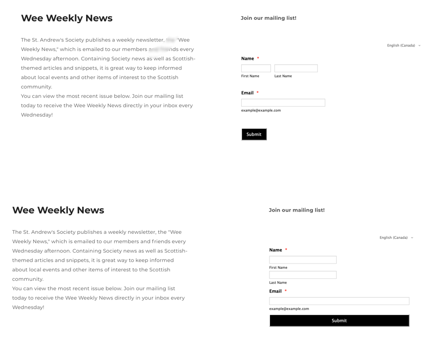
I understand that the form is responsive to the size of the column that contains it. However, the language selector in the top right-hand corner seems to be throwing things off somehow. If I reduce the size of the webpage column even a little bit, the first and last name fields will begin to wrap, even though there is still plenty of empty space to the right. The "submit" button also somehow starts to fill the entire width of the column. I am attaching a composite screenshot that shows the "before" and "after" - I hope this is helpful.
Is there any way to tighten up the width of the form and prevent all that wasted white space to the right, without the field wrapping? It looks weird having the language selector floating so far to the right with all that empty space in between.
Many thanks!
Sara
-
Amjad_AReplied on June 18, 2020 at 7:21 PM
Hi there, @Sara!
Thank you for contacting support.I have cloned your form and did some testings to reduce the white space you are having. Please insert this custom CSS into your form to reduce the white space.
.form-sub-label-container {
width: 42%;
margin-right: 20px;
padding-right: 10px;
}
.form-textbox{
width: 98%
}
.form-line{
padding: 0 !important;
}
.form-sub-label-container {
width: 100%;
}
.form-input-wide .q4_email {
width: 100%;
}
I hope this will solve the issue you are having, please let us know if this does not works for you.
Thanks! -
sasmontrealReplied on June 19, 2020 at 11:37 AM
I'm afraid that did not work! The name fields now wrap no matter how wide the column is (first and last names on separate lines instead of side by side), and all the fields fill the entire width. See screenshot below.
I really need the two parts of the name to be on the same line - in other words, to look exactly like the form does now (I have reverted to the original on the site), but without all the white space to the right.
My CSS skills are not up to the task - any help you could offer would be greatly appreciated!
Sara
-
Anita_KReplied on June 19, 2020 at 12:11 PM
Hi,
please allow me some time to look into this. I'll get back to you shortly.
-
Anita_KReplied on June 19, 2020 at 12:24 PM
Hi,
please replace the current CSS code with the following:
.form-line {
padding: 3px 5px 3px 15px;
}
.form-sub-label-container {
margin-right: 5px;
}
#first_3 {
width: 110%;
}
#last_3 {
width: 87%;
margin-left: 10px;
}
#input_4 {
width: 97%;
}
.form-textbox, .form-textarea {
padding: 2px 0px 2px 3px;
}
Let us know if you are happy with how it looks, or if you need further modifications.
-
sasmontrealReplied on June 19, 2020 at 2:31 PM
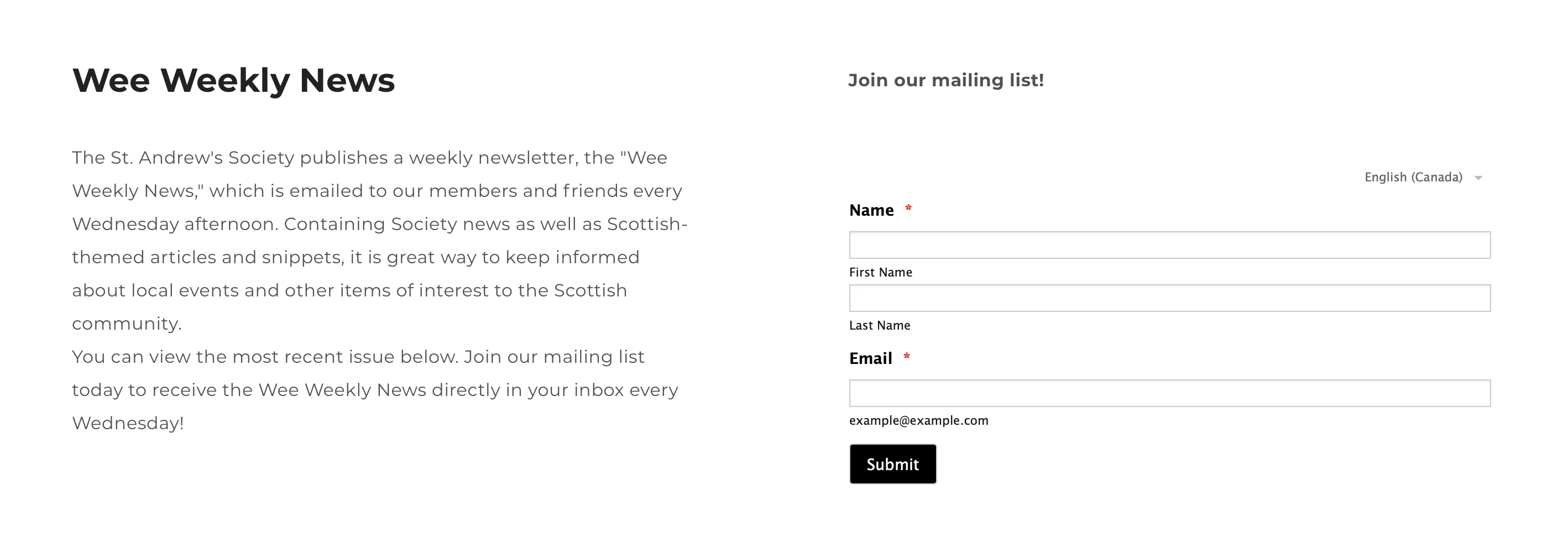
I'm afraid that didn't work either - the first and last name fields still move to separate lines even though there is still plenty of unused space to the right.
I have partially solved the problem by putting a max-width value on the language selector, so that at least it is not floating far off to the right anymore. This improves the overall appearance a lot. But I still wish I could reduce the overall width of the entire column without the name fields wrapping to two lines.
I am attaching an animation to demonstrate how the fields behave as I shrink and enlarge the width of the column in my website editor (the site is hosted on Weebly). I don't know why the name fields wrap long before the space appears to be filled.
If this is impossible to fix, that's ok - at least it's better than it was!
Thanks again,
Sara

-
John Support Team LeadReplied on June 19, 2020 at 3:48 PM
Hello Sara - That's how the form responds based on the size of the screen.
Now, I have made the First and Last Name field to be on the same line when viewed on a narrower screen size. Please try adding this to your existing CSS codes:
@media screen and (max-width: 480px), screen and (max-device-width: 768px) and (orientation: portrait), screen and (max-device-width: 415px) and (orientation: landscape){
input#first_3{
float:left;
width:150px!important;
}
input#last_3 {
float: left;
margin-top: -43px!important;
width: 150px!important;
margin-left: 170px;
}
label#sublabel_3_last {
float: left;
margin-top: -16px;
margin-left: 172px;
}
}
Please try that and let us know how it goes.
-
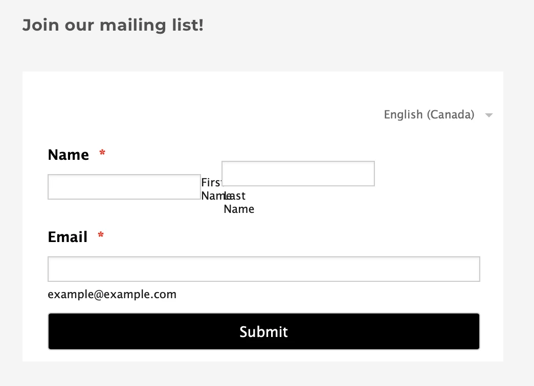
sasmontrealReplied on June 19, 2020 at 4:08 PM
You are so very kind - and that is a lot of code! Unfortunately, it did not end well (see screenshot). I understand there are probably limits to how precisely these things can be styled. I am happy to leave well enough alone right now.
Thank you again. I very much appreciate your prompt and painstaking tech support!!! I have been with Jotform for a year now, and I absolutely love it - it has made my working life much easier.
Sara
-
John Support Team LeadReplied on June 19, 2020 at 5:21 PM
Hello Sara - If you'll access the page via mobile, that code will work. I have set it up that way as I assume that your users might use their mobile phones in accessing the page.
But if you could provide a specific screen size of the devices that you think your users will use, we'll try to test again and provide you a code to use.
- Templates
- Integrations
- INTEGRATIONS
- See 100+ integrations
- FEATURED INTEGRATIONS
 PayPal
- Slack
- Google Sheets
- Mailchimp
- Zoom
- Dropbox
- Google Calendar
- Hubspot
- Salesforce
- See more Integrations
- Products
- PRODUCTS
- Form Builder
- Jotform Enterprise
- Jotform Apps
- Store Builder
- Jotform Tables
- Jotform Inbox
- Jotform Mobile App
- Jotform Approvals
- Report Builder
- Smart PDF Forms
- PDF Editor
- Jotform Sign
- Jotform for Salesforce Discover Now
- Support


