


-
maryaudeliaAsked on October 29, 2020 at 12:13 PM
I am trying to edit the CSS code to make the design for the mobile device the same as the website but I am struggling. The logo header in the mobile device looks flatter than the website, and the image checkbox widget also only has 1 column instead of 2. I want to resize the picture sizes too and the multiple-choice width but fail to do so.
https://form.jotform.com/202801031823037 here is my form and hopefully, someone can help me out!
Thank you!
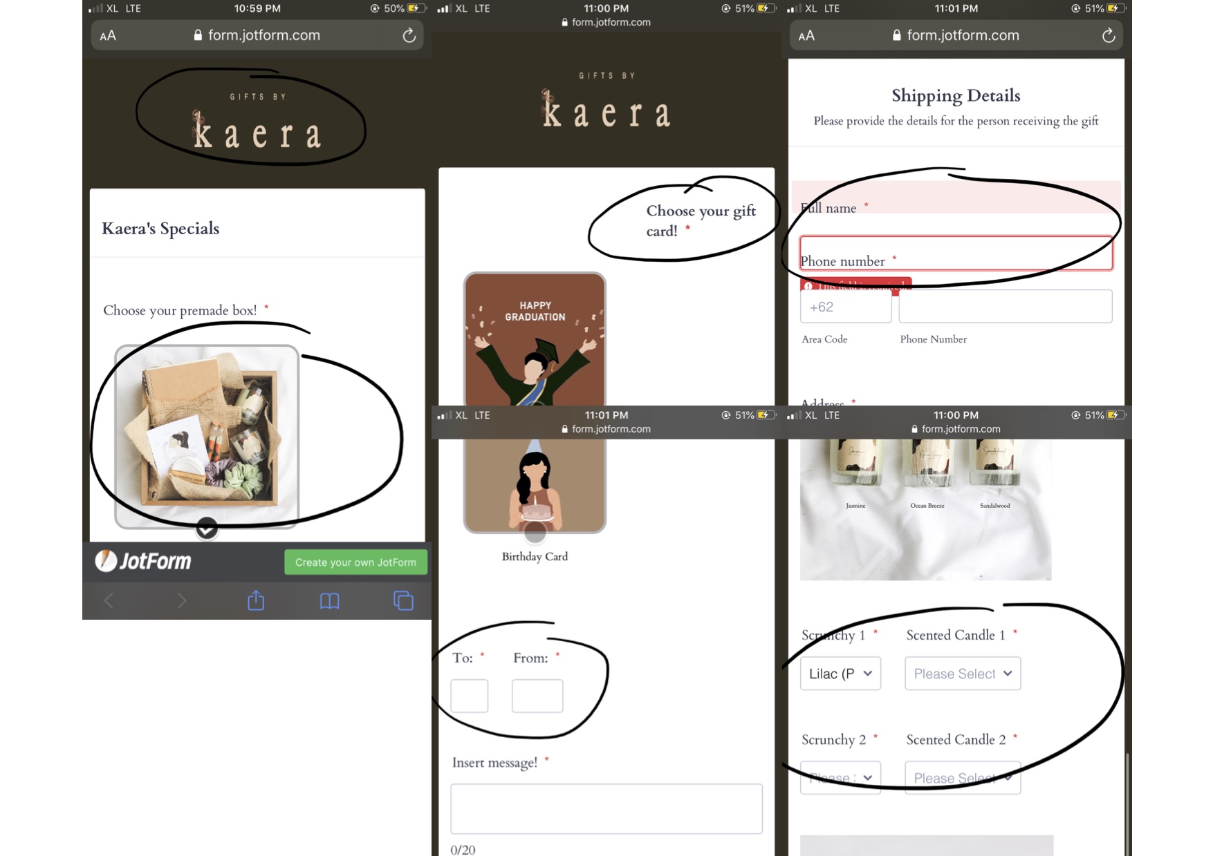 Page URL: https://form.jotform.com/202801031823037
 -
Bojan Support Team LeadReplied on October 29, 2020 at 2:43 PM
The problem with the logo is because there is some extra space on the side. Please remove it so the logo does not get smaller. It is possible to solve this with CSS, however, the logo will be smaller on the smaller screens.
If you place image checkboxes next to each other, there will be no room and they will need to be resized and might not be visible on phones.
I can see that you have tried to update the To and From fields by setting the width to 300px. This does not work because the wrapper of the fields is less than that. You need to use the following CSS:
#id_192, #id_193 {

width: 150px !important;

display: table;

}
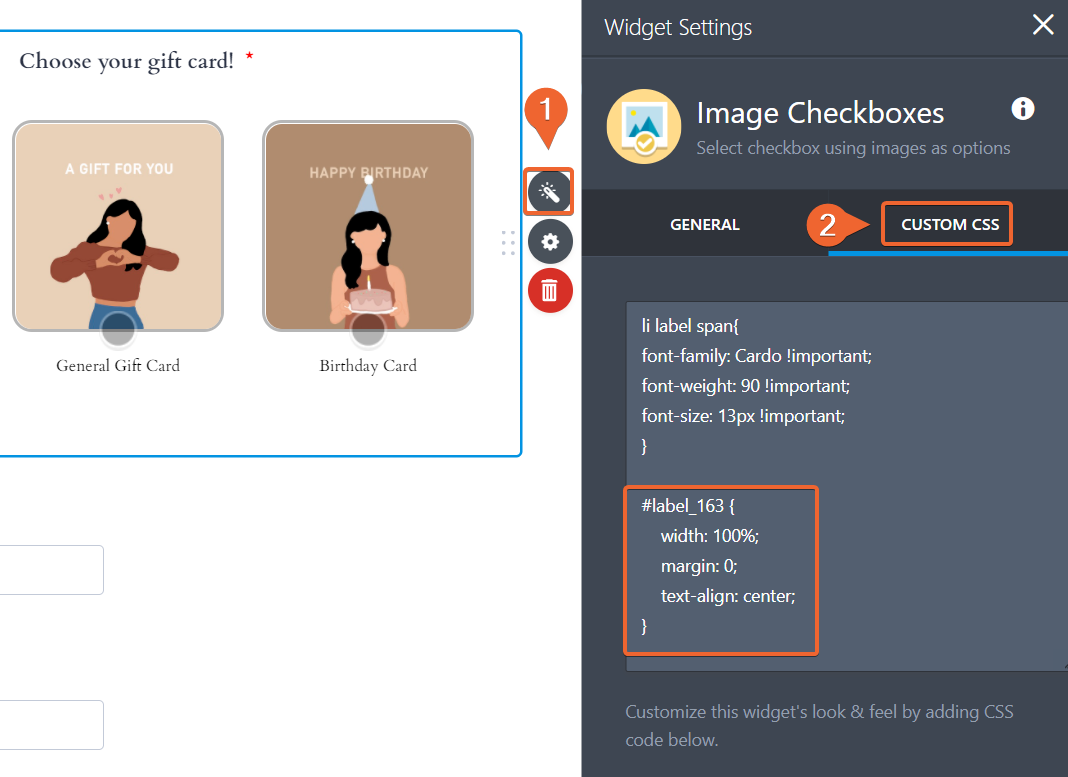
To solve the problem related to the Gift card selection, please add the following CSS:
#label_163 {

  width: 100%;

  margin: 0;

  text-align: center;

}
Please note that you need to inject this CSS directly into the widget:
To resolve the problem with the phone, please add the following:
#id_194 {

margin-top: 65px; !important

}
Can you please let us know how would you like to resize the images? We will be able to assist you once we have more information.
Thank you for your cooperation.
-
maryaudeliaReplied on October 29, 2020 at 4:55 PM
Thank you so much for your assistance! The codes manage to fit my desired design. As for the images, rather than resizing, I was thinking if it's possible to align it to the center, the same with the image checkbox widget.
-
Carlos_CReplied on October 29, 2020 at 8:58 PM
Hello There!
Please add the following CSS code in your Checkbox Image widget:
@media only screen and (max-width: 400px) {
li {
margin-left: 14%;
}
}
Please feel free to reach out if you have other questions or need some more help. I will be happy to help!
-
maryaudeliaReplied on October 30, 2020 at 12:29 AM
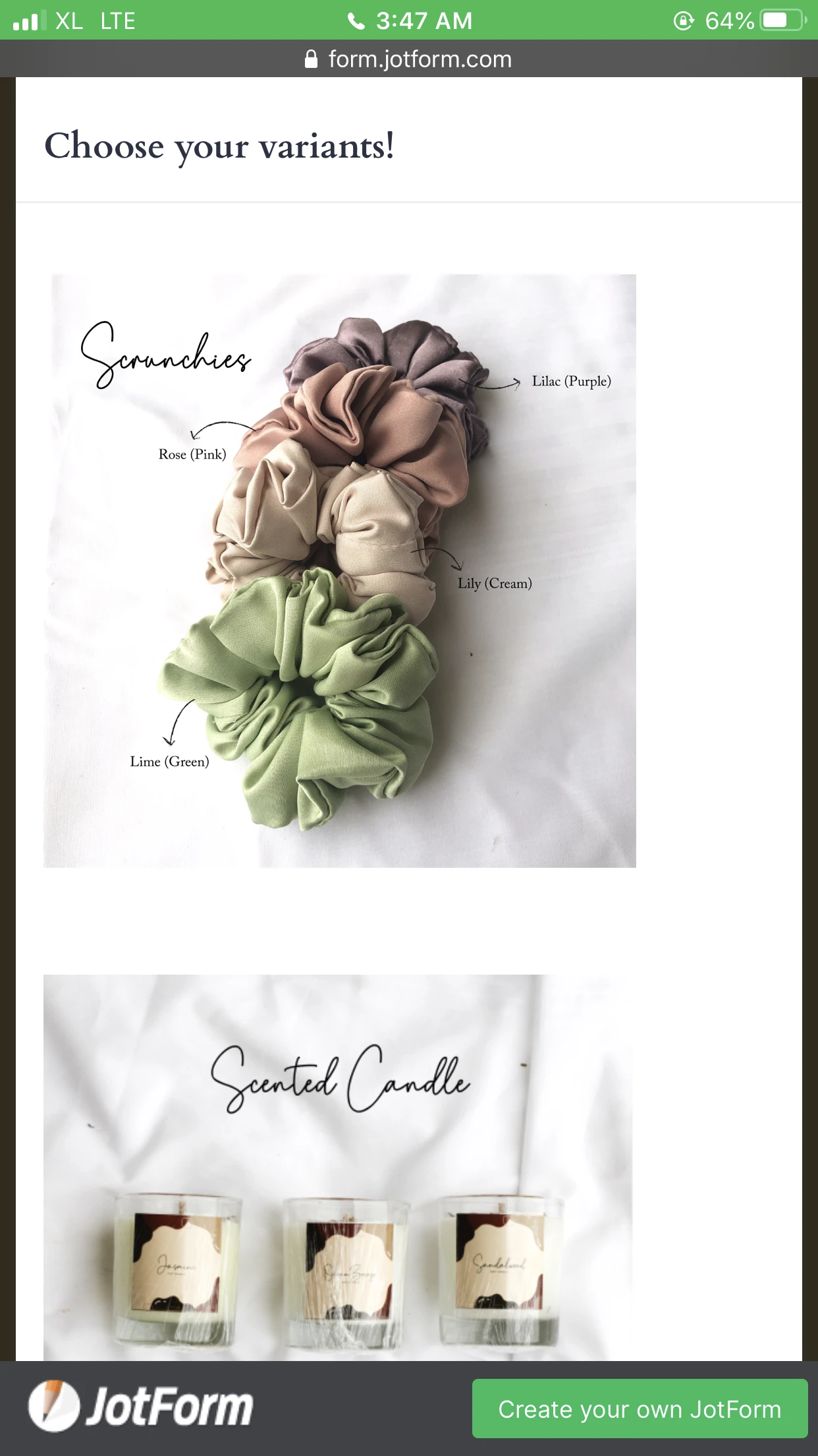
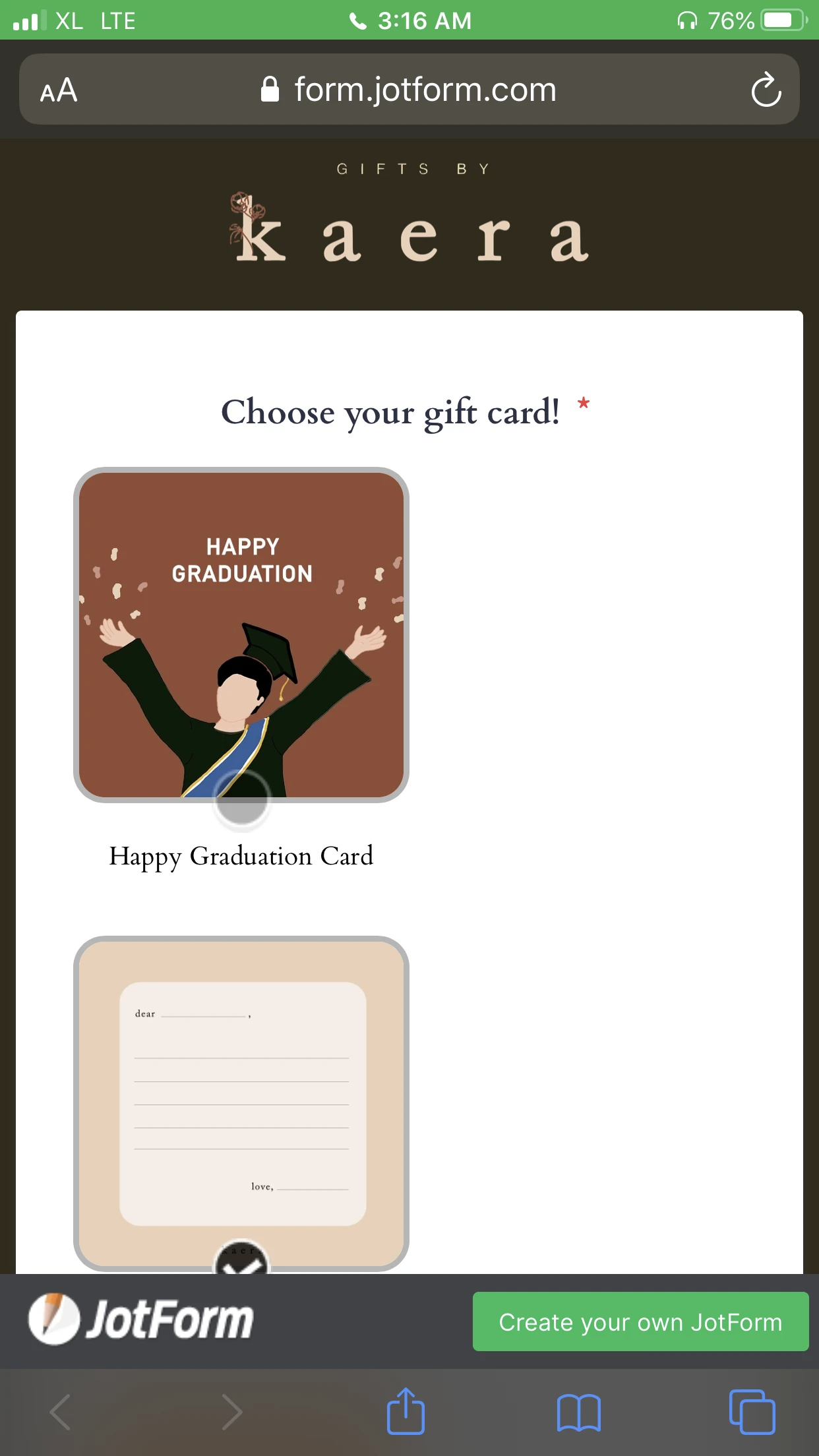
Thank you for helping Carlos! I tried the CSS code and it worked, however, it didn't work for my other checkbox image widget. I have attached the picture here and was wondering if you can also help regarding aligning the picture to be in the center.
Thank you!


-
Dagmar_BReplied on October 30, 2020 at 3:45 AM
Hello,
You need to enter the Code Carlos provided above into EACH Image Checkbox -Widget.
To align the images toward the center just select the Image and change the alignment to CENTER
- Templates
- Integrations
- INTEGRATIONS
- See 100+ integrations
- FEATURED INTEGRATIONS
 PayPal
- Slack
- Google Sheets
- Mailchimp
- Zoom
- Dropbox
- Google Calendar
- Hubspot
- Salesforce
- See more Integrations
- Products
- PRODUCTS
- Form Builder
- Jotform Enterprise
- Jotform Apps
- Store Builder
- Jotform Tables
- Jotform Inbox
- Jotform Mobile App
- Jotform Approvals
- Report Builder
- Smart PDF Forms
- PDF Editor
- Jotform Sign
- Jotform for Salesforce Discover Now
- Support


