


-
publisAsked on February 4, 2021 at 11:58 AM
Hello,
My first form is almost done and I am trying to adjust some details in the design of the product listing, regarding icon and width.
I have looked into the forum section and read many threads but could not find the answers.
Do you know if there would be a way :
- to specify a number of columns that would be different for each category ?
for instance, 4 items per line in the "depliants" category but only 1 in "don a la maison" ?-
to make the background of all product icons look transparent (=> light green, like the page) instead of the actual white ?-
to delete the zooming option for all icons and replace it with an url link (different for each icon) opening to a new window ?Thanks a lot for your help !
Best regards,
Elsa
-
John Support Team LeadReplied on February 4, 2021 at 4:56 PM
to specify a number of columns that would be different for each category ? for instance, 4 items per line in the "depliants" category but only 1 in "don a la maison" ?
Unfortunately, there is no option in the field to have multiple column styles. But you can use custom CSS codes to make a product appear on a single column. For the item you mentioned, please try injecting this custom CSS code below to your form:
#cid_3 > div > div:nth-child(5) > span.form-product-item.hover-product-item.on_col1.show_desc.show_option.new_ui {

  width: 100%!important;

}
Here's a guide on how-to-inject-custom-css-codes.
This will be the result:
I have moved your last two questions to each own separate ticket. I will respond to each shortly via these links below:
https://www.jotform.com/answers/2875493
https://www.jotform.com/answers/2875495
-
publisReplied on February 5, 2021 at 6:23 AM
Thank you John ! The form is really nicer thanks to your help (-> link to new form).
"Unfortunately, there is no option in the field to have multiple column styles." In that case, instead of changing the column number, would there be a way to specify a certain width, for ex. 150 px for all items in the first 4 categories (from "depliants" to "affiches") ?
-
Rehan Support Team LeadReplied on February 5, 2021 at 7:08 AM
Greetings,
Kindly inject the following CSS in your form:
.form-line.card-3col div[data-wrapper-react="true"] .form-product-item.new_ui.show_image {

   width: 150px;

}
You can check the cloned form below for the result.
https://form.jotform.com/210353257650955
Should you need further assistance then pelase let us know.
Thanks
-
publisReplied on February 5, 2021 at 7:29 AM
Hello Rehan,
Thank you very much ! I will be able to try your CSS with different px values. I have checked your cloned form and it seems the spacing between items has turned irregular(it has disappeared between 2 last items in a row): is there a way to keep a regular spacing ?
-
roneetReplied on February 5, 2021 at 7:52 AM
You may try injecting this CSS in your form:
.form-line.card-3col div[data-wrapper-react="true"] span.form-product-item {
width: calc(24% - 8px);
}
I have injected the CSS in this cloned form. Could you please test the form?
Guide: https://form.jotform.com/210352870393959
Let us know how it goes.
Thanks.
-
publisReplied on February 5, 2021 at 8:10 AM
Thank you, the result is the same... (on both Firefox and GGChrome + cleared cache too).

-
Richie JotForm SupportReplied on February 5, 2021 at 8:36 AM
Kindly add this custom CSS
.form-line.card-3col div[data-wrapper-react="true"] .form-product-item.new_ui {
margin:3px 3px 3px 10px !important;
}
Screenshot:

Let us know how it goes.
-
publisReplied on February 5, 2021 at 11:24 AM
It's not working, the items were now only 2 in a line, but thanks for having tried differents things. I'll leave it like that, I am happy to know how to change the width of the item cells thanks to this thread. Have a nice evening !
-
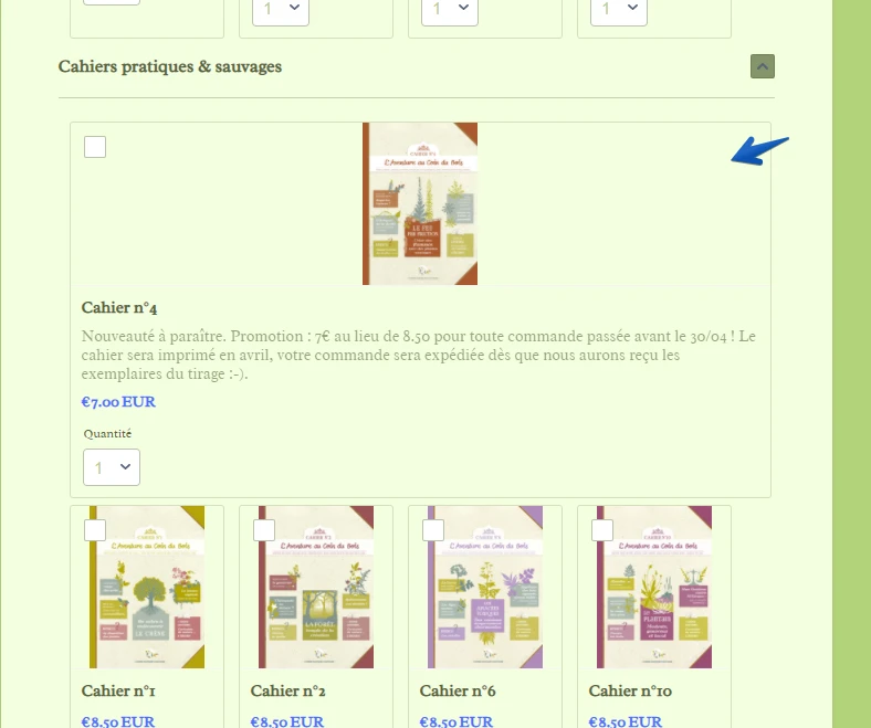
publisReplied on March 20, 2021 at 6:39 AM
Hello,
Our form is now active on our website, but when I add an article in a category, the first article takes the whole width instead of the third, like it should : see ex. in the 2d category "Cahiers". Form link : https://eu.jotform.com/210352886787367/
Is there a way to correct this please ?
Thank you !
Best regards. -
Richie JotForm SupportReplied on March 20, 2021 at 9:18 AM
You may add this custom CSS:
.form-line.card-3col div[data-wrapper-react="true"] .form-product-item.new_ui.show_image {

   width: 140px !important;

   margin: 3px 3px 3px 10px !important;

}
Sample screenshot:
Let us know how it goes.
-
publisReplied on March 20, 2021 at 9:50 AM
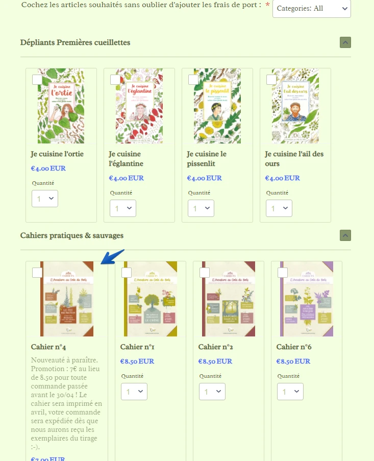
Thank you RIchie. The problem occurs only in the 2d category called "Cahiers" ("dépliants" was fine) because of a new article I've added, which appears alone in a row. Your screenshot shows 4 articles in a row instead of 3, and with this design, the checkboxes overlap the bookcovers, something I would like to avoid. Is there a code that would make all articles stay 3 in a row everywhere just like before, except in the "don" category, even if I add new articles ?
-
Richie JotForm SupportReplied on March 20, 2021 at 11:24 AM
Hi, with the CSS I have shared, the product would auto adjust when you add images to them.
Here is a sample screenshot:
Please give it a try and let us know how it goes.
-
publisReplied on March 22, 2021 at 9:25 AM
Than you Richie, I have tried it on a clone form : is there a way to avoid the overlapping checkbox on the bookcover (absent in the current form) ?

-
roneetReplied on March 22, 2021 at 11:28 AM
You may inject this CSS in your form:
.form-line.card-3col div[data-wrapper-react="true"] .form-product-item.new_ui.show_image .image_area {
width: 123%;
}
This code will adjust the overlapping.
Here is the cloned form where I have applied the CSS:
https://form.jotform.com/210804786872969
Thanks.
-
publisReplied on March 22, 2021 at 1:25 PM
Than you Roneet for your help, it solves the overlapping but not the fact that the first article in the 2d category still takes a whole row instead of a third or a quarter (= which was my concern)... Do you see ?
-
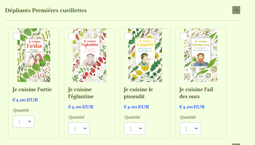
VincentJayReplied on March 22, 2021 at 8:26 PM
Hi,
Are you referring to this section of the form?
If yes, please add this custom CSS code to your form:
span.form-product-item.hover-product-item.on_col1.show_image.show_desc.show_option.full_img.new_ui {

  max-width: 25%;

}
Result:
-
publisReplied on March 23, 2021 at 3:48 AM
Thank you, I will try to combine the different codes to adjust the width and avoid overlapping. Have a good day !
- Templates
- Integrations
- INTEGRATIONS
- See 100+ integrations
- FEATURED INTEGRATIONS
 PayPal
- Slack
- Google Sheets
- Mailchimp
- Zoom
- Dropbox
- Google Calendar
- Hubspot
- Salesforce
- See more Integrations
- Products
- PRODUCTS
- Form Builder
- Jotform Enterprise
- Jotform Apps
- Store Builder
- Jotform Tables
- Jotform Inbox
- Jotform Mobile App
- Jotform Approvals
- Report Builder
- Smart PDF Forms
- PDF Editor
- Jotform Sign
- Jotform for Salesforce Discover Now
- Support


