


-
endrinitaAsked on February 22, 2021 at 5:18 PM
Hello,
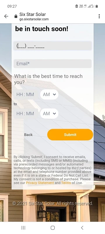
The submit button is too large on mobile devices. How can I ensure that the button stays within the form width?
-
Girish JotForm SupportReplied on February 22, 2021 at 11:01 PM
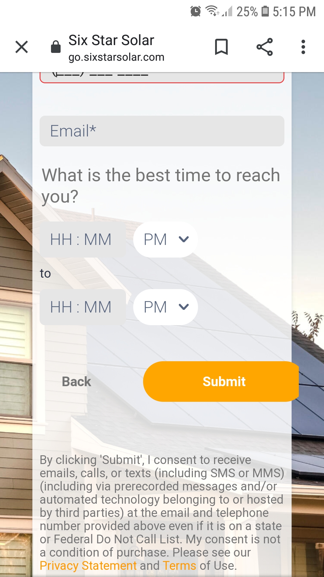
I tested both your direct form link and your embedded form on an Android phone and was able to view the Submit button correctly:
Could you test again probably using a different device? Please let us know which device and web browser you were testing on.
Alternatively, please embed the form using the iFrame code and check: https://www.jotform.com/help/148-getting-the-form-iframe-code
-
endrinitaReplied on February 23, 2021 at 8:14 AM
I tested the form using an Android phone as well. The issue persisted even after switching to the iFrame code.
Any other ideas?
-
Mike_G JotForm SupportReplied on February 23, 2021 at 9:50 AM
I was able to reproduce the issue you have described when I tested it on an Android device on my end.
You can fix the issue by injecting the custom CSS codes below into your form.
@media screen and (max-width: 480px) {

.form-all .form-submit-button {

    min-width: 100px !important;

}

}
Reference Guide: How-to-Inject-Custom-CSS-Codes
Please give it a try and let us know if you need any further assistance.
-
endrinitaReplied on February 23, 2021 at 10:40 AM
Thanks! This worked.
- Templates
- Integrations
- INTEGRATIONS
- See 100+ integrations
- FEATURED INTEGRATIONS
 PayPal
- Slack
- Google Sheets
- Mailchimp
- Zoom
- Dropbox
- Google Calendar
- Hubspot
- Salesforce
- See more Integrations
- Products
- PRODUCTS
- Form Builder
- Jotform Enterprise
- Jotform Apps
- Store Builder
- Jotform Tables
- Jotform Inbox
- Jotform Mobile App
- Jotform Approvals
- Report Builder
- Smart PDF Forms
- PDF Editor
- Jotform Sign
- Jotform for Salesforce Discover Now
- Support


