


-
tasneem.walyAsked on February 24, 2021 at 5:43 PM
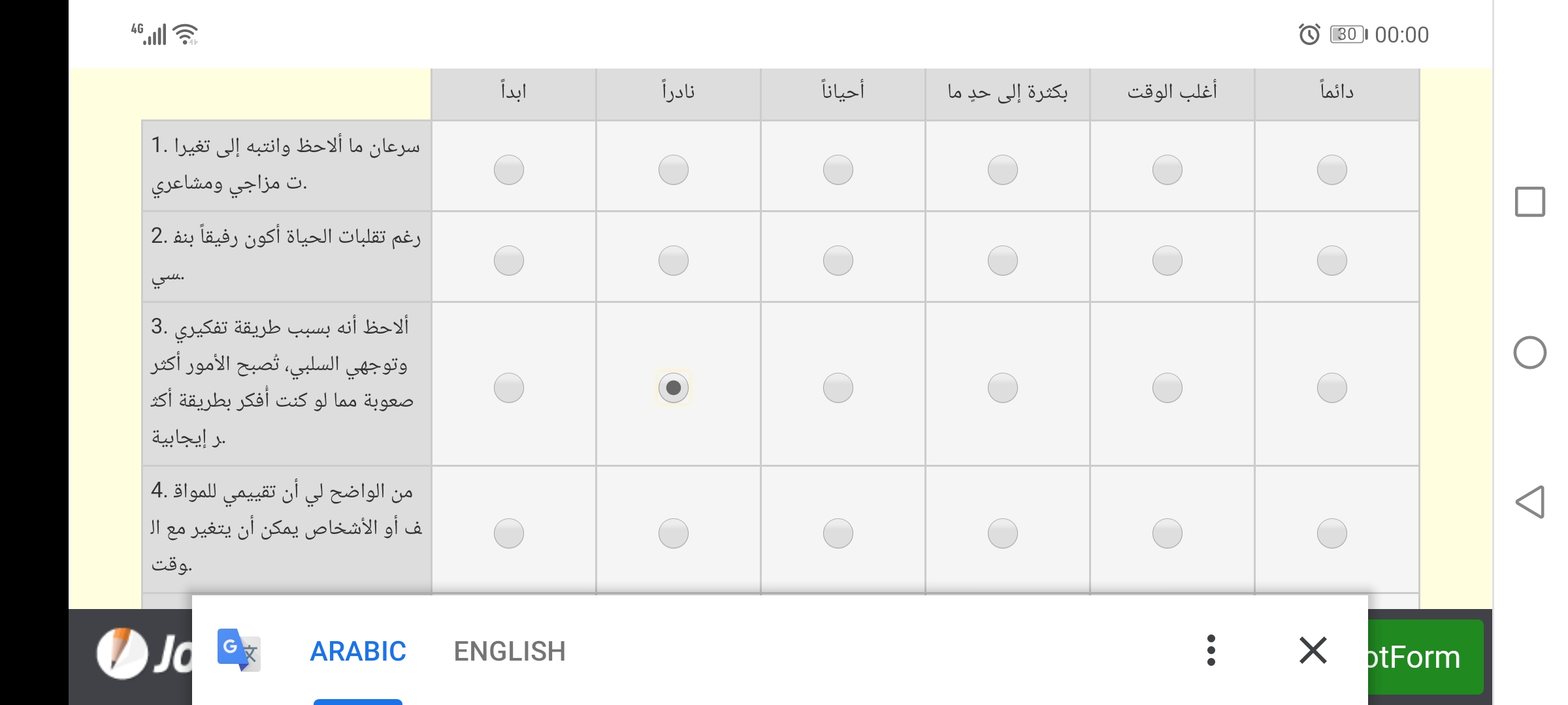
First, thank you for your great work. Second, it would be appreciated if you made the rows in Input Tables wider when they appear on mobiles because a lot of participants complaining that the items fields (where the sentences are written) are so much narrow and the radio buttons are so big, and that happens even if they rotated their mobile screens. Also, it will be great, if you keep the columns labels appear even when scrolled down, like in Excel Tables.
Thanks a lot!
-
roneetReplied on February 24, 2021 at 11:50 PM
May we know which form are you referring to?
Please inject this CSS to adjust the column width in the input table:
@media screen and (max-width: 480px), screen and (max-device-width: 768px) and (orientation: portrait), screen and (max-device-width: 415px) and (orientation: landscape) {
th.form-matrix-column-headers {
max-width: 55px;
}
}
Guide: https://www.jotform.com/help/117-how-to-inject-custom-css-codes
Let us know how it goes.
Thanks.
-
tasneem.walyReplied on February 25, 2021 at 2:55 AM
Thanks a lot for your help, it worked, and now it's much better when the mobile is rotated.
I was speaking about my forms, and sent a screenshot of how the table looked like.
Thanks.
-
jonathanReplied on February 25, 2021 at 6:16 AM
Thank you for letting us know all is good now. You can use the following link to update us
- Templates
- Integrations
- INTEGRATIONS
- See 100+ integrations
- FEATURED INTEGRATIONS
 PayPal
- Slack
- Google Sheets
- Mailchimp
- Zoom
- Dropbox
- Google Calendar
- Hubspot
- Salesforce
- See more Integrations
- Products
- PRODUCTS
- Form Builder
- Jotform Enterprise
- Jotform Apps
- Store Builder
- Jotform Tables
- Jotform Inbox
- Jotform Mobile App
- Jotform Approvals
- Report Builder
- Smart PDF Forms
- PDF Editor
- Jotform Sign
- Jotform for Salesforce Discover Now
- Support


