


-
sreenath_sreenathpAsked on March 4, 2021 at 11:57 PM
How can i make my form mobile responsive. The input table is not mobile responsive.
Please help me with a code to make my form mobile responsive.
-
Ashwin JotForm SupportReplied on March 5, 2021 at 3:51 AM
Please note that forms are by default responsive but you seem to have injected several custom CSS code in your form. I would suggest you to please inject the following custom CSS code in your form for input table and see if that gives you the desired result:
@media screen and (max-width: 480px), screen and (max-device-width: 767px) and (orientation: portrait), screen and (max-device-width: 415px) and (orientation: landscape){
.form-matrix-table {
width: 46%!important;
margin-left: -60px;
max-width: initial!important;
}
li#id_372 {
margin-left: 0px;
width: 100%;
}
}
Do try it out and get back to us if you have any questions.
-
sreenath_sreenathpReplied on March 5, 2021 at 9:16 AM
It still adding a scroll bar. the input table is a bit huge. Is it possible to have the input table in the one screen without having a scroll bar.
-
Ariel JotForm SupportReplied on March 5, 2021 at 10:59 AM
Greetings,
HTML tables are known to be a pain on small screens. Your options are to either, zoom out the table, squish the content horizontally, or add a scrollbar.
Or, you can utilize CSS pseudo-elements before or after to try to display the columns into rows. I wouldn't recommend doing this because you'd have to customize each cell of every table you'd like to fit on the screen; it would be a nightmare to maintain. But here's a guide if you want to go ahead.
What I suggest is to convert your single-rowed tables to Single Choice elements. Enable the Spread to Columns if you need the options to do just that.

The Single Choice element is mobile responsive by default.

Let us know if you need further assistance.
-
sreenath_sreenathpReplied on March 6, 2021 at 3:51 AM
But i want to use input tables itself.
Also can you give me a code for making the form input button completely blue on selection.
-
Ashwin JotForm SupportReplied on March 6, 2021 at 5:50 AM
You seem you have many input tables in form. Please delete the CSS code which I shared earlier and inject the following custom CSS code in your form:
@media screen and (max-width: 480px), screen and (max-device-width: 767px) and (orientation: portrait), screen and (max-device-width: 415px) and (orientation: landscape){

.form-matrix-table {

 width: 46%!important;

 margin-left: -60px;

 max-width: initial!important;

}

li#id_372 {

 margin-left: 0px;

 width: 100%;

}

li#id_373 {

  margin-left: 0px !important;

  width: 100% !important;

}

#cid_373 th.form-matrix-headers {

  min-width: 35px;

  padding-left: 0px;

  padding-right: 0px;

}

#cid_373 table.form-matrix-table {

  width: 44%!important;

  margin-left: -21px !important;

  max-width: initial!important;

}

#cid_374 th.form-matrix-headers {

  min-width: 45px;

  padding-left: 0px;

  padding-right: 0px;

}

#cid_374 table.form-matrix-table {

  width: 50%!important;

  margin-left: -49px !important;

  max-width: initial!important;

}

}
Do get back to us if you have any questions.
-
sreenath_sreenathpReplied on March 6, 2021 at 6:25 AM
It looks better now.
Can you help me with the code to make the below input table button better when selected.
-
Sigit JotForm SupportReplied on March 6, 2021 at 9:38 AM
Greetings,
You can try changing the color of the column headers and input to suite your needs.
HTML Color Codes: https://htmlcolorcodes.com/
.form-matrix-column-headers {

background-color: #32849c;

color: #fff;

}

.form-matrix-values input {

  background-color: #fff;

}
Please give it a try.
Regards.
-
sreenath_sreenathpReplied on March 8, 2021 at 12:14 AM
Nope you dint get me. I want to style the radio button inside the table.
I want my radio button to be styled like below on selection. Please could you help me with a code for that.
And also my content is overlapping when viewed on mobile, please help me with a code for this too.
-
Ashwin JotForm SupportReplied on March 8, 2021 at 1:35 AM
Please inject the following custom CSS code in your form and see if that gives you the desired result of single choice field:
.form-matrix-table input[type='radio']:checked::before {
background-color: #ffffff !important;
bottom: 2px !important;
left: 2px !important;
top: 2px !important;
height: 9px !important;
width: 9px !important;
}
.form-matrix-table input[type='radio'] {
background-color: #2E6DA4 !important;
}
Hope this helps.
Do get back to us if you have any questions.
-
sreenath_sreenathpReplied on March 8, 2021 at 5:31 AM
No its not working as i wanted.
-
Sigit JotForm SupportReplied on March 8, 2021 at 8:32 AM
Greetings,
Kindly inject the following custom CSS code in your form and see if that gives you the desired result
.form-radio+label:after, .form-radio+span:after {

 background: none !important;

}

.form-radio:checked+label:before {

 border-color: blue !important;

 border: 4px solid #000 !important;

}
Hope this helps.
Do get back to us if you have any questions.
-
Sigit JotForm SupportReplied on March 8, 2021 at 9:12 AM
Greetings,
If the previous custom CSS code doesn't work on custom theme (I tested it on default theme https://form.jotform.com/210663064329049).
A workaround, kindly inject the following custom CSS code in your form and see if that gives you the desired result
input[type=radio].form-radio {

display:none;

}


input[type=radio].form-radio + label {

padding-left:26px;

height:22px;

display:inline-block;

line-height:22px;

background-repeat:no-repeat;

background-position: 0 0;

font-size:17px;

vertical-align:middle;

cursor:pointer;

}


input[type=radio].form-radio:checked + label {

background-position: 0 -21px;

}


input[type=radio] + label {

background-image:url(https://i.ibb.co/K0CxNWM/radio-flat.png);

-webkit-touch-callout: none;

-webkit-user-select: none;

-khtml-user-select: none;

-moz-user-select: none;

-ms-user-select: none;

user-select: none;

}
Cloned version of the form https://form.jotform.com/210643470436956
Hope this helps.
Do get back to us if you have any questions.
-
sreenath_sreenathpReplied on March 8, 2021 at 10:02 AM
Yes its working as expected. Thank you
I just need one more help. My content is overlapping in mobile version. Can you provide a solution for this?
-
Ashwin JotForm SupportReplied on March 8, 2021 at 11:25 AM
I have injected the following custom CSS code in your form and that seems to have fixed the issue:
#cid_372 table.form-matrix-table {
margin-top: 21px !important;
}
Please test your form and get back to us if you need any other changes.
We will wait for your response.
-
sreenath_sreenathpReplied on March 8, 2021 at 10:59 PM
Its still overlapping a bit and the buttons are disoriented.
-
Ashwin JotForm SupportReplied on March 9, 2021 at 1:20 AM
I have made some changes in the custom CSS code of your form. Please check your form and see if it displays the form correctly in mobile device.
Do get back to us if you need any other changes.
-
sreenath_sreenathpReplied on March 9, 2021 at 2:44 AM
Hey its still overlapping.
Also can you make these tick marks more visible in the pdf editor. I couldn't find any option to style the tick marks.
-
Ashwin JotForm SupportReplied on March 9, 2021 at 4:03 AM
Can you please review all questions of your form and list down the changes you are to implement? It is very time-consuming to work on the same form multiple times for each field.
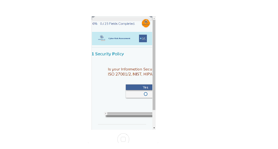
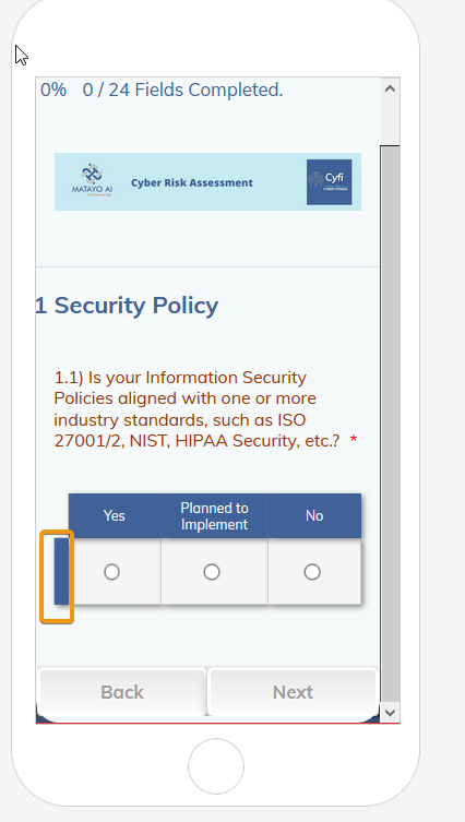
I have gone ahead and fixed the "1.3" question overlapping issue. Unfortunately it is not possible to style the change in the style of the input table answers in a PDF document. If you want, you can change the "Display Type" to standard and see if that fits into your requirement. Please check the screenshot below:

Hope this helps.
Do get back to us if you have any questions.
-
sreenath_sreenathpReplied on March 10, 2021 at 1:53 AM
The questions 1.1,1.3,2.2,2.3,2.4,2.5,3.1,3.2,4.2,4.3,5.1,5.2,5.3,5.4,6.1,6.2,6.3,6.4,6.5,6.6,6.7,7.1,7.2,7.3,7.4,7.5,7.6,7.7,8.1,8.2,8.3,9.1,9.2,9.3.10.1,10.2,10.3,10.4,10.5,10.6 are overlapping in mobile format. Please find me a solution.
Thank you.
-
Ashwin JotForm SupportReplied on March 10, 2021 at 3:17 AM
I am working on your request but it may take some time. I will get back to you on this soon.
-
Ashwin JotForm SupportReplied on March 10, 2021 at 3:34 AM
I have injected custom CSS code in your form to resolve the overlapping issue. Please check your form and see if all the fields are displaying correctly or not.
-
sreenath_sreenathpReplied on March 10, 2021 at 11:14 PM
Hey the questions are still overlapping in the mobile format.
-
Ashwin JotForm SupportReplied on March 11, 2021 at 2:13 AM
I am checking on your form and will get back to you on this soon.
-
Ashwin JotForm SupportReplied on March 11, 2021 at 2:48 AM
You seem to have injected so many custom CSS code in your form which is causing this issue on mobile view. I have tried to fix this issue, but it is very time-consuming. Please take a look at the following cloned form and see if it displays the fields correctly: https://form.jotform.com/210681615899972
Feel free to clone this form in your account. The following guide should help you in form cloning: https://www.jotform.com/help/42-how-to-clone-an-existing-form-from-a-url
Do get back to us if you have any questions.
-
sreenath_sreenathpReplied on March 11, 2021 at 9:00 AM
Yes its working fine, but none of my advanced css styling is applied. Please check.
-
Richie JotForm SupportReplied on March 11, 2021 at 11:25 AM
May we know the CSS you have applied in the advance so that we can check?
Looking forward for your response.
-
sreenath_sreenathpReplied on March 12, 2021 at 3:07 AM
https://www.jotform.com/build/210521056463446/design
This is the link to my advanced css design.
This is how its showing.
I want it like this.
-
Richie JotForm SupportReplied on March 12, 2021 at 5:07 AM
I have checked and you have a lots of CSS.
It seems you're referring to my colleagues form.
Please note that the above screenshot is how you would view the input table in mobile.
Let me test your requirement further and I will get back to you once I have further information.
-
Richie JotForm SupportReplied on March 12, 2021 at 7:53 AM
Please check my sample form if this fits your requirements.
https://form.jotform.com/210702218254950
I have edited how the input table is shown when viewing in mobile device.

If this fits your requirements, you may clone my form.
Guide:https://www.jotform.com/help/42-how-to-clone-an-existing-form-from-a-url
Looking forward for your response.
-
Richie JotForm SupportReplied on March 15, 2021 at 4:29 AM
No actually its different css styling.
I dont want the row header to be visible and my question is in a different color. I want the design exactly like the below picture.
Hi, unfortunately I cannot find a CSS that would totally remove the row headers on mobile.
I was only able to minimize the row headers size as fully removing the row headers will remove the form.
Sample form:https://form.jotform.com/210702218254950
-
sreenath_sreenathpReplied on March 15, 2021 at 11:38 PM
For some of the questions my css styling isnt applied, my buttons are not of the same style, the astr is suppose to be white so that its not visible. Some row headers has content that needs to be hidden(like the one below, 1.2 should not be seen). Please find a way to hide the row header with no content(not all). Th rows with content(they have questions, please dont change them.
-
Ashwin JotForm SupportReplied on March 16, 2021 at 12:57 AM
I am checking the row header issue, but it is taking some time. I will get back to you on this soon.
-
Ashwin JotForm SupportReplied on March 16, 2021 at 1:20 AM
Please take a look at the following cloned form and see if it displays the fields correctly in the mobile device: https://form.jotform.com/210740781599969
I have injected custom CSS code to hide the row header which does not have any content. As per your requirement, table header for 1.2 is also now hidden.
Do you mean to say that asterisk color you want it to change to white?
We will wait for your response.
- Templates
- Integrations
- INTEGRATIONS
- See 100+ integrations
- FEATURED INTEGRATIONS
 PayPal
- Slack
- Google Sheets
- Mailchimp
- Zoom
- Dropbox
- Google Calendar
- Hubspot
- Salesforce
- See more Integrations
- Products
- PRODUCTS
- Form Builder
- Jotform Enterprise
- Jotform Apps
- Store Builder
- Jotform Tables
- Jotform Inbox
- Jotform Mobile App
- Jotform Approvals
- Report Builder
- Smart PDF Forms
- PDF Editor
- Jotform Sign
- Jotform for Salesforce Discover Now
- Support


