


-
RRdigitalAsked on March 21, 2021 at 4:27 AM
Hello,
Despite adding the CSS to make this mobile friendly, it still doesn't look good on the mobile version? Is anyone able to help me make it look like the EXACT same versions as on the desktop?
Desktop link: https://www.all-links.me/profile/
Current mobile screen shot attached.
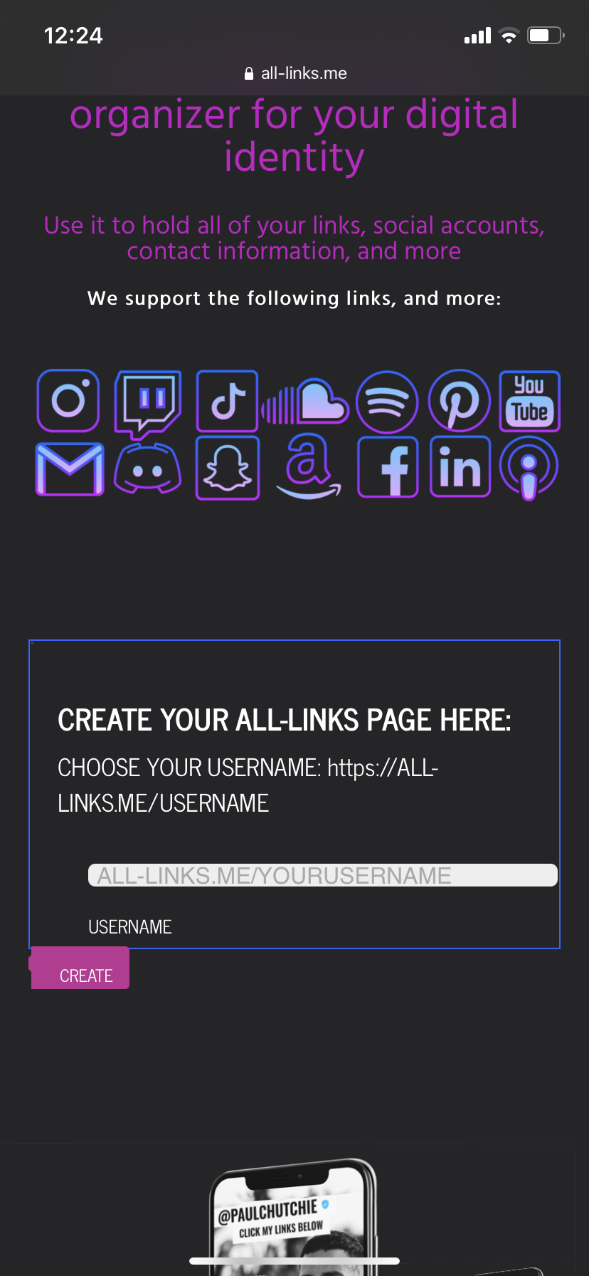 Page URL: https://form.jotform.me/210752790159459
 -
Richie JotForm SupportReplied on March 21, 2021 at 11:27 AM
You may try this custom CSS
@media screen and (max-width: 480px){

    #cid_2{

    margin-top: -40px !imporant;

    position:absolute !important;

}

#input_1{

    margin-left: -30px !important;

    width: 270px !important;

}

.form-buttons-wrapper{

    position: absolute;

margin-top: -60px !important;

margin-left: 280px !important;

}

}
Please make sure to add the CSS on top of all your CSS or update your mobile CSS.
Screenshot:
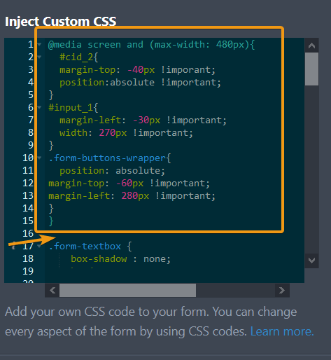
Sample form:https://form.jotform.com/210794643292965
Let us know how it goes.
-
RRdigitalReplied on March 21, 2021 at 11:49 AM
Amazing thank you.
Just a few more things to tidy it up:
How can I make the input text dark? It's dark on the desktop version but white on mobile so you cannot see what you are writing?How can I make all align both the white box and 'https;' text so that it's inline with the text above (Create your.. and Choose your...)
Many thanks in advance.
-
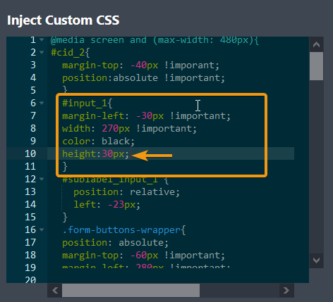
Gaetan_BReplied on March 21, 2021 at 5:15 PM
Hello,
I have adjusted the code, you can replace the existing one with the one below:
@media screen and (max-width: 480px){

#cid_2{

  	margin-top: -40px !imporant;

  	position:absolute !important;

  }

  #input_1{

  	margin-left: -30px !important;

  	width: 270px !important;

  	color: black;

  }

  #sublabel_input_1 {

    position: relative;

    left: -23px;

  }

  .form-buttons-wrapper{

  	position: absolute;

  margin-top: -60px !important;

  margin-left: 280px !important;

  }

}


.form-textbox {

    box-shadow : none;

    border : none;

    border-radius : 5px;

    background : #eeeeee;

    padding : 6px;

    outline : none;

    height : 16px;

}


.form-line.form-line-column.form-col-1 {

    margin : 0;

    padding : 0;

}


.form-line.form-line-column.form-col-2 {

    padding : 0;

    margin : 0;

}


.form-submit-button {

    background : #be3395;

    border : none;

    border-top-left-radius : 0;

    border-bottom-left-radius : 0;

    color : #fff;

    text-shadow : none;

    text-transform : uppercase;

    box-shadow : none;

    padding : 5px 20px !important;

    text-align : right !important;

    position : relative;

    margin : 0;

    margin-left : -10px;

    outline : none;

    height : 40px;

}


.form-submit-button:hover {

    background : #be3395;

}


.form-submit-button:before {

    width : 0;

    height : 0;

    border-style : solid;

    border-width : 8px 8px 8px 0;

    border-color : transparent #be3395 transparent transparent;

    content : "";

    position : absolute;

    left : -6px;

    top : 4px;

    z-index : 111;

}


.form-submit-button:active {

    box-shadow : none;

}


.form-buttons-wrapper {

    margin : 0;

    padding : 0;

}


.form-header-group {

    border-bottom : none;

}


.jotform-form {

    border : 1px solid #2d64fc !important;

}


.jotform-form {

    padding-top : 0px !important;

}


#cid_1 {

    margin-left : 40px;

}
Hope this helps.
Do not hesitate to reach out if you need further assistance.
-
RRdigitalReplied on March 22, 2021 at 4:02 AM
Thank you so much for your help, its looking much better.
We are nearly there now.
I have attached a screen shot of what I see when typing in the text box, it's like the text box needs to be linger because you can only see the top of the text.
Thanks for your help, it's really appreciated.
Rachael

-
Richie JotForm SupportReplied on March 22, 2021 at 5:30 AM
You may add the height CSS inside your #input_1.
height:30px;
Please give it a try and let us know how it goes.
-
RRdigitalReplied on March 22, 2021 at 7:00 AM
Fantastic, thank you so much!
- Templates
- Integrations
- INTEGRATIONS
- See 100+ integrations
- FEATURED INTEGRATIONS
 PayPal
- Slack
- Google Sheets
- Mailchimp
- Zoom
- Dropbox
- Google Calendar
- Hubspot
- Salesforce
- See more Integrations
- Products
- PRODUCTS
- Form Builder
- Jotform Enterprise
- Jotform Apps
- Store Builder
- Jotform Tables
- Jotform Inbox
- Jotform Mobile App
- Jotform Approvals
- Report Builder
- Smart PDF Forms
- PDF Editor
- Jotform Sign
- Jotform for Salesforce Discover Now
- Support

