


-
Francis_ComptonAsked on June 11, 2021 at 9:20 AM
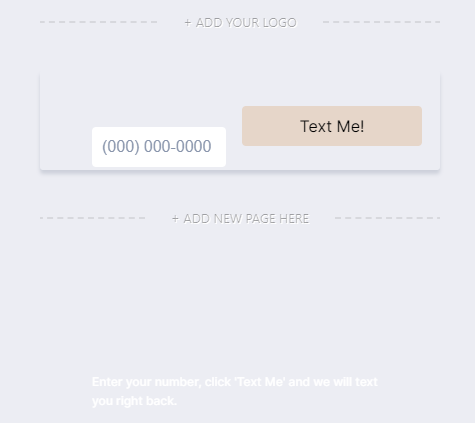
I am trying to change the size and shape of the Copy of Text Me form:
https://form.jotform.com/211255727461454However, it seems like there is a limit to the width of the Submit button.
I have tried using CSS to change the width, but it won't let it be smaller than 120px
.form-submit-button {
position : absolute;
left : 30px;
top : 36px;
width : 60px;
padding : 0px 0px 0px 0px;
}
Is there a solution to this? I need the button smaller.
As well, I've coded the sub-heading to appear where I want it in the Advanced Design section, but when I publish, the text disappears completely.
Please help!
 Page URL: https://form.jotform.com/211255727461454
 -
Michal_S Jotform SupportReplied on June 11, 2021 at 10:33 AM
Hello!
To make the button smaller, please add the following CSS to your Custom CSS:
.submit-button{
min-width:60px!important;
}
Adjust the min-width pixel value as needed.
If you'd like it even smaller than that, then add a width to that same rule too:
.submit-button{
min-width:10px!important;
width:10px!important;
}
Related guide: How to Inject Custom CSS Codes
The text is invisible because it's white text on a white background.
Changing the color to black makes it appear:
To change the color of the heading just click the heading in the Advanced Designer and change it in the menu:
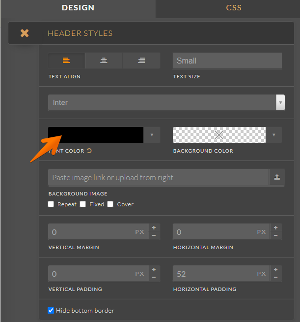
Make sure you save your changes when using the Advanced Designer - the settings are not saved automatically.
Please let us know if you require any further assistance.
Thank you!
-
Francis_ComptonReplied on June 11, 2021 at 4:46 PM
Thank you - the Submit button is looking much much better!
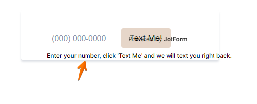
However, the issue with the white text isn't that it is white-on-white. The background which I am applying form is all black, so the text needs to remain white. The issue is that the text doesn't seem to appear at all when applied to a slim menu bar, but shows up in other sections of the site. I'm not sure if this is because of the positioning.
This is how it displays currently
I am trying to make the form as close to this existing AMPScript form as possible:
How can I make the spacing more narrow between the submit button, as well as the subheader?
-
Kenneth JotForm SupportReplied on June 11, 2021 at 8:32 PM
Hi there,
Currently, the vertical spacing is alright but the subheader is over-extending.
Is that what you want us to address now?
Awaiting your response.
Best.
-
Francis_ComptonReplied on June 16, 2021 at 2:41 PM
Hello!
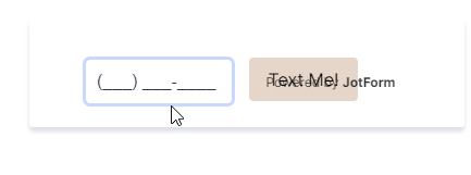
I have changed the text, but not the phone number field is expanding too wide, despite the width looking perfect in the preview.
How do I ascribe a fixed width to the input field?
Thank You
-
Kenneth JotForm SupportReplied on June 16, 2021 at 6:42 PM
Hi there,
We would like to clarify, whether you want to reduce the Phone number field's width?
And are you referring to the desktop view? Or is it on mobile?
Awaiting your response.
Best.
-
Francis_ComptonReplied on June 17, 2021 at 12:17 PM
Hello,
I would like to reduce the phone number field width. This expanding of the field occurs in desktop. I would like the field to be only so wide as the input of those 9 digits.
Thank you
-
Michal_S Jotform SupportReplied on June 17, 2021 at 1:48 PM
Hello!
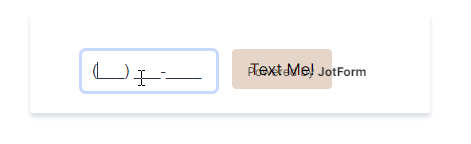
I'm sorry, but I can't see the difference in width between the preview and the live version:
Preview:
Live:
You can try adding this CSS code to specify the width of the phone field:
#cid_4{
width:115px;
}
And you can also remove the padding to make it take up all the available space, enabling you to further reduce the width without cutting off the characters:
#input_4_full{
padding:0px!important;
}
Modify the value in green to your liking.
If this is not what you meant, please specify what width you mean exactly (a screenshot would be great).
Thank you!
-
Francis_ComptonReplied on June 18, 2021 at 8:58 AM
Hello,
I've added both, just to make sure.
Also, is there a way to remove the drop-shadow effect on these forms? I just want the input fields, I don't need the graphic effects.
As well, there seems to be space off to the far right of the button - is there a way to reduce that?
Thank You,
-
Nikola JotForm SupportReplied on June 18, 2021 at 11:40 AM
You can remove the shadow with this CSS code:
.form-all {
box-shadow: none !important;
}
If you want to move the submit button to right, add this CSS code as well:
.page-section li[data-type=control_button] .selectedControls+div, .page-section li[data-type=control_button]>div:first-child {
padding-left: 30px;
}
-
Francis_ComptonReplied on June 18, 2021 at 12:30 PM
Thank you - I've removed the drop shadow now.
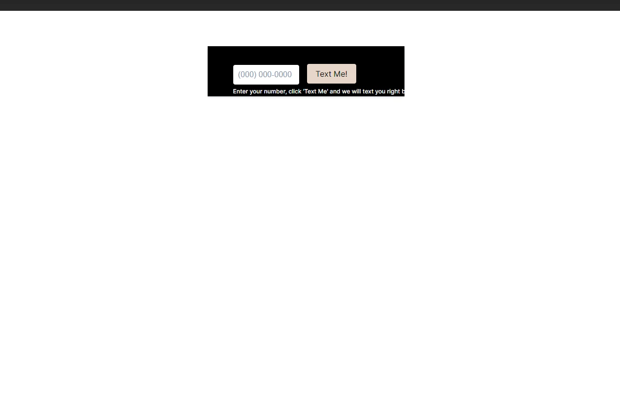
Regarding the size of the form, the button location is actually ideal. It minimizes the form as much as possible. However, I am referring to the spacing to the right:
I want to close in the green border as much as I can, so that it does not disrupt the main menu we have built. The space to the immediate right of the 'Text Me!' button is too much, but the space above and to the left is also too large.
Thank You!
-
Nikola JotForm SupportReplied on June 18, 2021 at 1:47 PM
You can remove the space by adding this CSS code to the form:
ul.page-section {
margin: 0;
padding: 0;
}
and reducing the width of the form to 300px.
Related Guide: The Importance of Form Widths
-
Francis_ComptonReplied on June 18, 2021 at 3:12 PM
Thank you - I have included this code into the CSS, but it looks like it only changed the text number field. Is that correct? Or it will show up properly when it's input into the page.
vs
Do you need to see the entire CSS used, to make sure they are all gelling together?
-
Kenneth JotForm SupportReplied on June 18, 2021 at 7:17 PM
Hi there,
So I reduced the width and moved the submit button to the right to even out the spacing of the left and right side:

Here the code is to reduce the width:
.form-all {
width: 300px !important;
}
Please adjust the following to realign the submit button:
.form-submit-button {
position: absolute;
left: 62px;
top: 39px;
width: 60px;
padding: 0px 0px 0px 0px;
}
Best.
-
Francis_ComptonReplied on June 21, 2021 at 3:01 PM
Long story short, I am trying to insert this form into an Elementor site, in the main menu.
This is what is happening when I input the form:this is what I have for the .form-all:
.form-all {
box-shadow : none !important;
width: 300px !important;
height : 100px;
padding-top : 0;
}
Do I need to change instead the .form-section.page-section?
I am told by the site designer that "it also continues to have mystery empty space above" that is wrecking havoc on the menu.
-
Francis_ComptonReplied on June 21, 2021 at 3:30 PM
Also, the spacing between the input field and the button has increased.
And once you actually do submit, the Thank You page also drastically changes the menu:
- Templates
- Integrations
- INTEGRATIONS
- See 100+ integrations
- FEATURED INTEGRATIONS
 PayPal
- Slack
- Google Sheets
- Mailchimp
- Zoom
- Dropbox
- Google Calendar
- Hubspot
- Salesforce
- See more Integrations
- Products
- PRODUCTS
- Form Builder
- Jotform Enterprise
- Jotform Apps
- Store Builder
- Jotform Tables
- Jotform Inbox
- Jotform Mobile App
- Jotform Approvals
- Report Builder
- Smart PDF Forms
- PDF Editor
- Jotform Sign
- Jotform for Salesforce Discover Now
- Support


