


-
ChasAsked on June 16, 2021 at 8:08 AM
In the attachment, I have highlighted the issue with a red circle. For some reason, I'm mobile view, I am not able to read the second part of the Braintree description.
Any suggestions?
Chas
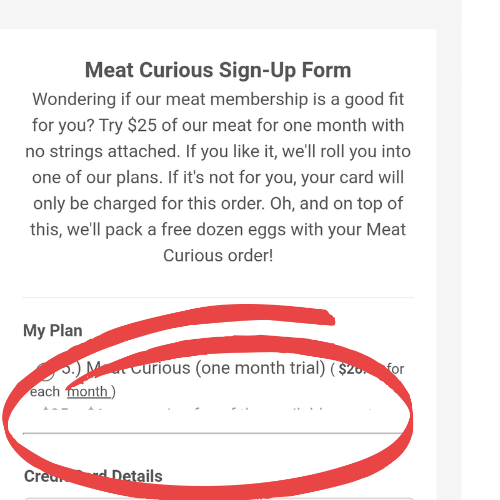 Page URL: https://form.jotform.com/211605335141140
 -
Anthony_EvansReplied on June 16, 2021 at 12:57 PM
Howdy Chas,
That issue is being caused by this CSS in your form:
span.form-product-item.hover-product-item {

    height : 50px;

}
Removing this doesn't seem to make a difference, visually, on the desktop version. Please remove that code to allow the entire product to be visible on mobile.
Please let us know if there's anything else we can help you with!
-
Charles EdensReplied on June 16, 2021 at 3:51 PM
Perfect! Thank you!
-
saintfrancislittleitalyReplied on June 16, 2021 at 6:01 PM
-
Tommaso_FReplied on June 17, 2021 at 2:03 AM
Hello @saintfrancislittleitaly
I have moved your question to a different thread and soon you will receive a reply here:
https://www.jotform.com/answers/3165977
Best regards.
- Templates
- Integrations
- INTEGRATIONS
- See 100+ integrations
- FEATURED INTEGRATIONS
 PayPal
- Slack
- Google Sheets
- Mailchimp
- Zoom
- Dropbox
- Google Calendar
- Hubspot
- Salesforce
- See more Integrations
- Products
- PRODUCTS
- Form Builder
- Jotform Enterprise
- Jotform Apps
- Store Builder
- Jotform Tables
- Jotform Inbox
- Jotform Mobile App
- Jotform Approvals
- Report Builder
- Smart PDF Forms
- PDF Editor
- Jotform Sign
- Jotform for Salesforce Discover Now
- Support


