


-
XARDSAsked on June 18, 2021 at 4:14 PM
Hello, I noticed that when using the input verification widget I get the following display error on mobile version.
Probably due to button width. Can this be set dynamically or do I need to just resize it to normal button size?
Actually on my phone I'm not having this issue but maybe this may hint to other phones getting this display error. -
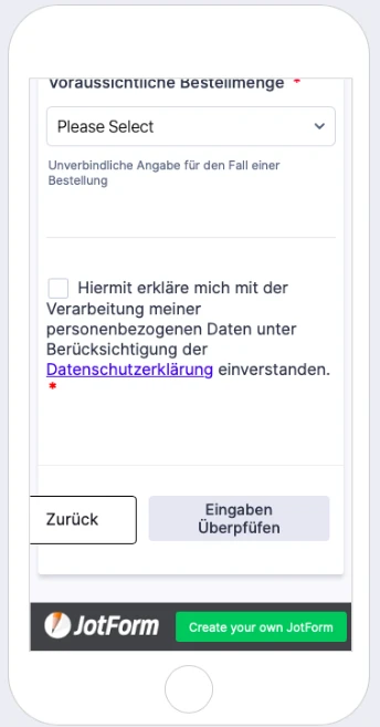
XARDSReplied on June 18, 2021 at 9:07 PM
When going to the next page on "Eingaben Überprüfen" on my phone I get this display error:
-
Vick_W Jotform SupportReplied on June 19, 2021 at 4:03 AM
Hi there,
I've tested your form on my Android phone and I do not see these visual errors. The buttons are showing correctly on the form. Please tell us the device name and model that you are using as well as the browser so we can test this further.
Looking forward to your reply.
Thanks
-
XARDSReplied on June 19, 2021 at 10:19 AM
Hi,
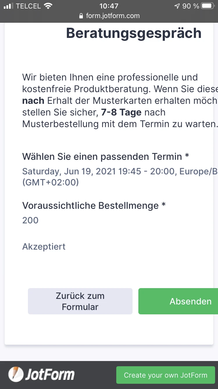
well, the first picture was obviously from the preview function in jot form and the second was from my iPhone 8 with Safari.
-
roneetReplied on June 19, 2021 at 12:56 PM
Are you seeing the error only on mobile devices?
Can we test your form on our phone?
https://www.jotform.com/form/211430885359864
Looking forward to your response.
Thanks.
-
XARDSReplied on June 19, 2021 at 1:02 PM
Yes I am only having this on my phone, not on pc. Sure you can test in your phone, thank you.
-
Billy JotForm SupportReplied on June 19, 2021 at 7:48 PM
Hello,
Upon investigation, it appears that we need to inject a CSS code to prevent the items from going out of their container which I already did for your convenience.
I injected this code:
  #previewContainer {

    padding: 0 !important;

  }


  #previewContainer ul {

padding: 5px !important;

}


.form-all .form-submit-button {

min-width: 30% !important;

}
How it should look like
And here's how the preview looks like before submitting the form:

Let us know if you need further assistance.
Best regards,
-
XARDSReplied on June 20, 2021 at 2:25 PM
Thank you very much.
- Templates
- Integrations
- INTEGRATIONS
- See 100+ integrations
- FEATURED INTEGRATIONS
 PayPal
- Slack
- Google Sheets
- Mailchimp
- Zoom
- Dropbox
- Google Calendar
- Hubspot
- Salesforce
- See more Integrations
- Products
- PRODUCTS
- Form Builder
- Jotform Enterprise
- Jotform Apps
- Store Builder
- Jotform Tables
- Jotform Inbox
- Jotform Mobile App
- Jotform Approvals
- Report Builder
- Smart PDF Forms
- PDF Editor
- Jotform Sign
- Jotform for Salesforce Discover Now
- Support


