


-
syawal75Asked on June 27, 2021 at 2:00 PM
Hi,
I want to reduce the gap between the header and the beginning of the form. The desktop view is okay but the mobile phone view is not okay. I have injected custom CSS to maintain the header height so that it will not be stretched. Please refer to the attached picture showing the gap between the header and the first field is too big.
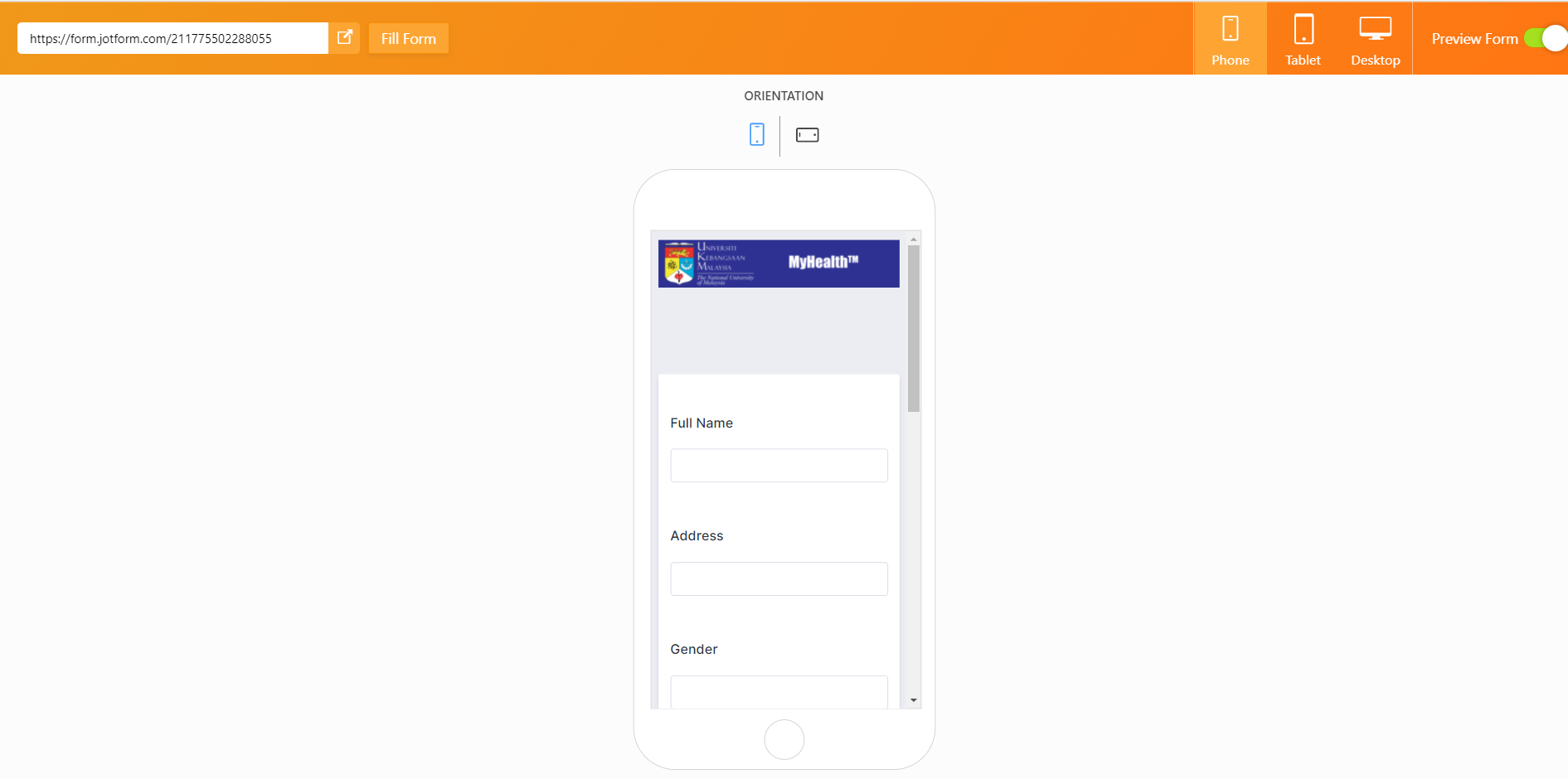 Page URL: https://form.jotform.com/211775502288055
 -
Patrick_RReplied on June 28, 2021 at 5:24 AM
Hello! Please check this form on your mobile device: https://form.jotform.com/211782418506961
If this solves your purpose, then you can implement the following CSS code to achieve this:
@media screen and (max-width:480px) {

 .form-all{

  margin-top: 0px !important;

 }


 div.formLogoWrapper.Left{

  position: static;

  border-bottom: 7px solid #ECEDF3;

 }


 div.formLogoWrapper.Left > img.formLogoImg{

  display: block;

 }

}
Make sure that you place this code at the end of your existing CSS code.
In case this doesn't solve your purpose or if you have any questions, let us know.
Thank you!
-
syawal75Replied on June 28, 2021 at 5:50 AM
Thank you Patrick. That solved the gap perfectly. By the way, how do I reduce the gap between the field in mobile view? The gap between the field for tablet and desktop view is okay but for mobile view, the gap seems bigger.
Thank you.
-
Lorenz JotForm SupportReplied on June 28, 2021 at 7:19 AM
Hi there,
Kindly please add this code into your form.
@media screen and (max-width:480px) {

li.form-line {


margin-bottom: -14px;

}

}
I hope this helps. Let us know if you need any further assistance.
-
syawal75Replied on June 28, 2021 at 8:34 AM
Thank you, Lorenz. It works.
- Templates
- Integrations
- INTEGRATIONS
- See 100+ integrations
- FEATURED INTEGRATIONS
 PayPal
- Slack
- Google Sheets
- Mailchimp
- Zoom
- Dropbox
- Google Calendar
- Hubspot
- Salesforce
- See more Integrations
- Products
- PRODUCTS
- Form Builder
- Jotform Enterprise
- Jotform Apps
- Store Builder
- Jotform Tables
- Jotform Inbox
- Jotform Mobile App
- Jotform Approvals
- Report Builder
- Smart PDF Forms
- PDF Editor
- Jotform Sign
- Jotform for Salesforce Discover Now
- Support


