


-
olivierarthusAsked on October 19, 2021 at 8:40 AM
Hello
In forms there is a standard option (not a widget) to add text to a field when hovering the mouse (not sure this is the right term, but basically when flying the mouse over the field). The text is then displaid.
This is a nice a option, but as far as I can tell it does not work on mobile or tablet, since there is no mouse. Or if it does work with mobile, it is not intuitive enough as I have not been able to make it work with my phone.Is there a widget or a way to achie a similar outcome, both for laptop and mobile.
I want to use it for a simple purpose: for many fields I want to add a help field, where the user will only see the detailed content when requesting it. If not requested the user will only see a sign showing help is available.
Thanks -
Marco JotForm SupportReplied on October 19, 2021 at 9:11 AM
Hello there,
Thanks for reaching out to us.
For obvious reasons the hover event only makes sense on those devices equipped with a mouse, touchpad, etc. The most you can do on smartphone, is to make the hover text always visible.
This is how your form may appear:
Basically on top of each field, you'll see the tooltip with the hover text you set from the field properties:
If you like the result, you can inject the following CSS code into your form:
 @media screen and (max-width: 480px) {

 .form-line .form-description {

   visibility: visible !important;

   overflow-x: clip !important;

}

}
Let us know if you need any further assistance,
Regards
-
olivierarthusReplied on October 19, 2021 at 10:31 AM
Thanks
Making the text always visible does not work for me. Mobile phone screens are not very large and making the text always visible consumes a lot of space.
What I really need is a way to:
- click on a help/info button
- on click display the help / info text
- at end of text, have the option to unfold it again.The non editable content widget comes pretty close to this need but is not intuitive in my opinion.
so I was hpoing for a better alternative
thanks
-
Bojan Support Team LeadReplied on October 19, 2021 at 10:56 AM
Greetings.
I was able to add custom HTML to the form that might work for you. You can test my example form here:
https://form.jotform.com/212914302160038If you view it on a phone, a question mark will appear next to the question which can be clicked and additional information will be shown. Can you please test this and let us know if this solution will work?
Please note that you will need to modify some HTML to update the shown text. Also, you will have to modify the text that will be shown on the form and on the desktops separately.
If this solution will work for you, we will provide you with instructions on how you can implement this on your form.
Thank you for your cooperation.
-
olivierarthusReplied on October 31, 2021 at 5:24 AM
thnaks it works for me
-
Bojan Support Team LeadReplied on October 31, 2021 at 6:32 AM
Greetings.
You will first have to add a paragraph field below each question:
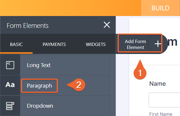
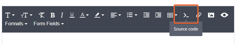
In it, you will need to modify the Source code:
Please add the following HTML to it:
<div><a class="button" style="position: absolute; transform: translateY(-475%); right: 10px;" href="#" rel="nofollow"><img style="width: 25px;" src="https://www.jotform.com/uploads/Bojan_J/form_files/71768.616ed92c207698.71130886.png" alt="" /></a>

<p style="display: none;">This is some additional information about the name field</p>

</div>
Here is where you can modify the text that will be shown on mobile devices.
You will also need to add the following CSS directly into the form:
.button:hover + p {

  position: absolute;

  transform: translateY(-475%);

  right: 50px;

  max-width: 200px;

  color: #fff;

  background-color: #687988;

  border-radius: 4px;

  font-size: 11px;

  line-height: 13px;

  padding: 5px 6px;

  overflow-y: auto;

 display: block !important;

}

.control_text {

 margin: 0;

 padding: 0;

 padding-left: 10px;

}

@media only screen and (min-width: 600px) {

 .button {

  display: none !important;

 }

}
You can click here to see how to inject CSS into your form.
Let us know if you have any additional questions.
- Templates
- Integrations
- INTEGRATIONS
- See 100+ integrations
- FEATURED INTEGRATIONS
 PayPal
- Slack
- Google Sheets
- Mailchimp
- Zoom
- Dropbox
- Google Calendar
- Hubspot
- Salesforce
- See more Integrations
- Products
- PRODUCTS
- Form Builder
- Jotform Enterprise
- Jotform Apps
- Store Builder
- Jotform Tables
- Jotform Inbox
- Jotform Mobile App
- Jotform Approvals
- Report Builder
- Smart PDF Forms
- PDF Editor
- Jotform Sign
- Jotform for Salesforce Discover Now
- Support


