


-
labiosthetiqueAsked on March 11, 2014 at 10:10 PM
Hi,
I embedded my form on a simple page empty page here:http://www.labiosthetique.com.au/joborder/
but it's not responsive on mobile once embedded, what can I do?
-
CesarReplied on March 11, 2014 at 10:29 PM
Kindly try embedding the form using the iFrame Method. This should allow the form to render on mobile.
Do let us know if the issue persits. Thank you.
Related Article:
Getting-the-Form-iFrame-Code -
labiosthetiqueReplied on March 11, 2014 at 10:36 PM
Hi Cesar,
thanks for your answer. However, I tried and it doesn't work neither...
-
David JotForm Support ManagerReplied on March 11, 2014 at 11:08 PM
Hi, please try injecting this CSS code into your form:
/*-----------RESPONSIVE LAYOUT-----------*/
@media (max-width: 480px) {
.form-textarea,
.form-textbox,
.form-dropdown{
width: 100% !important;
-webkit-box-sizing: border-box;
-moz-box-sizing: border-box;
box-sizing: border-box;
}
.form-label-left, .form-label-right{
width: auto;
}
.form-buttons-wrapper{
margin-left:0 !important;
}
.form-input {
width: 100%;
}
.form-all{
width: 75%;
}
.form-sub-label-container {
width: 100%;
display:block;
}
}
-
labiosthetiqueReplied on March 11, 2014 at 11:16 PM
Hi BDAVID,
Thanks. Still doesn't work...
Am I the only case with this problem?
-
CesarReplied on March 12, 2014 at 12:08 AM
Alternative please try the following code:
@media only screen and (max-device-width: 550px){
.form-all {
width: 500px !important;
}
}Do let us know if this helps displaying the form on your end. Thank you.
-
labiosthetiqueReplied on March 12, 2014 at 12:55 AM
-
Elton Support Team LeadReplied on March 12, 2014 at 3:18 AM
@labiosthetique
Here are some corrections.
1. First, you have to embed your form using the default script embed code.
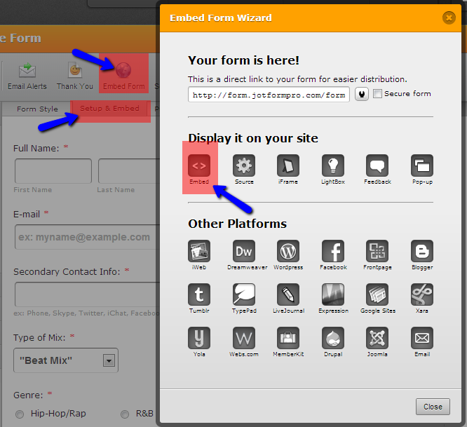
2. You have to inject the provided CSS codes on your form not within your page. Follow guide this: https://www.jotform.com/help/117-How-to-Inject-Custom-CSS-Codes
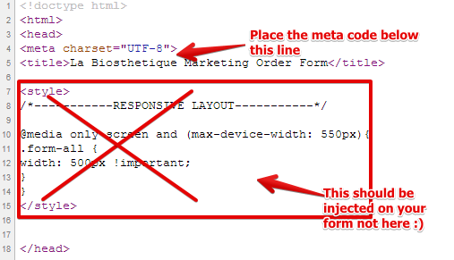
3. The HTML page where the form is embedded is lacking a meta code that would scale the form properly on mobile devices. Please add the following meta code between the head tag on your HTML page.
Check this visual guide:
Let us know if you still have issues with your form. Thanks!
-
labiosthetiqueReplied on March 14, 2014 at 12:25 AM
EltonCris, thank you, it works!
Thank you very much everybody for your help, very good support!
- Templates
- Integrations
- INTEGRATIONS
- See 100+ integrations
- FEATURED INTEGRATIONS
 PayPal
- Slack
- Google Sheets
- Mailchimp
- Zoom
- Dropbox
- Google Calendar
- Hubspot
- Salesforce
- See more Integrations
- Products
- PRODUCTS
- Form Builder
- Jotform Enterprise
- Jotform Apps
- Store Builder
- Jotform Tables
- Jotform Inbox
- Jotform Mobile App
- Jotform Approvals
- Report Builder
- Smart PDF Forms
- PDF Editor
- Jotform Sign
- Jotform for Salesforce Discover Now
- Support


