
-
intotriteamAsked on October 26, 2021 at 8:45 AM
Hi,
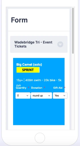
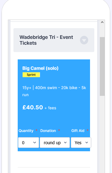
How can I format my order form to look like your restaurant order form template (I can not just adapt the restaurant template as it does not support several features I need). Basically, I am trying to move the quantity and donation fields into the blue background area (or make it appear as if it was one area). Also, how can I adapt the section collapse style to look like the one used in the restaurant order form (see screenshot attached)?
My form: https://form.jotform.com/212962719414055
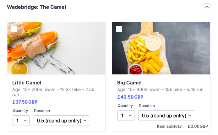
Adapted copy of Restaurant oder form: https://form.jotform.com/212922817090353
 Page URL: https://form.jotform.com/212962719414055
 -
Lorenz JotForm SupportReplied on October 26, 2021 at 9:36 AM
Hi there,
The form template is using PayPal integrations for his product.
However, if you don't want to apply any payment vendor to your form, then you may use the Purchase order tool instead.
Here's a guide: https://www.jotform.com/help/460-how-to-create-payment-form-with-purchase-order/
To have the same product layout, you can simply add a product, and product image. Then to enable the Quantity selector, and other product options, please check the guide below.
Guide:https://www.jotform.com/help/264-create-sub-products-based-on-a-product-option/
I hope this helps. Let us know if you need any further assistance.
-
intotriteamReplied on October 26, 2021 at 9:40 AM
Sorry but this doesn't help. The whole issue is based on the fact that I can not use one of your payment forms because the functionality I need is not supported. I am therefore trying to replicate the look of it, without using the same underlying technology.
-
Jovanne JotForm SupportReplied on October 26, 2021 at 10:47 AM
Hi,
Could you please provide us the site URL of the form that you would like to replicate the looks?
We can insert custom CSS to your form to somehow replicate the design of the form.
We look forward to your response.
-
intotriteamReplied on October 27, 2021 at 5:24 AM
Hi,
Both the site URL of my form and the URL of the restaurant order form, the look and feel if which I am trying to replicate, are in my original message in this thread, along with a screenshot of what I am trying to achieve. I would be grateful for your support to achieve this through CSS.
Michael
-
Lorenz JotForm SupportReplied on October 27, 2021 at 7:56 AM
Hi there,
Apologies, but CSS alone is not enough to meet your requirement(e.g. product image, product options for each item), having complete control over the HTML code will at least help, however, we do not support custom HTML in the builder.
May we know what features will you be using that are not compatible with the payment integrations, may be we can somehow come up with a workaround for that instead? Also, could you please share with us the whole idea on how you want your order form to work?
We will wait for your response.
-
intotriteamReplied on October 27, 2021 at 9:15 AM
Hi,
A product image is not needed. All I need is to be able is to visually integrate dropdowns into the text field above, which I set up as a paragraph. It is basically a case of allowing a background (coloured tile) to sit behind both the paragraph and the dropdowns, to make it look as if they were all part of one tile, even though they are separate fields.
The problem with the payment forms is that:
a) they do not allow for multiple kinds of subproducts. Subproducts overwrite the original price, hence only one type of subproduct can be selected at any given time. What I need is for subproducts to provide an additional pricing layer, with sublevel prices being additive, rather than replacing the original price. For example, if the original price is 10, subproduct 1 is 1 and subproduct 2 is 2 then the total price is 10+1+2=13. Subproducts should therefore specify a premium or discount vs. the original price, they do not replace it. So in my form, I think of subproducts as add-ons, rather than unique products
b) only one category is allowed. I need category 1: event location, category 2: adult/junior
c) I need to be able to refer to the quantity and price fields of each product individually. The payment forms don't allow that. The issue is that I need to set up conditions for the rest of the form depending on the quantities of each product selected. Calculation fields or show/hide conditions can only access the entire range of products, not products individually.
The idea of my form is to set up an event order form similar to how we applications work. The firm will have three tabs: the 'cart' where the user selects events, the attendee section where each product selected is matched to an attendee form specific to that product and participant, and the 'checkout' page that shows everything the User has selected, allows discounts to be applied and payment. The form submission email will then be styled as an order confirmation.
The trouble is that a user can order tickets for events for himself, friends and family and choose between different event locations, event distances, age groups with hundreds of permutations. For each permutation, I need to present the user with an attendee form that is specific to the attendee and product selected. I therefore need to be able to set up conditions along the lines of: if user has 2x product 1 and 3x product 2 in the oder, show 2x attendee form 1 and 3x attendee form 2, and none of the other dozens of forms.
Michael
-
Richie JotForm SupportReplied on October 27, 2021 at 10:27 AM
Hi Michael, I would suggest using the inventory widget to have a quantity.
You can also manually calculate the price buy using the form calculation widget.
Guide:https://www.jotform.com/help/259-how-to-perform-form-calculation-using-a-widget/
Sample form:https://form.jotform.com/212993800525962
Let us know if this fits your requirements.
-
intotriteamReplied on October 27, 2021 at 12:37 PM
Hi,
I am aware of the inventory and calculation widgets. Functionality is not my problem here, it already works as planned. The issue is the look and feel of it.
So let me reiterate what I am trying to do:
Visually integrate dropdowns into the text field above, which I set up as a paragraph. It is basically a case of allowing a background (coloured tile) to sit behind both the paragraph and the dropdowns, to make it look as if they were all part of one tile, even though they are separate fields.
Michael
-
Richie JotForm SupportReplied on October 27, 2021 at 1:58 PM
It is possible to use CSS to move the fields to your paragraph however, first you must edit your paragraph to increase the height of the table and move the price.
Sample paragraph source code:
<div style="background: #33A8FF;">
<table style="height: 126px; width: 355.125px;">
<tbody>
<tr style="height: 221px;">
<td style="width: 23px; height: 21px;"> </td>
<td style="width: 810.125px; height: 21px;">
<p><span style="color: #ffffff;"><strong>Big Camel (solo) <img src="https://www.jotform.com/uploads/intotriteam/form_files/Screenshot%202021-10-26%20at%2012.10.50.6177e24b6829d0.55094623.png" alt="" width="58" height="17" /></strong></span></p>
<p><span style="font-size: 10pt; color: #ffffff;">15y+ | 400m swim - 20k bike - 5k run</span></p>
<p>£40.50</p>
</td>
</tr>
<tr style="height: 0px;">
<td style="width: 23px; height: 0px;"> </td>
<td style="width: 810.125px; height: 0px;"> </td>
</tr>
</tbody>
</table>
</div>
Then you can add this custom CSS:
#id_24{

position: absolute;

margin-top: 260px;

width: 100px;

font-size: 10px;

margin-left: 10px;

 }


#id_37{

position: absolute;

margin-top: 260px;

width: 130px;

font-size: 10px;

margin-left: 160px;

 }
Guide:https://www.jotform.com/help/117-how-to-inject-custom-css-codes/
Sample form:https://form.jotform.com/212993800525962
Kindly give it a try and let us know how it goes.
-
intotriteamReplied on October 27, 2021 at 3:48 PM
Thanks Richie. I have implemented the code and slightly tweaked the measurements in my form.
- Would it be possible to decrease the font size of the quantity and donation labels to 10 and change the font colour to white?
- Is it possible to reduce the padding on top of the tile to 50% of its current size?
- Could the spacing between the three lines of text in the paragraph be increased?
Also, when looking at the form on mobile, the formatting of the quantity and donation dropdowns is all over the place. Can this be cleaned up to match the desktop view? Happy to use a dropdown for quantity too to save space, in case that makes things easier.
Michael
-
Parker JotForm SupportReplied on October 27, 2021 at 6:29 PM
Hello,
Could you please provide screenshots and annotate them so we know what exactly we're looking for and what you're trying to increase since all 3 look different. I'm not really sure what you want reduced in size or paragraph lines increased means. If you just want more margin on the paragraph fields you can do that by increasing the margin-top and bottom of those.
This will change the dropdown label text and size.
.form-dropdown {font-size: 10px;}


#label_24.form-label, #label_37.form-label {color: #fff;}
https://www.jotform.com/help/438-how-to-post-screenshots-to-our-support-forum/
-
intotriteamReplied on October 28, 2021 at 6:01 AM
Hi,
Please find a screenshot attached with instructions of how I would like the formatting to be tweaked. There is also a problem with how the form appears on mobile - the dropdowns don't seem to adjust in size to the smaller screen. Can this be fixed?
Form URL: http://form.jotform.com/212962719414055
Michael

-
Ashwin JotForm SupportReplied on October 28, 2021 at 6:52 AM
Please take a look at the following cloned form where I have made the changes in the first paragraph field and see if it displays the questions correctly: https://form.jotform.com/213002431619948
Do get back to us if you need to apply the same changes in the other paragraph fields.
We will wait for your response.
-
intotriteamReplied on October 28, 2021 at 7:43 AM
Hi,
The desktop version is now much better, thanks. Can the issue with the drop downs overlapping on mobile view be sorted? As 80% of customers order on mobile, that is key.
Michael
-
Richie JotForm SupportReplied on October 28, 2021 at 8:15 AM
You can add this custom CSS into your form for the fields to be mobile responsive.
@media screen and (max-width: 480px){

 #id_40{

 margin-top: 320px;

 width: 90px !important;

 margin-left: 5px;

}

#id_37{

  margin-top: 320px;

  width: 120px !important;

  margin-left: 77px;

}

#id_41{

 margin-top: 320px;

 width: 88px !important;

  margin-left: 180px;

}

}
Sample screenshot:
Let us know how it goes.
-
intotriteamReplied on October 28, 2021 at 8:45 AM
Thanks, I copied your form and was able to tweak your mobile values slightly to make it appear as intend on my phone. New form URL: https://form.jotform.com/213003766795359
However, all these values are set as absolute. I am a bit worried that it will now look ok on my phone but not on different mobile phone screen sizes. Is it possible to get around that issue somehow by setting the form width and height to a size that works for all screens or any other way?
Michael
-
Jovanne JotForm SupportReplied on October 28, 2021 at 8:49 AM
Hi Michael,
The CSS code provided by my colleague will be intended to work on all mobile devices. You can also check on how the form should look across different devices in the Form Preview feature.
Let us know if you have further questions.
-
intotriteamReplied on October 28, 2021 at 8:56 AM
That's the trouble, the values provided by your colleague did not work for my phone, the dropdowns were all outside the coloured background and too far down the screen. By tweaking the values to work for my phone, the preview I get now for mobile is pretty bad, the dropdowns overlap the paragraph field.
-
Lorenz JotForm SupportReplied on October 28, 2021 at 10:12 AM
Hi there,
Please try to view your form using an actual mobile device, the elements are displayed responsively.
See the image below.

Thank you.
-
intotriteamReplied on October 28, 2021 at 1:00 PM
Ok, thanks. I have checked it on three different phones, apple and android and it seems to work fine. A couple of tweaks still to do:
- When you select an option from one of the dropdowns, the entire field is highlighted in white (see screenshot). Can this be disabled or the colour adjusted to the same as the blue background to make it invisible?
- Is it possible to decrease the padding at the bottom by 50% (see screenshot)
Many thanks for your help
Michael

-
Mianala Jotform SupportReplied on October 28, 2021 at 2:29 PM
Hi there,
- You can inject the following CSS codes into the form:
.form-line.form-line-active {


    background : none !important;


    background-color : transparent !important;


}
Guide: https://www.jotform.com/help/117-how-to-inject-custom-css-codes
- You need to delete the space under the numbers and delete the last row of the table.
Screenshot:
Demo: https://form.jotform.com/213005515347952
Let us know if you need further assistance.
-
intotriteamReplied on October 29, 2021 at 2:24 PM
I have set up 4 tickets with your help in the first section. I would now like to add a section break with another 4 tickets of the same style thereafter. Since we are defining the style in css, where we specify the distance from the top for each field, how does this work with section breaks, given that the user may open or close the section breaks, i.e the distance to the top depends on user action.
New form URL: http://form.jotform.com/213003766795359
Michael
-
intotriteamReplied on October 29, 2021 at 2:28 PM
Also, I would like to style the section break as in your restaurant order form template (screenshot attached). Could you provide the css code for desktop and mobile for that?
Michael

-
Parker JotForm SupportReplied on October 29, 2021 at 3:44 PM
Hello,
It's not going to be possible to use these as your fields have been set with absolute positioning to be an overlay which won't be able to move when they're closed.
-
intotriteamReplied on October 29, 2021 at 4:13 PM
Oh great, that means an entire week's work was in vain as being able to hide fields is crucial for the functionality of the form. So back to square one, css is not a solution.
Is there seriously no way to conditionally show/hide content and thus use or do not use a certain css code snippet? Or is it possible to define the location in css relative to a section header, rather than absolute values?
The only other way to tackle the problem from a completely different angle is to use the visual coding aspects of your payment forms, but without the payment functionality attached to it (https://eu.jotform.com/form-templates/responsive-product-order-form). Then make the quantity and subproduct dropdowns for each product individually accessible for the calculation widget. By default, only the total payment amount is accessible. I need to be able to extract the quantity and subproduct selections individually.
Michael
-
Parker JotForm SupportReplied on October 29, 2021 at 5:19 PM
Hello,
If you need this to work as you have created it thus far I would suggest hosting it on your own website and using the source code for the form. On your own site you can then move HTML pieces around as well as implement your own custom JavaScript to be able to get the features you would like.
https://www.jotform.com/help/104-how-to-get-the-full-source-code-of-your-form/
-
intotriteamReplied on October 30, 2021 at 6:44 PM
No, not keen on java solution or hosting it on my website.
I found a way of customising css without using absolute references. What I would need your help with is the sizing of the paragraph field (grey area). I set the table width to 331px but if the mobile screen is wider than that, it displays it edge to edge. How can I set the size for all mobile screens <480px as absolute, to 331px, no autoresizing?
Form URL: http://form.jotform.com/213003766795359
Michael
-
Basil JotForm SupportReplied on October 30, 2021 at 8:03 PM
Hi,
You can set a media query for mobile screens less than 480px and include the CSS code inside the media query.
@media

screen and (max-width: 480px){

code here

}
Your form already has media queries added, just add the CSS to the section that shows a maximum width of 480px.
I believe the code below might be what you are looking for:
#text_64{

width: 331px !important

}
Adding the code above to the media query will make the width fixed up to a width of 480px.
Please let us know if you require any further assistance.
-
intotriteamReplied on October 31, 2021 at 6:33 AM
Perfect, thanks, that works. The problem I had was that I could not find the field name of the paragraph field - it is not shown on the advanced tab as for other fields. Where can I find the field names for any paragraph field?
Michael
-
Bojan Support Team LeadReplied on October 31, 2021 at 7:16 AM
Greetings Michael.
Unfortunately, I didn't quite understand your question. Can you please provide more information about it? Feel free to post any screenshots you think might be useful.
Thank you for your cooperation.
-
intotriteamReplied on November 1, 2021 at 9:38 AM
Hi,
Is it possible to hide/unhide a form field via CSS? What I am trying to do is to hide a field on mobile view but display it on desktop view or vice versa.
Michael
-
Richie JotForm SupportReplied on November 1, 2021 at 10:22 AM
You can use CSS media rules if you want to hide a field in mobile.
Example CSS medial rule for mobile :
@media screen and (max-width: 480px){

your CSS code.

}
Kindly give it a try and let us know how it goes.
-
intotriteamReplied on November 1, 2021 at 10:34 AM
I know that. I am looking for the actual CSS code to hide/unhide a field. Please use field #id_92 as an example.
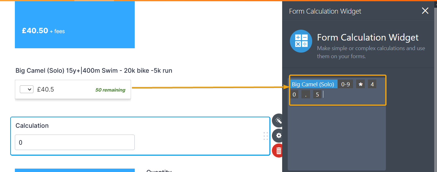
Also, I have three calculation fields (#id_61, #id_84, #id_85) for which I am setting the field width via CSS. However, it seems to only adjust the width of the field itself, not the width of the white box that actually shows the calculation value (see screenshot attached). What is the CSS code for changing the colour and width of the white area of each field please? Can I make the white field rectangular (i.e. not have the rounded edges)?
below those calculation fields, I have three pink paragraph fields. I am trying to get them into one row by adjusting the width of the paragraphs but these fields don't seem to take my CSS code. Any suggestions?

Michael
-
Mike_G JotForm SupportReplied on November 1, 2021 at 12:20 PM
Here are the codes you need to meet the requirements you have mentioned in your last response.
To hide this element

when your form is being viewed on smaller screens, please inject these custom CSS codes:
@media screen and (max-width: 480px) {

li#id_92 {

    display: none;

}

}
As for adjusting the width, the background color, and the border radius of the fields shown in your screenshot, please inject the custom CSS codes:
/***For the Event field***/

#label_61 + .form-input-wide {

    width: 100% !important;

}

#label_61 + .form-input-wide input {

    background: yellow;

    border-radius: 0px;

}


/***For the Entries field***/

#label_84 + .form-input-wide {

    width: 100% !important;

}

#label_84 + .form-input-wide input {

    background: lightgreen;

    border-radius: 0px;

}


/***For the Subtotal field***/

#label_85 + .form-input-wide {

    width: 100% !important;

}

#label_85 + .form-input-wide input {

    background: crimson;

    border-radius: 0px;

}
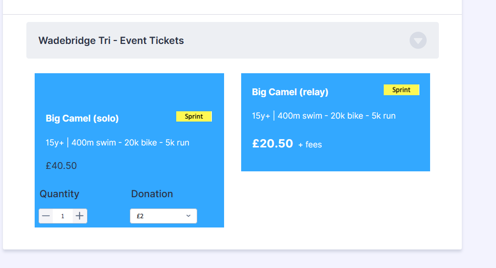
Here's the result:

Feel free to let us know if you need any further assistance.
- Templates
- Integrations
- INTEGRATIONS
- See 100+ integrations
- FEATURED INTEGRATIONS
 PayPal
- Slack
- Google Sheets
- Mailchimp
- Zoom
- Dropbox
- Google Calendar
- Hubspot
- Salesforce
- See more Integrations
- Products
- PRODUCTS
- Form Builder
- Jotform Enterprise
- Jotform Apps
- Store Builder
- Jotform Tables
- Jotform Inbox
- Jotform Mobile App
- Jotform Approvals
- Report Builder
- Smart PDF Forms
- PDF Editor
- Jotform Sign
- Jotform for Salesforce Discover Now
- Support