


-
ALEXANDER_FUNGAsked on November 17, 2021 at 11:45 AM
Hi team,
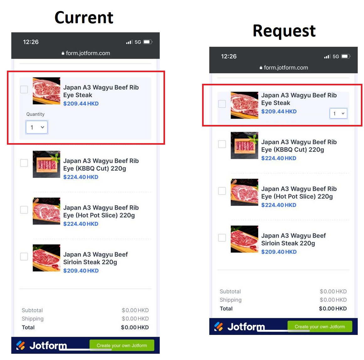
I need help resizing the form on the mobile view to be more compact.
I followed a previous post here which helped me a lot however I want to make some revisions to further improve its compactness.
Is it possible to do the following?
- Move the product title and pricing so it aligns at the top
- Remove the word "quantity" in the quantity selector
- Resize the quantity selector to become smaller
- Relocate the quantity selector to the bottom right
- Preferably all the information to be displayed at the same height as the product picture
- Current CSS from this post has disabled the ability to click and expand and view the product picture, is it possible to enable it?
 Page URL: https://form.jotform.com/213191615318048
 -
Parker JotForm SupportReplied on November 17, 2021 at 1:13 PM
Hello,
You can try adding in this.
@media screen and (max-width: 415px) {

    .form-sub-label {

        display: none !important;

    }

    .p_image {

        z-index: 1;

    }

    .form-product-container {

        padding: 0 !important;

    }

    .form-sub-label-container {

        float: right !important;

    }

}
You run into problems at certain resolutions if you move the dropdown up as it will cover up text on some devices so I'm not sure if you want to do that or not. The following instead of just float right will make it look correct on some screens but you'd need to take it off for smaller if you didn't want it overlapping.
    .form-sub-label-container {

        float: right !important;

        position: relative;

        top: -25px;

    }
- Templates
- Integrations
- INTEGRATIONS
- See 100+ integrations
- FEATURED INTEGRATIONS
 PayPal
- Slack
- Google Sheets
- Mailchimp
- Zoom
- Dropbox
- Google Calendar
- Hubspot
- Salesforce
- See more Integrations
- Products
- PRODUCTS
- Form Builder
- Jotform Enterprise
- Jotform Apps
- Store Builder
- Jotform Tables
- Jotform Inbox
- Jotform Mobile App
- Jotform Approvals
- Report Builder
- Smart PDF Forms
- PDF Editor
- Jotform Sign
- Jotform for Salesforce Discover Now
- Support
