


-
avokadobar.istAsked on November 25, 2021 at 9:21 PM
Hello
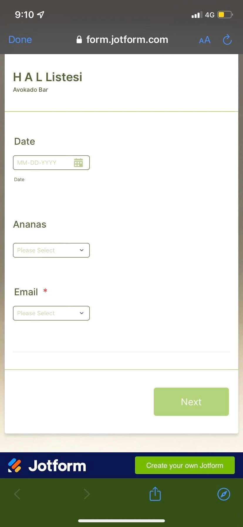
I have an issue regarding the width of my dropdown menus in the form on the iPhone... <the drop down menu and the label are not on the same line .
This is what i get.
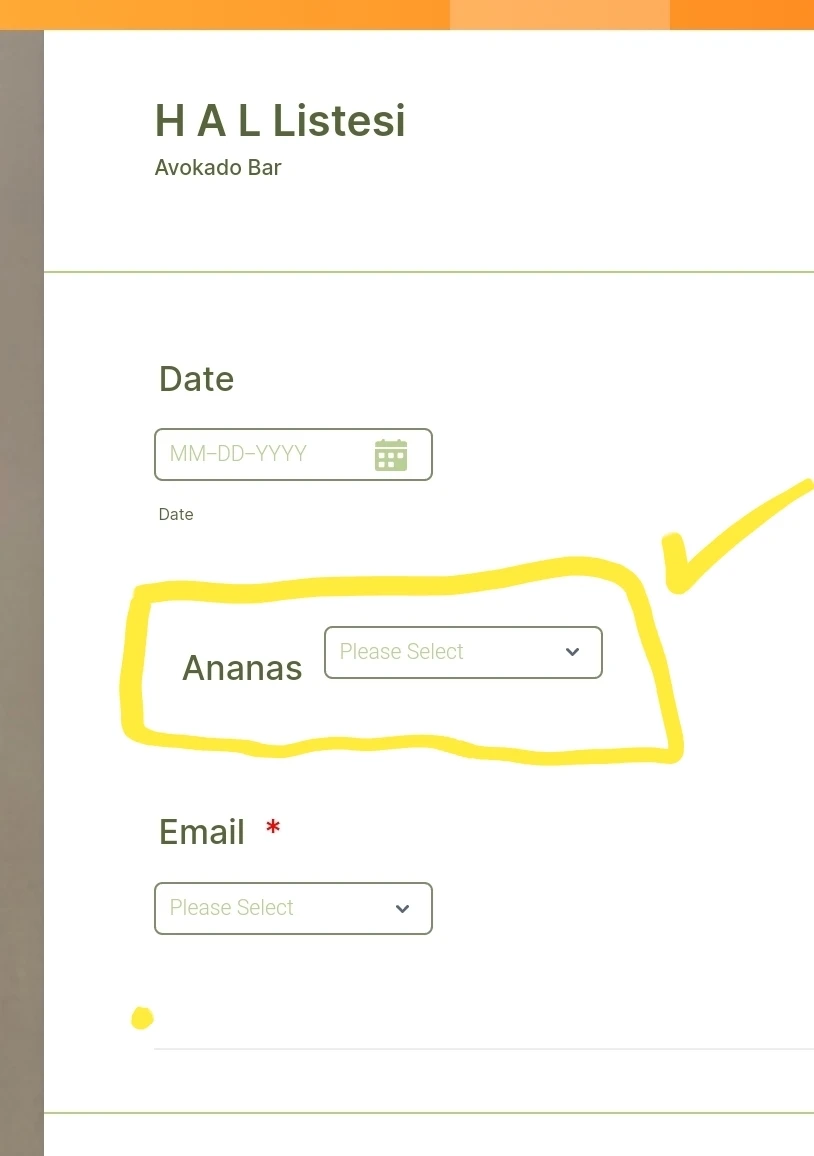
Bu i want this
Ive tried to add in the form designer in style part, in the inject custom css the next code but did not work at all. :(
@media only screen and (min-device-width: 320px) and (max-device-width: 736px) {
li[data-type="control_dropdown"] > div.form-input {
width: 50% !important;
}
}
Page URL: https://form.jotform.com/213277074069661 -
Lorenz JotForm SupportReplied on November 25, 2021 at 10:53 PM
Hi there,
Kindly please try this code below.
@media only screen and (min-device-width: 320px) and (max-device-width: 736px) {
.form-line{
display:flex !important;
}
.form-line .form-label{
width: 30%!important;
}
}
I hope this helps. Please let us know how it goes.
-
avokadobar.istReplied on November 28, 2021 at 9:49 PM
Hello
THANKSSS...it kinda does it. The one that i had with left alignment went to the top and all the others with Top alignment went to the left. So I did the opposite to reach my goal.
- Templates
- Integrations
- INTEGRATIONS
- See 100+ integrations
- FEATURED INTEGRATIONS
 PayPal
- Slack
- Google Sheets
- Mailchimp
- Zoom
- Dropbox
- Google Calendar
- Hubspot
- Salesforce
- See more Integrations
- Products
- PRODUCTS
- Form Builder
- Jotform Enterprise
- Jotform Apps
- Store Builder
- Jotform Tables
- Jotform Inbox
- Jotform Mobile App
- Jotform Approvals
- Report Builder
- Smart PDF Forms
- PDF Editor
- Jotform Sign
- Jotform for Salesforce Discover Now
- Support

