


-
waktupulangAsked on April 9, 2014 at 10:54 PM
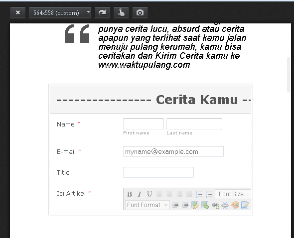
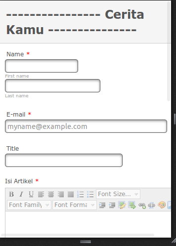
I want to use this jotform could open in mobile, my problem is like the capture below
-
jonathanReplied on April 10, 2014 at 4:03 AM
Hi,
Please review this thread also. It should provide guidance what CSS code to inject in your form so that it becomes mobile responsive.
You can start by using this CSS codes for base
@media only screen
and (min-device-width : 320px)
and (max-device-width : 480px) {
.form-all {
width: 320px !important;
}
.form-line {
padding-top: 0px !important;
padding-bottom: 0px !important;
padding-left: 3px !important;
}
Inject this CSS code in your form and then test the form in your mobile device.
Please inform us if you need further assistance.
Thanks
-
waktupulangReplied on April 10, 2014 at 5:48 AM
I've followed your instructions to change the css code, but still doesn't work in mobile displays
I please help me to solve this problem
Thanks,
-
TitusNReplied on April 10, 2014 at 10:18 AM
Hello,
The other fields look Ok from what I see -Or perhaps you want all the fields at equal length?
The text-area field has inline styling of a minimum width of 553px - which cannot be changed even with injected CSS forced on the field:
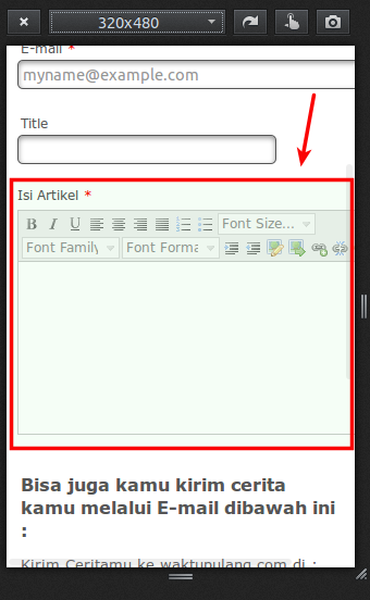
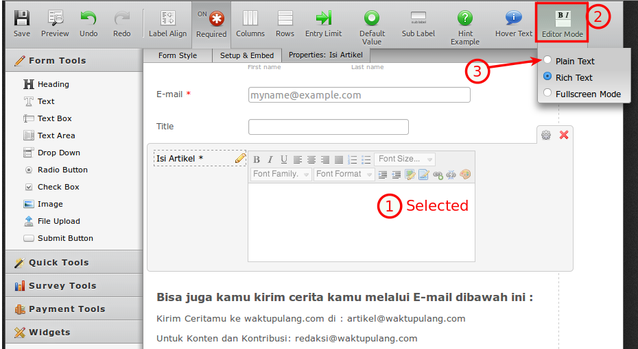
That is only true when rich text is enabled - if you would- disabling rich text and setting the field back to plain text would make the field respond to a smaller width:
Otherwise - you might have to work with 353px
Let us know.
- Templates
- Integrations
- INTEGRATIONS
- See 100+ integrations
- FEATURED INTEGRATIONS
 PayPal
- Slack
- Google Sheets
- Mailchimp
- Zoom
- Dropbox
- Google Calendar
- Hubspot
- Salesforce
- See more Integrations
- Products
- PRODUCTS
- Form Builder
- Jotform Enterprise
- Jotform Apps
- Store Builder
- Jotform Tables
- Jotform Inbox
- Jotform Mobile App
- Jotform Approvals
- Report Builder
- Smart PDF Forms
- PDF Editor
- Jotform Sign
- Jotform for Salesforce Discover Now
- Support
