


-
u2utechAsked on April 11, 2014 at 9:02 AM
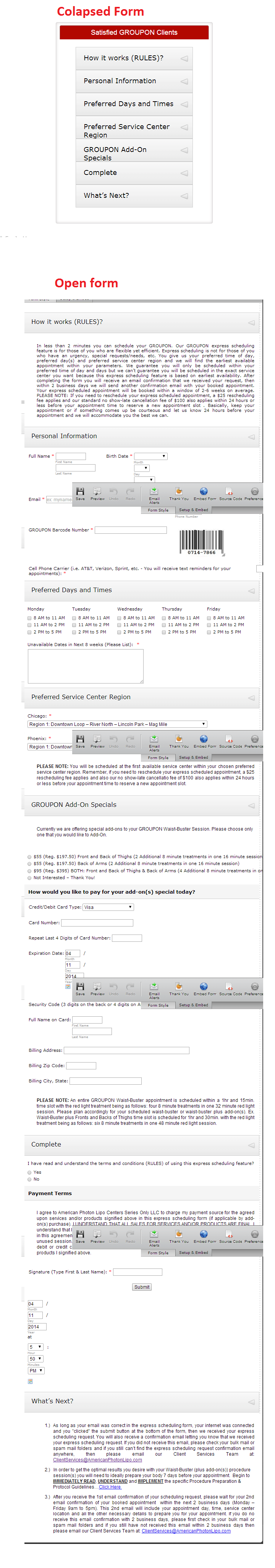
I have integrated the Jot Form to my site and want it be responsive for mobiles. Can you help please?
My website link is: http://americanphotonlipo.com/
Any help will be highly appreciated,
Warm Regards,
Tanweer
-
Welvin Support Team LeadReplied on April 11, 2014 at 10:29 AM
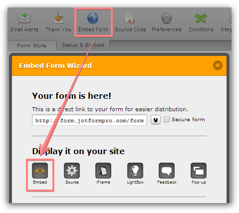
I assumed that you have the form responsive on mobile devices, per your screenshot. I tested it here and the only issue I found is that the collapse won't open if you click on it. Please try using our iFrame Codes instead: Getting-the-Form-iFrame-Code then get back to us for the results and so we can check further.
Thanks
-
u2utechReplied on April 13, 2014 at 10:13 AM
Hello Welvin,
Thanks for the guidelines, I have put iFrame-Code but the form is still not working. Please see the attached screenshot taken from iphone.
https://www.dropbox.com/s/tl9jg1q02759hct/a%20part%20of%20form%20on%20iphone.png
Your help is highly appreciated,
Tanweer
-
David JotForm Support ManagerReplied on April 13, 2014 at 1:20 PM
Hi, please replace and try injecting this CSS code in your form:
@media only screen
and (min-device-width : 320px)
and (max-device-width : 480px) {
.form-textarea,
.form-textbox,
.form-dropdown{
width: 100% !important;
-webkit-box-sizing: border-box;
-moz-box-sizing: border-box;
box-sizing: border-box;
}
.form-all {
width: 75%;
}
.form-line {
padding-top: 0px !important;
padding-bottom: 0px !important;
padding-left: 3px !important;
}
.form-label-left, .form-label-right{
width: auto;
}
.form-buttons-wrapper{
margin-left:0 !important;
}
.form-input {
width: 100%;
}
.form-sub-label-container {
width: 100%;
display:block;
}
Hope this helps you, let us know what happens, we will be glad to assist you.
-
u2utechReplied on April 14, 2014 at 6:26 AM
Hello BDavid,
Thanks for a quick response. I have inserted the css code in the form, and embeded iFrame as instructed. There is some issue in tabs, when I click on a tab to open it, form cuts off at bottom. I have attached a screenshot here:
https://www.dropbox.com/s/0ce0s8vw9akycyz/Jot%20form%20issue.png
Site URL is: http://americanphotonlipo.com/
Pleae review and help me as soon as possible.
Regards,
Tanweer
-
Ashwin JotForm SupportReplied on April 14, 2014 at 9:47 AM
Hello Tanweer,
It seems you have changed the Form collapse of your form. I did check your web page where you have embedded your form and found that the "GROUPON Add-On Specials" section is completely changed. Please check the screenshot below:
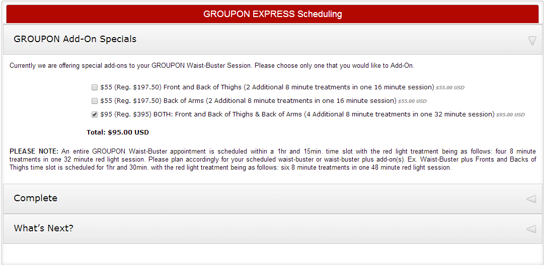
Is it the same form for which you have shared the screenshot? Upon checking your form in iPhone device, I found that the "GROUPON Add-On Specials" section seems to still getting cropped slightly from the bottom. I believe slightly increasing your iFrame height should solve your problem. I would sugest you to please use the following iFrame code in your web page and see if that helps you:
<iframe id="JotFormIFrame" onDISABLEDload="window.parent.scrollTo(0,0)" allowtransparency="true" src="//form.jotformpro.com/form/41026043361946" frameborder="0" style="width: 100%; height: 490px; border: none;" scrolling="no"></iframe>
Do get back to us if the issue persists.
Thank you!
-
u2utechReplied on April 14, 2014 at 1:19 PM
Hello Ashwin_d,
Thanks for a quick reply. Sorry the form is updated that's why you saw it changed than the screenshot previously sent. I put your iFrame with Height: 490px but it was still being cropped in android phone so I increased the height to 750px to adjust that. Another problem comes up when all the tabs are closed, it's showing unnecessary extra space under the form. Please screenshot attached here:
https://www.dropbox.com/s/blndke5k73wu9rp/Jot%20form%20issue_2.png
Your help in this regard will be highly appreciated,
Regards,
Tanweer
-
Mike_T Jotform SupportReplied on April 14, 2014 at 2:17 PM
Can you please try standard JS based form Embed code? It should auto-adjust the form height so it is worth trying.
Thank you.
-
u2utechReplied on April 14, 2014 at 3:03 PM
Hello,
I have tried "standard JS based form Embed code" and unnecessary form height issue is resolved but Now form is not working in mobiles, iphone, android, etc because tapping to open the tab isn't working. Please help me in this regard.
Thanks again,
Tanweer
-
Welvin Support Team LeadReplied on April 14, 2014 at 4:18 PM
Hi Tanweer,
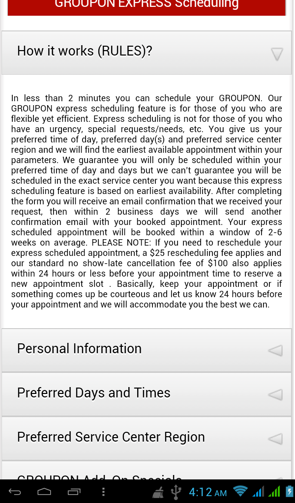
I have no problem viewing your form using an android device. See screenshot below:
But, kindly try re-embedding your form using the following codes with added jQuery no-conflict codes: http://pastiebin.com/534c4267c4830. Let us know for the results.
Thanks
-
u2utechReplied on April 15, 2014 at 8:30 AM
Hello Sir,
I have re-embedded form using code with jQuery you sent me but it's still not being tapped in mobile phones. Please check the issue. I kept tapping on form tabs but tabs aren't opening.
Regards,
Tanweer
-
jonathanReplied on April 15, 2014 at 10:00 AM
@Tanweer
I was able to see the problem with the current embed. I tested the form, and I could not even open the collapse fields anymore even on desktop browser.
May I suggest you remove the latest embedded code with jquery script, and re-embed instead the form again using the iframe code.
After re-embedding using iframe code, please test if form is functioning as it was before.
We will look for alternative solution to address the form responsiveness when in mobile browser.
Kindly inform us if there is a problem when embedding using the iframe code.
Thanks.
- Templates
- Integrations
- INTEGRATIONS
- See 100+ integrations
- FEATURED INTEGRATIONS
 PayPal
- Slack
- Google Sheets
- Mailchimp
- Zoom
- Dropbox
- Google Calendar
- Hubspot
- Salesforce
- See more Integrations
- Products
- PRODUCTS
- Form Builder
- Jotform Enterprise
- Jotform Apps
- Store Builder
- Jotform Tables
- Jotform Inbox
- Jotform Mobile App
- Jotform Approvals
- Report Builder
- Smart PDF Forms
- PDF Editor
- Jotform Sign
- Jotform for Salesforce Discover Now
- Support


