


-
impactodisenoAsked on May 14, 2014 at 6:38 PM
The website is made on XARA PRO 10 and the form is not working properly on mobile devices
-
impactodisenoReplied on May 14, 2014 at 8:22 PM
Anyone who can help me out?
-
bobReplied on May 15, 2014 at 1:02 AM
Injecting custom css can adjust the form with mobile device.
Form width is a big fact as it should be adjust with mobile screen. Know the importance of form width in the given link below.
http://www.jotform.com/help/35-The-Importance-of-Form-Widths
Could you please give us the URL of the form which you need to display in mobile device.
Thank You
-
impactodisenoReplied on May 15, 2014 at 9:09 AM
Sure, i have the same problem in two websites: www.disenoimpacto.com/contacto and http://www.tracergps.com/landingpage ..
Thank you
-
Jeanette JotForm SupportReplied on May 15, 2014 at 12:34 PM
First of all, we do recommend to use the iFrame code
We also do recommend to add this code in your HTML page, before the </head> tag.
<style>
iframe, iframe#JotFormIFrame { height:500px !important; }
</style>
<meta name="viewport" content="width=device-width, initial-scale=1.0, maximum-scale=1.0, user-scalable=0" />
Then add this code in your form styles (use this guide)/* Smartphones (portrait and landscape) ----------- */
@media only screenand (max-device-width: 320px)
and (max-device-width : 100%) {
iframe, .form-all {
width: 100%!important;
height:500px !important; } }
-
impactodisenoReplied on May 15, 2014 at 12:48 PM
Didn't work! now its even worst because i cant see it on any computer!
-
Mike_T Jotform SupportReplied on May 15, 2014 at 3:59 PM
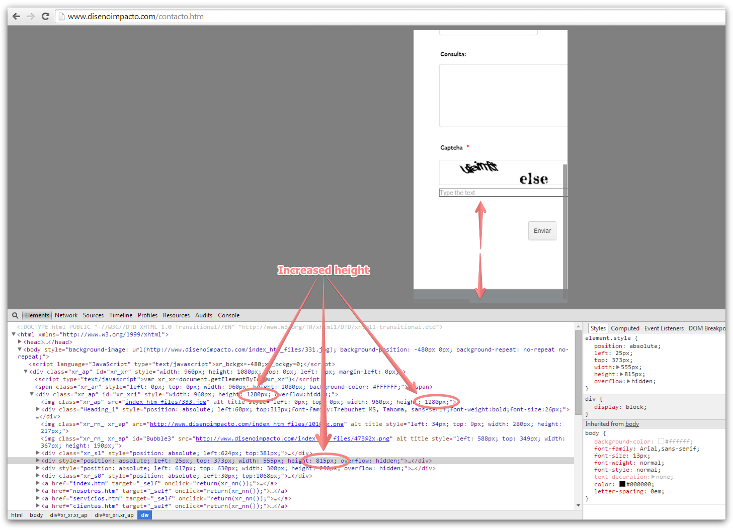
The issue seems to be related to the layout of your page. The page height is not long enough to fit the full form, so that the Submit button is not visible on the mobile devices.
Can you try to increase the height of the page? You have several divs, so it is probably that you will need to increase it in different places.
Thank you.
-
impactodisenoReplied on May 15, 2014 at 6:17 PM
I dont understand. Remember that im using Xara Designer. For computers, it displays great. The problem is the form isnt auto-adjusting right in mobile devices
-
CesarReplied on May 16, 2014 at 12:08 AM
I do see that you are still using the script embed code. We do recommend to use the iFrame code to facilitate the form rendered on a mobile device. It appears that the problem appears to be on the height value of the div where the form is on.
If the code is not viewable through the application you are building this site on. You may need to open your webpage's source code on a text editor and modify the div's height value through there.
Thank you.
-
impactodisenoReplied on May 16, 2014 at 9:46 AM
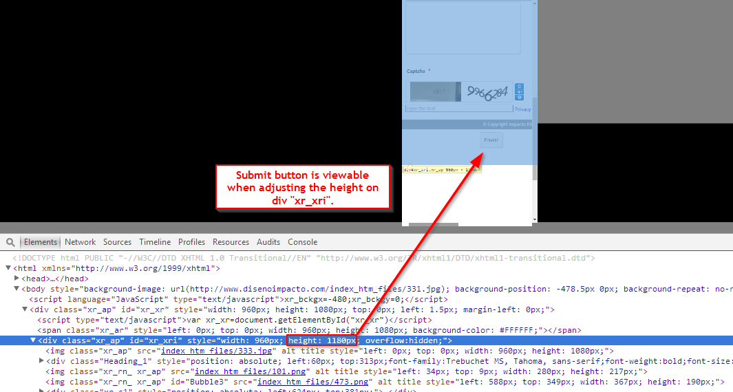
When using the iframe, i cant even see the send button from the computer. I always use the xara's embed code for JotForm. I algo tried placing custom height values as you told me, but it makes no diference
-
TitusNReplied on May 16, 2014 at 1:46 PM
Hello,
I think we need to break down the issue so that we can move forward towards a solution that works well for you.
Let's approach the solution from two perspectives:
1. Making the form responsive:
- Please shring all the fields on the form as shown:
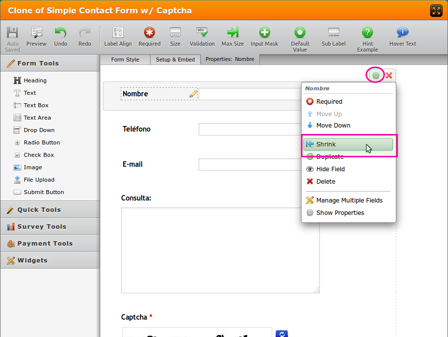
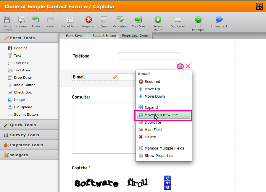
If any of the fields end up on the same horizontal line due to the shrinking, just move them to the next:
After doing this - most of your fields should resize when the width shrinks. Please view this test form on your mobile device and see what I mean: http://form.jotformpro.com/form/41355410952955 - the captcha field is a little wide, but that can be deat with later.
2. Put the newly updated form on your website:
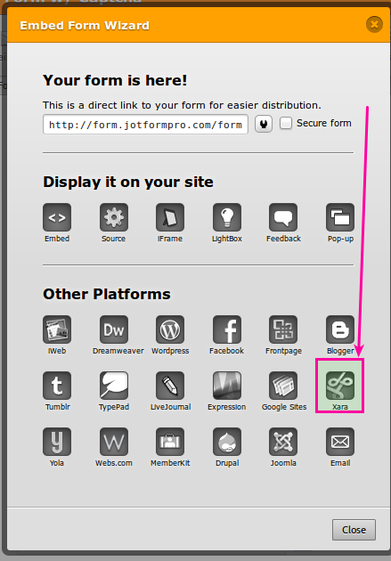
- Begin with the Xara code:
After you have done this - there might be some issues still - and thats OK - we can deal with each at a time so that we can fix the issue conclusively.
If this method presents additional issues, please respond with the following:
1. The URL where the updated form has been placed
2. The mobile device you tested with so that we can also see what you see
Then, we will address each display issue one at a time.
Unfortunately - with a blend of different solutions working together (Jotform & Xara Code), there are always some teething issues - never a one-fix-all approach - but all can be addressed and fixed.
Looking forward to your response.
-
impactodisenoReplied on May 17, 2014 at 2:44 PM
Hi, sorry i took too much time. It seems to be working fine, i tested it from my Samsung S2. Check it out and tell me what u think: www.disenoimpacto.com
I had to expand the jotform ifram in the xara program, since it wasnt display the "send" button.
- Templates
- Integrations
- INTEGRATIONS
- See 100+ integrations
- FEATURED INTEGRATIONS
 PayPal
- Slack
- Google Sheets
- Mailchimp
- Zoom
- Dropbox
- Google Calendar
- Hubspot
- Salesforce
- See more Integrations
- Products
- PRODUCTS
- Form Builder
- Jotform Enterprise
- Jotform Apps
- Store Builder
- Jotform Tables
- Jotform Inbox
- Jotform Mobile App
- Jotform Approvals
- Report Builder
- Smart PDF Forms
- PDF Editor
- Jotform Sign
- Jotform for Salesforce Discover Now
- Support


