


-
kmonastyrskyAsked on May 21, 2014 at 1:51 PM
Hi, please kindly point me out to the article / info / tools that describes the design/implementation of the responsive (i.e. desktop/tablet/mobile) forms.
Thank you,
Konstantin Monastyrsky
-
Mike_T Jotform SupportReplied on May 21, 2014 at 3:36 PM
I would like to inform you that our forms are mobile friendly by default, and usually look good on different devices. However, there are many factors (i.e., website layout, form layout, used form fields and widgets) that might affect the form appearance, so each case is different.
We can do custom CSS injections including @media injections for different screen size devices in order to affect the mobile styling and fix related issues.
If you are facing any issues with your forms on mobile devices, let us know. We will try to check it out and help you.
-
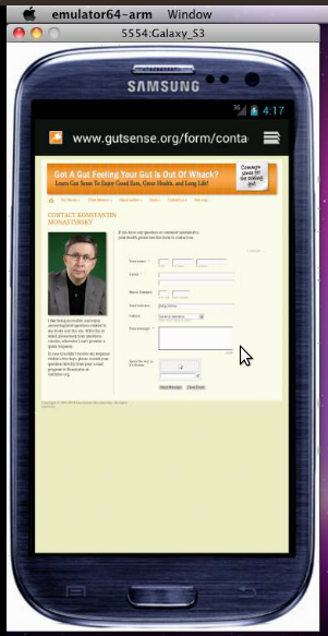
kmonastyrskyReplied on May 21, 2014 at 3:51 PMHi Mike,
Thank you so much for your support. Please kindly take a look at this link
from your iPhone or Android:
http://qtadigital.com/projects/Gutsense/form/contact.html (this is our
development server with responsive design).
The form doesn't display the validation code field and the Submit button.
Thank you again,
Konstantin Monastyrsky
... -
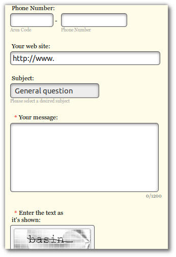
Jeanette JotForm SupportReplied on May 21, 2014 at 4:30 PM
You are right, I just inspected the form in iphone emulator, and I can see the problem:
To fix the problem, I would recommend you to embed the iFrame code and set the Scrolling property to "yes" rather than "no"
Otherwise, if you do not wish to show scroll bars, then please try adding this code in your HTML page, before the </head> tag of your page.
<style>
iframe, iframe#JotFormIFrame { height:550px !important; }
</style>
<meta name="viewport" content="width=device-width, initial-scale=1.0, maximum-scale=1.0, user-scalable=0" />
Then add the code below in your form (use this guide)
@media only screen and (max-device-width: 480px) {
iframe,.form-all { height:550px !important; } }You can adjust the height accordingly until you see all the fields in the form. Let us know if the issue persist.
-
kmonastyrskyReplied on May 21, 2014 at 9:11 PMHi Jeanette,
Thank you for your help. Unfortunately, you've been running a wrong link in
the emulator. Please run this one:
http://qtadigital.com/projects/Gutsense/form/contact.htm
We have a problem with vertical display, not horizontal. Please suggest
what to do in this case.
Thank you,
Konstantin
... -
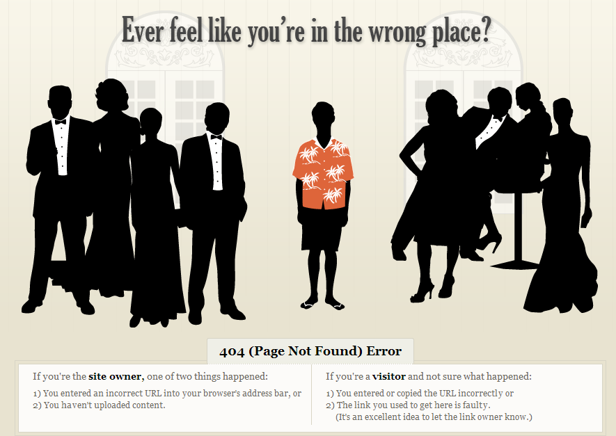
CesarReplied on May 21, 2014 at 11:55 PM
Please verify the updated link provided above, as it prompts a 404 error. We will await your response.
Thank you.
Screenshot:
-
kmonastyrskyReplied on May 22, 2014 at 12:21 AMIt is resolving on my end. Please kindly try once more:
http://qtadigital.com/projects/Gutsense/form/contact.html
... -
TitusNReplied on May 22, 2014 at 5:43 AM
Hello,
We need to make the form responsive first before you place it on your website.
Do the following:
1. Add CSS to your form to make the fields that are overflowing to respond to the browser width:
CSS:
/*Makes the fields to mainain a 95% width at all times*/
#input_16,
#input_16_confirm,
#input_6 {
width: 95%!important
}Use this guide to add the CSS above to your form
2. Get the Iframe code from your form and re-embed it on your website
Let us know when you do this - and we shall advice what else needs adjusting.
Open this copy of your form on your mobile device/emulator - how does it look?
Looking forward to your response.
- Templates
- Integrations
- INTEGRATIONS
- See 100+ integrations
- FEATURED INTEGRATIONS
 PayPal
- Slack
- Google Sheets
- Mailchimp
- Zoom
- Dropbox
- Google Calendar
- Hubspot
- Salesforce
- See more Integrations
- Products
- PRODUCTS
- Form Builder
- Jotform Enterprise
- Jotform Apps
- Store Builder
- Jotform Tables
- Jotform Inbox
- Jotform Mobile App
- Jotform Approvals
- Report Builder
- Smart PDF Forms
- PDF Editor
- Jotform Sign
- Jotform for Salesforce Discover Now
- Support


