


-
markashtonAsked on June 12, 2014 at 11:39 AM
Hi,
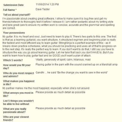
The check input widget is a great idea. So, I tried it on a form I'm developing for a client. The form uses the edit link function so a user can come back and edit stuff .. add a photo or two ... then come back again later.
To check one's ongoing input ... there is a lot of value ...
But if one has a lot of info in a text area function then it looks a bit of a mess as the alignment of the text changes
-
CarinaReplied on June 12, 2014 at 1:18 PM
Thank you for your input on this widget. I forwarded this suggestion to our 2nd level team so they can take your suggestion into consideration.
They will contact you via this thread if they have an update on this.
Please let us know if further support is needed.
Thank you.
-
markashtonReplied on June 13, 2014 at 9:20 AM
Nicholas,
Sound good ... but is the Check Input widget missing ... I can't find it with a Search ??
Is it me?
Thanks Mark
-
markashtonReplied on June 13, 2014 at 9:35 AM
Hi Nicholas,
I have added the widget ... great.
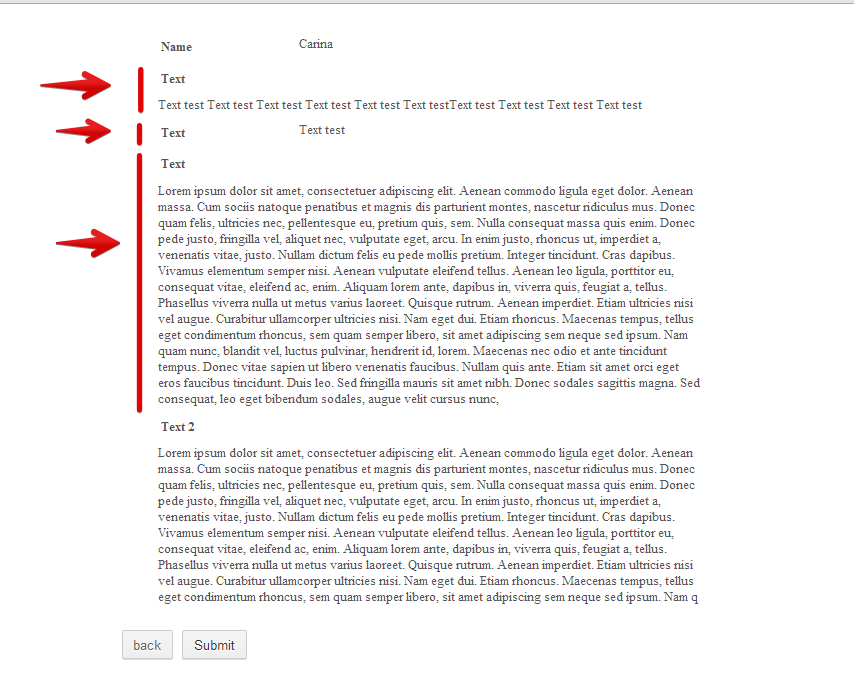
I see no change whatsoever from my original post ... the text still aligns as I first advised.
For the purposes of reviewing input ... I think that their needs to be clear separation of question from answer ... that one can see at a glance.
This top-alignment thing with the question on top of the answer makes it difficult to "see the wood from the trees".
I think questions need to be on left and answers on the right hand side.
Make sense?
Thanks Mark
-
markashtonReplied on June 13, 2014 at 10:07 AM
Well ... you can see that there is going to be an overflow because there is a paragraph of text.
What I'm saying is that, for this tool to be useful, we need clear demarcation between headings and content.
Otherwise, one might as well just look at the form they are filling in most of the time.
So, my point is that on LHS have titles of fields and on RHS have content ... so that one can flick through with one's eyes and evaluate 'at-a-glance'.
The tool is not user-friendly in its display at the moment.
Thanks Mark
- Templates
- Integrations
- INTEGRATIONS
- See 100+ integrations
- FEATURED INTEGRATIONS
 PayPal
- Slack
- Google Sheets
- Mailchimp
- Zoom
- Dropbox
- Google Calendar
- Hubspot
- Salesforce
- See more Integrations
- Products
- PRODUCTS
- Form Builder
- Jotform Enterprise
- Jotform Apps
- Store Builder
- Jotform Tables
- Jotform Inbox
- Jotform Mobile App
- Jotform Approvals
- Report Builder
- Smart PDF Forms
- PDF Editor
- Jotform Sign
- Jotform for Salesforce Discover Now
- Support

