


-
hlaclairAsked on June 18, 2014 at 11:28 AM
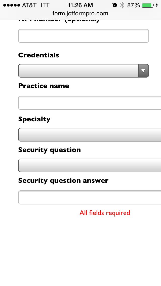
I've injected CSS into the form to get the look I want, but I'm noticing that my page break CSS must be messing up when trying to display on mobile platforms. Can you help? I can't see the buttons at all on iPhone and only see a portion of it on Android.
-
Jeanette JotForm SupportReplied on June 18, 2014 at 1:55 PM
Our forms are mobile friendly. We do recommend to use the iFrame version of the form
We also do recommend to add this code in your HTML page, before the </head> tag.
<style>
iframe, iframe#JotFormIFrame { height:500px !important; }
</style>
<meta name="viewport" content="width=device-width, initial-scale=1.0, maximum-scale=1.0, user-scalable=0" />
But if you are using the direct link then add this code in your form styles (use this guide)/* Smartphones (portrait and landscape) ----------- */
@media only screenand (max-device-width: 320px)
and (max-device-width : 100%) {
iframe, .form-all {
width: 100%!important;
height:500px !important; } }
In general, this code should fix the problem, but you can adjust the height accordingly until you get the desired effect.
-
hlaclairReplied on June 18, 2014 at 3:25 PM
I tried using the code that you indicated for the direct link and nothing changed. I don't have access to the </head> tag so I can't use that. Any other suggestions?
-
jonathanReplied on June 18, 2014 at 5:14 PM
@ hlaclair
Hi,
Are you still referring to this form http://www.jotformpro.com/form/41053533085953 ?
I checked the form's injected CSS code, but I could not see the suggested code by Jeanette in your form. This was the only CSS code I see on the form http://pastie.org/9303411
Please make the adjustment and add the suggested CSS code. Then check again if it makes the difference.
Please inform us if you need more assistance.
Thanks!
-
jonathanReplied on June 18, 2014 at 5:26 PM
@ hlaclair
You migh also want to use the Mobile Responsive widget on your form. As it makes it easier to make the form responsive when viewed in mobile browsers.
Thanks.
- Templates
- Integrations
- INTEGRATIONS
- See 100+ integrations
- FEATURED INTEGRATIONS
 PayPal
- Slack
- Google Sheets
- Mailchimp
- Zoom
- Dropbox
- Google Calendar
- Hubspot
- Salesforce
- See more Integrations
- Products
- PRODUCTS
- Form Builder
- Jotform Enterprise
- Jotform Apps
- Store Builder
- Jotform Tables
- Jotform Inbox
- Jotform Mobile App
- Jotform Approvals
- Report Builder
- Smart PDF Forms
- PDF Editor
- Jotform Sign
- Jotform for Salesforce Discover Now
- Support


