


-
ahpdelawareAsked on June 20, 2014 at 7:25 PM
Hello,
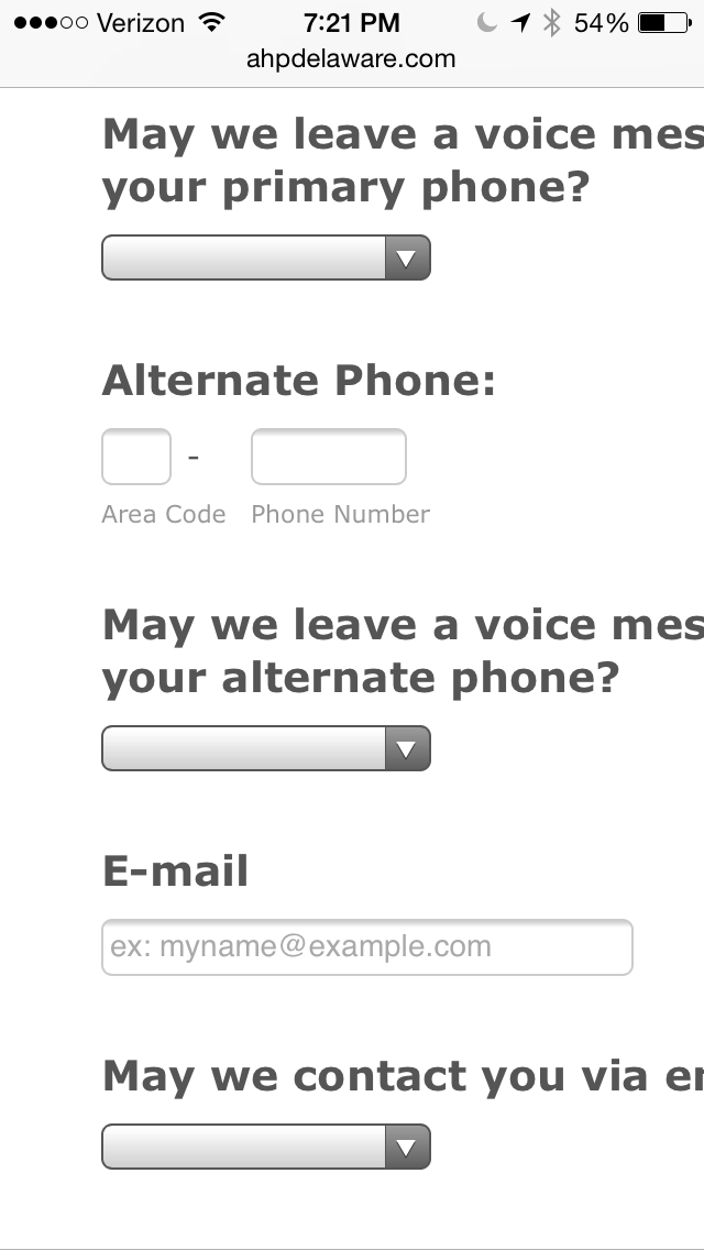
I'm having trouble with one of the 3 JotForms I'm using on my responsive website. 2 of the 3 forms work perfectly on smartphones (gracefully degrading when the smartphone is rotated from landscape to portrait mode, with all labels and form elements completely visible). But one of the 3 forms looks awful on smartphones in portrait orientation, but perfectly fine on smartphones in landscape orientation. Any suggestions on how I can make this form: https://ahpdelaware.com/contact-us/new-client-appointment-request/, look like these 2 forms: https://ahpdelaware.com/contact-us/ and https://ahpdelaware.com/contact-us/, on smartphones?
Thanks in advance for your help!
-
Welvin Support Team LeadReplied on June 21, 2014 at 4:42 AM
Hi,
Please try to add our Mobile Responsive Widget to your form: http://widgets.jotform.com/widget/mobile_responsive. This widget should make your form mobile responsive.
If you see any issues, please get back to us.
Thanks
-
Welvin Support Team LeadReplied on June 21, 2014 at 4:42 AM
By the way, you can add the widget to your form by following this guide: http://www.jotform.com/help/252-How-to-Add-a-Widget-to-your-Form
Thanks
- Templates
- Integrations
- INTEGRATIONS
- See 100+ integrations
- FEATURED INTEGRATIONS
 PayPal
- Slack
- Google Sheets
- Mailchimp
- Zoom
- Dropbox
- Google Calendar
- Hubspot
- Salesforce
- See more Integrations
- Products
- PRODUCTS
- Form Builder
- Jotform Enterprise
- Jotform Apps
- Store Builder
- Jotform Tables
- Jotform Inbox
- Jotform Mobile App
- Jotform Approvals
- Report Builder
- Smart PDF Forms
- PDF Editor
- Jotform Sign
- Jotform for Salesforce Discover Now
- Support
