


-
allthebatterAsked on June 21, 2014 at 6:18 AM
-
Elton Support Team LeadReplied on June 21, 2014 at 9:04 PM
Hi,
Note that the form when viewed on mobile has longer length than when viewed on desktop browsers. It appears that your footer does not seem to be dynamic. It does not automatically adjust according to the content embedded on the page that's why the form was covered up by your footer so it appears to be cut off. However, you can actually scroll down until you see the bottom part of your form.
This is how it appears on iOS Simulator.
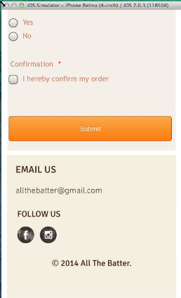
If there's no settings on your page where you can bring the footer a little bit lower until it displays the entire form then I think there's no other solution other than shrinking your form length by injecting the following CSS codes to your form. Guide: How-to-Inject-Custom-CSS-Codes. This might help prevent cut off.
@media only screen and (max-width: 40em){
.form-line, .form-line.form-line-column{
padding: 0 2px !important;
}
}Regards!
-
allthebatterReplied on June 24, 2014 at 3:17 AM
Hi
The CSS seems to work, but the content of my form looks squashed together on mobile. Is there anyway to avoid that?
Thanks!
-
Welvin Support Team LeadReplied on June 24, 2014 at 5:12 AM
I have checked the form using a mobile emulator and using an actual android device, but the form seems looking good. Anyway you could send us a screenshot of the current look using your device? This way, we'll have the idea on what to adjust.
Thanks
-
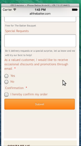
allthebatterReplied on June 24, 2014 at 5:39 AM
Hi,
Attached is the screenshot of the problem!
.jpg)
Thanks!
-
jonathanReplied on June 24, 2014 at 8:09 AM
Hi,
I checked the embedded form http://form.jotform.me/form/40995033432453 in your website http://www.allthebatter.com/#!order/c1uuh
but I noted that the form do NOT have any injected CSS code on it for mobile responsiveness.
And I think what you wanted to use instead is this form http://www.jotform.me/form/41684698330463 as it was the one that have the injected CSS code.
Can you please try replacing the embedded form with the other form, see if it will work.
Hope this help. Inform us if you need further assistance.
Thanks!
-
allthebatterReplied on June 25, 2014 at 9:17 AM
I have added in the CSS codes to the current form already. The content appears to be very clustered together. Also, the form on an iphone5 experiences the same problem of being cut off despite the CSS code.
Thanks!
-
Jeanette JotForm SupportReplied on June 25, 2014 at 1:48 PM
I've tested the form on iPhone5 and iPhone5S
The problem doesn't happen when the form is viewed in the standalone version on browserstack mobile emulator.
But if the problem persist in your iPhone model, then I would recommend to modify your injected CSS code to this one (and increase the hight as needed)
@media only screen and (min-device-width : 310px) and (max-device-width : 100%)
{iframe,.form-all { height:480px !important; } }
{ .form-all { width: 310px !important; } .form-line { padding-left: 5px !important; } .form-textarea { width: 290px !important; } .form-dropdown { width: 280px !important; } #subHeader_56.form-subHeader { text-align: center !important; } } -
allthebatterReplied on June 26, 2014 at 5:45 AM
Hi,
On the Wix emulator for mobile site, it has always been looking fine. However, the problem of the missing "Submit" button as shown in the submitted screenshot above is still uncorrected even after following the suggestions given.
Also, we have realised that once the required fills are not keyed in, the "This field is required" prompt will appear. And when this happens, it pushes the whole form length such that even more sections at the bottom cannot be seen as it is covered by the footer.
Thank you for your help!
-
edwardbutterworth37Replied on June 26, 2014 at 5:58 AM
-
jonathanReplied on June 26, 2014 at 8:52 AM
@ allthebatter
Hi,
Can you please add also this CSS codes into your form
.form-validation-error {
border-color: red !important;
}
.form-line-error .form-error-message {
display: none;
}
what it does is, removed the "required field" text that pushes that fields down making the form become longer.
Please try this. Inform us if it does not make any difference.
Thanks.
-
allthebatterReplied on July 3, 2014 at 11:51 AM
Hi,
Once the fills are all keyed in on the mobile site, the form elongates and the submit button will be pushed down underneath the footer. This problem is seen in all the IPhone5 that we have tried. We have contacted Wix to help make the footer adjustable accordingly to Jotform's length but they do not deal with the HTML embedded.
Could you help with this persistent problem with our mobile order form asap?
Thank you!
-
Welvin Support Team LeadReplied on July 3, 2014 at 12:39 PM
Well, your Wix template footer is fixed. The form is responsive as you could see, but the footer doesn't respond when the form is filled.
The only solution would be to set your iFrame scrolling attribute to "YES". So, get the codes here with that setting: http://pastiebin.com/53b586bcb1064
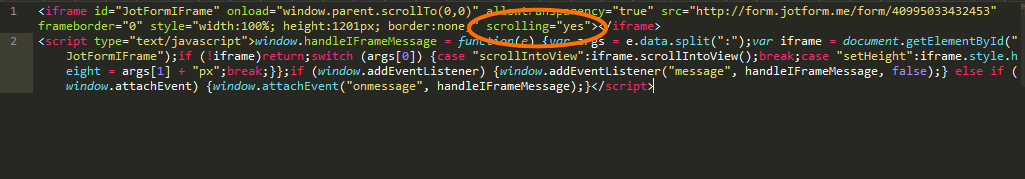
Once the form is filled, you can scroll to the bottom to see the submit button.
Thanks
-
allthebatterReplied on July 3, 2014 at 1:17 PM
Hi,
Do I paste the whole code into the Custom CSS code section?
Thank you!
-
Elton Support Team LeadReplied on July 3, 2014 at 1:55 PM
@allthebatter
I have made a little adjustment on the CSS codes injected to your form. I added CSS that removes the form top padding and reduces the textarea height when the form is viewed on mobile. This might help prevent cut off. Kindly review. This might help.
What my colleague also means is that, you have to change the scrolling attribute to yes on your iframe embed code. You can find it when you check the iframe embed code you pasted on your Wix site.
Thanks!
- Templates
- Integrations
- INTEGRATIONS
- See 100+ integrations
- FEATURED INTEGRATIONS
 PayPal
- Slack
- Google Sheets
- Mailchimp
- Zoom
- Dropbox
- Google Calendar
- Hubspot
- Salesforce
- See more Integrations
- Products
- PRODUCTS
- Form Builder
- Jotform Enterprise
- Jotform Apps
- Store Builder
- Jotform Tables
- Jotform Inbox
- Jotform Mobile App
- Jotform Approvals
- Report Builder
- Smart PDF Forms
- PDF Editor
- Jotform Sign
- Jotform for Salesforce Discover Now
- Support


