


-
UEPWebAsked on July 16, 2014 at 5:50 PM
Our forms are embedded on our site using SharePoint web parts. The pages are adaptive to mobile platforms, but the our JotForm embedded forms are not, and blow out the margins of our pages.
Can I use adaptive widths or percentages in our form templates, or is there another solution that we can use?
Thank you!
-
Jeanette JotForm SupportReplied on July 16, 2014 at 11:54 PM
We currently have a Mobile Responsibe widget that you can use for that purpose.
Please give that a try and let us know should you have more questions about this.
-
UEPWebReplied on July 17, 2014 at 9:32 AM
Hi, Thank you for your quick reply! I tried adding the widget to the top of the form, however there was no change in mobile display. Is there something that I need to change in the form itself for this widget to work?
Thanks!
-
KadeJMReplied on July 17, 2014 at 12:22 PM
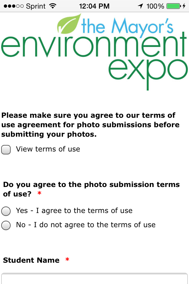
I found the problem. It is happening because of the CSS Margin Offset you are using for your form's Injected CSS Code. So because of that it is throwing off the whole form so that it looks cut off. Please see this comparison of Screenshots to show you.
Your Website with Form:
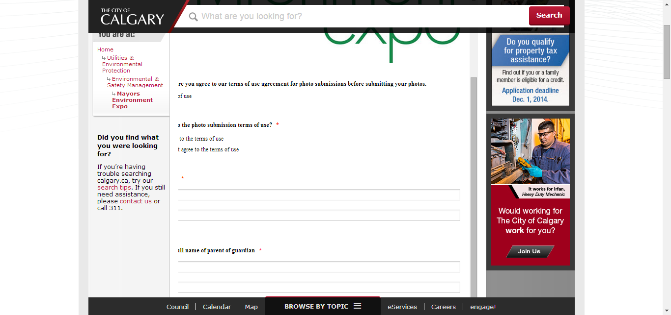
Your Mobile Form w/ CSS Margin Offset on Your Website:

Your Direct Form Link on Mobile w/ CSS:
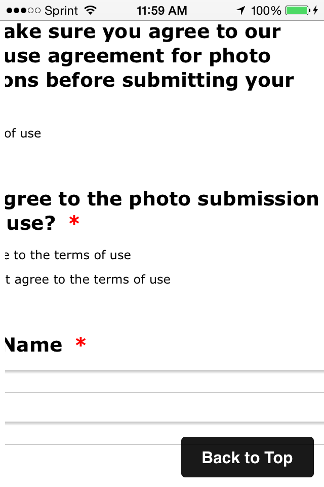
Your Direct Form Link on Mobile w/ NO CSS:
- Notice now that the CSS has been removed it shows up fine on Mobile and it's not cut off.
- Templates
- Integrations
- INTEGRATIONS
- See 100+ integrations
- FEATURED INTEGRATIONS
 PayPal
- Slack
- Google Sheets
- Mailchimp
- Zoom
- Dropbox
- Google Calendar
- Hubspot
- Salesforce
- See more Integrations
- Products
- PRODUCTS
- Form Builder
- Jotform Enterprise
- Jotform Apps
- Store Builder
- Jotform Tables
- Jotform Inbox
- Jotform Mobile App
- Jotform Approvals
- Report Builder
- Smart PDF Forms
- PDF Editor
- Jotform Sign
- Jotform for Salesforce Discover Now
- Support


