


-
ahpdelawareAsked on July 17, 2014 at 3:10 PM
Hello,
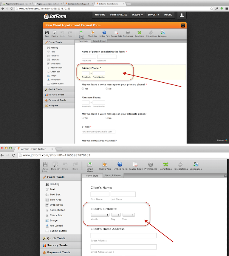
I'd like to start by saying that JotForm is a great, easy-to-use tool and I'm quite happy with it! I'm experiencing display issues on my site, with one of our JotForms (pls see page: https://ahpdelaware.com/contact-us/new-client-appointment-request/). I first created the form, then applied the Mobile Responsive Widget to improve the form's appearance on mobile devices. Most of the form's elements looked better on mobile devices after adding the Mobile Responsive Widget, unfortunately 2 fields were abnormally stretched on all devices, after adding the Mobile Responsive Widget - namely the Primary Phone and Client’s Birthdate fields (pls see the above URL - the attached image shows the normal appearance of these fields in JotForm). I’d appreciate any advice on correcting this. The fields appear abnormally stretched on all devices: computers, tablets, and smartphones. Thank you in advance for your help.
-
David JotForm SupportReplied on July 17, 2014 at 4:23 PM
Hi,
Try adding this to your custom css:
http://www.jotform.com/help/117-How-to-Inject-Custom-CSS-Codes
.form-textbox{
width: 100px !important;
}
This should overwrite any other width properties being added to your fields and force them to whatever width you choose. Just change the "100px" to your desire. Let us know if this doesn't help and we will be happy to look into your issue further.
Thank you for using Jotform!
-
ahpdelawareReplied on July 17, 2014 at 6:10 PM
Thank you for the quick response, David. I injected the custom CSS you provided, but saw no change in the formatting of the primary phone or client birthdate fields (both still have the stretched appearance I mentioned earlier). Thoughts?
-Wilson
-
Elton Support Team LeadReplied on July 17, 2014 at 10:03 PM
Hi Wilson,
The form embedded on your page renders the mobile layout because the form width was embedded on a small container which triggers the media query CSS for mobile.
If you want to retain the phone and birth date picker field default layout, you can inject the following CSS codes to your form.
@media only screen and (max-width:40em){
input#input_9_area {
width: 60px !important;
}
input#input_9_phone {
width: 100px !important;
}
#cid_9 .form-sub-label-container, #id_7 .form-sub-label-container {
width: auto;
display: inline-block;
}
#id_7 .form-dropdown {
width: auto !important;
}
}
If you need further assistance, let us know. Regards!
-
ahpdelawareReplied on July 22, 2014 at 3:17 PM
EltonCris,
THANK YOU!!! That CSS worked perfectly! The fields no look correct on both computers and mobile devices.
-Wilson
-
David JotForm SupportReplied on July 22, 2014 at 3:21 PM
Hi,
On behalf of my colleague you are very welcome. Please let us know if there is anything else we can help you with and we will be happy to do so.
Thank you for using Jotform!
- Templates
- Integrations
- INTEGRATIONS
- See 100+ integrations
- FEATURED INTEGRATIONS
 PayPal
- Slack
- Google Sheets
- Mailchimp
- Zoom
- Dropbox
- Google Calendar
- Hubspot
- Salesforce
- See more Integrations
- Products
- PRODUCTS
- Form Builder
- Jotform Enterprise
- Jotform Apps
- Store Builder
- Jotform Tables
- Jotform Inbox
- Jotform Mobile App
- Jotform Approvals
- Report Builder
- Smart PDF Forms
- PDF Editor
- Jotform Sign
- Jotform for Salesforce Discover Now
- Support

