


-
RDTSAsked on August 15, 2014 at 4:19 PM
We have a form that is meant to be used on mobile devices and it is composed of 9 sections with Configurable List Widget. Unfortunately, the few last columns of the list are not appearing on mobile devices (Iphone or Galaxy Note3). Could you help us fix that bug? Is there a way to include an horizontal scroll bar? Is there any other formatting that could solve the issue?
Thank you!
-
Steve VP of Sales OperationsReplied on August 15, 2014 at 7:16 PM
Hello,
We're sorry to hear about the difficulty with the configurable list wizard issue. The configurable list widget allows you to edit the CSS so you can modify its layout as you like:
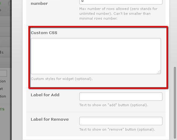
This is a long form- can you let us know exactly what sections are causing the issue? As for horizontal scrolling, when I tested it I was able to slide to the right to see the rest of one of the configurable lists.
In any case, what can be done is identify the configurable lists that are too wide, and modify their CSS per the wizard CSS settings.
Regards
-
RDTSReplied on August 18, 2014 at 9:32 AM
Good morning,
I have 9 confirgurable list widgets on Page 3 of my form that are all identical... they are all not appearing properly on mobile devices.
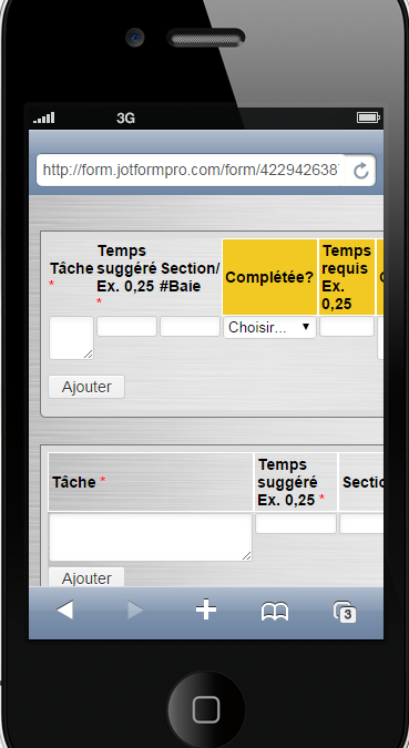
Here's what you can see on a desktop, which is perfect (6 columns):

Here's an iPhone view of the same widget where you can barely see the 3rd column:

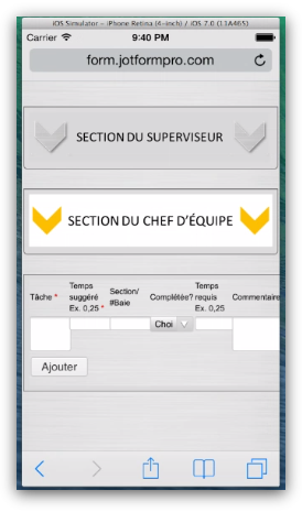
And here's a Samsung Galaxy Note3 view with the same issue:

Any clue how to fix this? We need to keep all 6 columns for this list and the result on desktop is exactly how we like it!
Thanks.
-
jedcadornaReplied on August 18, 2014 at 11:30 AM
Hello,
We'll have to make some test with custom CSS if that works as when I tried to inject some codes it only accepts some that has been used when the widget were created.
We'll see what we can do and updated this thread about the result.
-
jedcadornaReplied on August 18, 2014 at 12:55 PM
The configurable widget doesn't accept media queries base on my test so it would be impossible to have a wider view on PC vs Mobile like Iphone and Samsung note, unless my colleagues has some other solutions. You can set a fix size by squeezing fields when you apply some css code.
Here's my sample form with configurable widget that has squeezed fields. Widget on top has 5 viewable fields vs your original setup which is below that has only 3 viewable fields.
I would also suggest adding the mobile responsive widget so that other fields will be adjusted when viewed on mobile phones.
-
RDTSReplied on August 18, 2014 at 2:07 PM
Hi,
I will try adding the mobile responsive widget, but I don't think this will solve the problem...in your example we can only see 5 columns out of 6 and the field width of the first column which is a textarea can only fit a 5 letter word on a single line.
Hopefully one of your colleagues has another suggestion that may work better...
Thank you again!
-
Elton Support Team LeadReplied on August 18, 2014 at 3:48 PM
Hi,
Sorry but the mobile responsive widget isn't programmed to work with widgets. It's simply not possible, since widgets like this are loaded in a separate inline frame. However, I would still recommend using mobile responsive widget so all your form fields (except framed widgets) would render properly on mobile.
Regarding on the config list widget, try the following but this may not work properly with tables with long labels and with few number of columns. When tables are made responsive, its width would shrink on mobile but the cell contents would matter. You can't force the table width to shrink a bit further once its contents fits with the cell.
First, inject this with your form. Guide: How-to-Inject-Custom-CSS-Codes-to-your-Form
@media only screen and (max-device-width:30em){
.custom-field-frame {width: 100% !important;}
}
Second, inject this within your configurable list widget. As also explained by my colleague on the previous message.
@media only screen and (max-device-width:30em){
table#list {width: 100% !important;}
textbox, textarea, select{width:100% !important;}
input[type=text] {width: 100% !important;}
th {font-size: 10px !important;font-weight: normal !important;}
}
So far I get the following result. There's a little cut off though but if you can make the header labels short, the table will automatically shrink.
Hope this helps!
-
RDTSReplied on August 18, 2014 at 5:19 PM
Thanks @EltonCris!
Seems like this can be a good option.
I have tried the mobile responsive widget, but it makes the page layout, especially our logo, look quite weird...
Regarding the injected codes you shared, it worked great! We can now see all columns on both devices.
The only remaining problem, of course, is the width of the first column which makes it hard to write long sentences. I tried flipping the Galaxy Note and iPhone on the side, thinking it would allow more space for the table columns but with the current code it remains small. Is there a way to have it expand to a larger width for when used in landscape format with similar code/logical?
Here's the Galaxy Note render when flipped on the side:

Thanks!
-
jonathanReplied on August 18, 2014 at 7:42 PM
Hi,
Please try modifying the injected CSS code on the configurable list widget. This one
@media only screen and (max-device-width:30em){
table#list {width: 100% !important;}
textbox, textarea, select{width:100% !important;}
input[type=text] {width: 100% !important;}
th {font-size: 10px !important;font-weight: normal !important;}
}
by increasing the value for this max-device-width
@media only screen and (max-device-width:60em){
table#list {width: 100% !important;}
textbox, textarea, select{width:100% !important;}
input[type=text] {width: 100% !important;}
th {font-size: 10px !important;font-weight: normal !important;}
}
from what I understand, it will increase the width of all the width by 2x. Which could be a limitation that will need to use the device in flipped side.
Please try this and see if it makes any difference.
Thanks.
-
RDTSReplied on August 20, 2014 at 1:29 PM
Hi,
I have made a lot of different tests and while EltonCris first solution was working perfectly on iPhone, I realized the Mobile Responsive Widget was actually reacting quite unstably on the Galaxy Note, I guess due to wider screen... It would sometimes show the entire table and suddenly show back the original problem (cropped table with only 3 visible columns).
I also tried changing the code with (max-device-width:60em) in the widget but it made absolutely no difference.
So I ended up using EltonCris' original code without the Mobile Responsive Widget on, to avoid instability. It is unclear if injecting or not the first code into the form settings makes any difference, but injecting the second code into the Configurable List Widget certainly solves partially the issue by allowing us to see all columns on mobile devices, but with the disadvantage of shrinking the rows and not adjusting to flipped screen width.
Let me know if these details feed you more into finding a better solution for our problem!
Thanks!
-
Elton Support Team LeadReplied on August 20, 2014 at 4:38 PM
Hi,
My colleague's solution solution is actually correct but you may also include changing the CSS code for iframe. Inject this CSS code within your form not on the Config List Widget.
@media only screen and (max-device-width: 50em)
.custom-field-frame {
width: 100% !important;
min-width: 370px;
}
I have added a minimum width so it won't shrink down further than that and to prevent cut on the the fields. 370px is just perfect for the entire fields to fit it.
Make sure the CSS code for the widget has the same max-device-width to target tablet (wider) screens. 50em is 800px.
@media only screen and (max-device-width:50em){
table#list {width: 100% !important;}
textbox, textarea, select{width:100% !important;}
input[type=text] {width: 100% !important;}
th {font-size: 10px !important;font-weight: normal !important;}
}
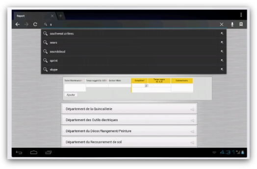
So far in Galaxy Note 10.1
Let us know if this doesn't help. Thanks!
- Templates
- Integrations
- INTEGRATIONS
- See 100+ integrations
- FEATURED INTEGRATIONS
 PayPal
- Slack
- Google Sheets
- Mailchimp
- Zoom
- Dropbox
- Google Calendar
- Hubspot
- Salesforce
- See more Integrations
- Products
- PRODUCTS
- Form Builder
- Jotform Enterprise
- Jotform Apps
- Store Builder
- Jotform Tables
- Jotform Inbox
- Jotform Mobile App
- Jotform Approvals
- Report Builder
- Smart PDF Forms
- PDF Editor
- Jotform Sign
- Jotform for Salesforce Discover Now
- Support


