


-
melodiacAsked on August 15, 2014 at 7:08 PM
Everything else works fine on mobile devices after some CSS injections but the sub labels on my forms keep getting cut off. Any ideas on how to solve this?
-
Steve VP of Sales OperationsReplied on August 15, 2014 at 8:43 PM
Hello,
I can see the issue here:
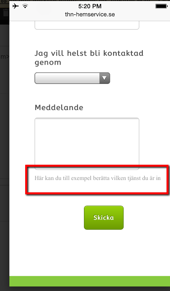
I see you've already tried adding custom CSS to target the sublabel on media devices. I'm working on finding the right css to inject to prevent the sublabels from getting cut off. We'll update this thread with the solution shortly.
Kind Regards
-
Steve VP of Sales OperationsReplied on August 15, 2014 at 8:58 PM
Hello,
I figured it out. The part we were missing was "white-space: normal !important;"
So per your code in the form, replace the last segment with this, (or update as you like). This works on my end, in a clone of the form.
@media only screen and (max-device-width: 960px){
.form-sub-label {
width: 200px !important;
}
.form-sub-label-container {
white-space: normal !important;
}
}Here's a thread on the same topic:
http://www.jotform.com/answers/235793-Word-Wrap-in-a-Form-Field-s-Sub-Label
Let us know if you have further questions.
Regards
-
melodiacReplied on August 15, 2014 at 9:10 PM
Works perfectly! Thank you so much, it would have taken me a long time to figure out and I didn't see that thread when I googled.
/Amanda
-
Steve VP of Sales OperationsReplied on August 15, 2014 at 10:02 PM
Great, glad it helped. Cheers!
- Templates
- Integrations
- INTEGRATIONS
- See 100+ integrations
- FEATURED INTEGRATIONS
 PayPal
- Slack
- Google Sheets
- Mailchimp
- Zoom
- Dropbox
- Google Calendar
- Hubspot
- Salesforce
- See more Integrations
- Products
- PRODUCTS
- Form Builder
- Jotform Enterprise
- Jotform Apps
- Store Builder
- Jotform Tables
- Jotform Inbox
- Jotform Mobile App
- Jotform Approvals
- Report Builder
- Smart PDF Forms
- PDF Editor
- Jotform Sign
- Jotform for Salesforce Discover Now
- Support
