


-
jmuskusAsked on September 13, 2014 at 10:00 AM
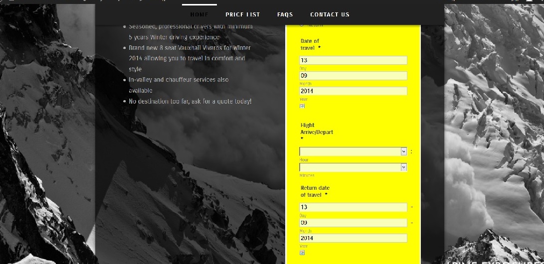
Hi, I entered the CSS as seen on this page: http://www.jotform.com/answers/240130-How-to-make-the-form-mobile-responsive which has worked perfectly to make the form responsive however it has also placed each box in the form on a new line even when viewed on a large screen e.g. there is a new line for the day and month and year in the date section. This makes the form very long and not very professional looking when viewed on the computer screen. Is it possible to change this? Thanks!
-
Welvin Support Team LeadReplied on September 13, 2014 at 1:01 PM
Hi,
Please remove the codes from the form and try to use our mobile responsive widget instead: http://widgets.jotform.com/widget/mobile_responsive.
Here's how you can -Add-a-Widget-to-your-Form.
Update us here for the result.
Thank you!
-
jmuskusReplied on September 13, 2014 at 6:56 PM
Hi, thanks, the widget does work but when viewed on my webpage on my desk top the form is very long with large gaps in between all the fields, it does not look like this on the JotForm preview.... Here are pictures of it with and without the widget activated:


-
jedcadornaReplied on September 14, 2014 at 4:45 AM
Not sure if this how you want your form will look on mobile.
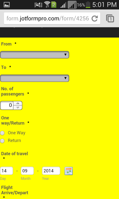
Can you please test this form http://form.jotformpro.com/form/42561344238958.
You can clone that if you want the settings of that form.
- Templates
- Integrations
- INTEGRATIONS
- See 100+ integrations
- FEATURED INTEGRATIONS
 PayPal
- Slack
- Google Sheets
- Mailchimp
- Zoom
- Dropbox
- Google Calendar
- Hubspot
- Salesforce
- See more Integrations
- Products
- PRODUCTS
- Form Builder
- Jotform Enterprise
- Jotform Apps
- Store Builder
- Jotform Tables
- Jotform Inbox
- Jotform Mobile App
- Jotform Approvals
- Report Builder
- Smart PDF Forms
- PDF Editor
- Jotform Sign
- Jotform for Salesforce Discover Now
- Support


