


-
woolalaaAsked on October 7, 2014 at 2:55 PM
Hi, how can I make my form optimised for different window size? I am trying to make the fields and buttons vertically aligned regardless of the window size when shrink.
-
Kiran Support Team LeadReplied on October 7, 2014 at 7:07 PM
I'm working on it. Please allow me some time to work on this and get back to you with relevant information.
Thank you for your patience.
-
woolalaaReplied on October 8, 2014 at 2:40 AM
thanks Kiran
-
woolalaaReplied on October 8, 2014 at 12:31 PM
Hi, any solution to this?
-
Kiran Support Team LeadReplied on October 8, 2014 at 1:27 PM
Sorry for the delay in responding back.
Here is the demo form http://form.jotformpro.com/form/42797387402969?. Please see if it works for you. You can clone this form to your account and make necessary changes as you need.
Please let us know if we cab be of any further help. Thank you.
-
angelaReplied on October 8, 2014 at 3:48 PM
great! thanks.
Now my button error message is missing. How do I get it to appear?
I added
.form-button-error {
display: inline !important;
position: relative;
top: 80px;
right: 330px;
}
-
woolalaaReplied on October 8, 2014 at 4:02 PM
Also, how can I make the red heading center? It seems that now some headings are centered while some are aligned right.
 Another issue is that I set the condition for the dropdown such that when it is empty, no fields will be shown. However, it didn't appear in the form as I wanted. Could you check where is the mistake I made in setting the condition?
Thank you
-
Kiran Support Team LeadReplied on October 8, 2014 at 6:09 PM
Let me check on this and get back to you.
Since we keep one issue per thread, I have moved the other question on the conditions to a new thread. It shall be addressed here http://www.jotform.com/answers/440534.
Thank you.
-
Kiran Support Team LeadReplied on October 9, 2014 at 9:14 AM
I have made necessary changes to the form
http://form.jotformpro.com/form/42797387402969

Please check now and let us know if you need further assistance.
Thank you for using JotForm.
-
woolalaaReplied on October 9, 2014 at 11:42 AM
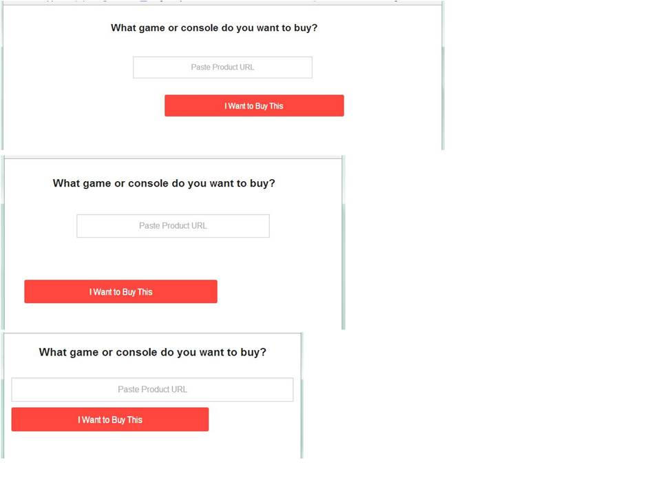
Thanks Kiran, but the problem of the width size changing still remains when I reduced the width of my browser. Same problem when I view it on mobile.

-
BenReplied on October 9, 2014 at 1:34 PM
Hi,
I can not find your jotform so I have cloned the jotform created by my colleague Kiran above.
I see that the issue happens only after certain size is met, then another style once it gets even less in widgth, but this CSS will fix that - see here how to use it.
@media screen and (max-width:640px)
{
button.form-pagebreak-back, button.form-pagebreak-next
{
width: 100% !important;
}
div.form-pagebreak-back-container, div.form-pagebreak-next-container
{
width: 100% !important;
}
}
@media screen and (max-width:640px)
{
div.form-pagebreak-back-container, div.form-pagebreak-next-container
{
width: 95% !important;
}
.form-input-wide > input.form-textbox
{
width: 95% !important;
}
}You can see my jotform here http://form.jotformpro.com/form/42815845493969
And you can clone it to your account following these steps: How to Clone an Existing Form from a URL
Do let us know if this works as you wanted it.
Best Regards,
Ben -
woolalaaReplied on October 10, 2014 at 12:51 AM
Hi Ben,
It works except for the last part of my form after the dropdown selection and the form submit button.
I edited your css codes by adding in the highlighted parts but I think I have made a mistake as it doesn't seem to work. Could you let me know the right code to use?
@media screen and (max-width:640px)
{
button.form-pagebreak-back, button.form-pagebreak-next, button.form-submit
{
width: 100% !important;
}
div.form-pagebreak-back-container, div.form-pagebreak-next-container, div.form-submit-container
{
width: 100% !important;
}
}@media screen and (max-width:640px)
{
div.form-pagebreak-back-container, div.form-pagebreak-next-container, div.form-submit-container
{
width: 95% !important;
}
.form-input-wide > input.form-textbox
{
width: 95% !important;
}
}
The form is here
-
Welvin Support Team LeadReplied on October 10, 2014 at 8:31 AM
I noticed that you have added the mobile responsive widget to your form, and of the same time, you have enabled Responsive Form option from the form settings.
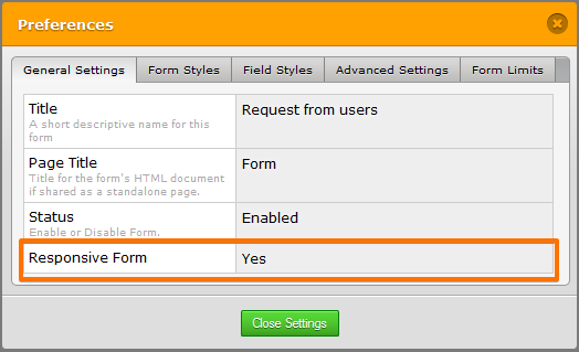
Having all of these to your form is not adviseable because that would create a conflict to the CSS codes.
If you want to inject a custom CSS codes, try to removed the mobile responsive widget and disable responsive form option.
Thank you!
- Templates
- Integrations
- INTEGRATIONS
- See 100+ integrations
- FEATURED INTEGRATIONS
 PayPal
- Slack
- Google Sheets
- Mailchimp
- Zoom
- Dropbox
- Google Calendar
- Hubspot
- Salesforce
- See more Integrations
- Products
- PRODUCTS
- Form Builder
- Jotform Enterprise
- Jotform Apps
- Store Builder
- Jotform Tables
- Jotform Inbox
- Jotform Mobile App
- Jotform Approvals
- Report Builder
- Smart PDF Forms
- PDF Editor
- Jotform Sign
- Jotform for Salesforce Discover Now
- Support


