


-
JoeysAngylAsked on October 8, 2014 at 1:39 AM
Currently, the form I'm working on is set up to look like it has two columns
Column 1 Column 2
First Name Company Name
Last Name Address
Etc.
When testing it on mobile it puts it all into one column in this specific order.
Column 1
First Name
Company Name
Last Name
Address
Etc.
I have tried multiple CSS codes to no avail and have been using the coding for IFrame. Is there currently any way around this? Preferably, I'd like them to still maintain the two column layout.
-
jedcadornaReplied on October 8, 2014 at 7:33 AM
Just to confirm that you wanted to see 2 columns on web and 2 columns on mobile? If yes I'll check your form and get back to you probably later this day once I have properly aligned your forms on web and mobile.
-
JoeysAngylReplied on October 8, 2014 at 10:13 AM
Yes Jedcadorna. I couldn't leave it up on my site as it's the site for my employer.
Thank you so much for your help =)
-
jedcadornaReplied on October 8, 2014 at 11:42 AM
@JoeyAngyl,
Here's my modified version of your Jotform http://form.jotformpro.com/form/42802895385970. 2 columns now shows on web and mobile. I just used absolute positioning.
Mobile view
Browser view
You can clone this form is you want this setup. Here's how to clone a form https://www.jotform.com/help/42-How-to-clone-an-existing-form-from-a-URL
-
JoeysAngylReplied on October 8, 2014 at 12:18 PM
I don't know why, but unfortunately it did not work for me.
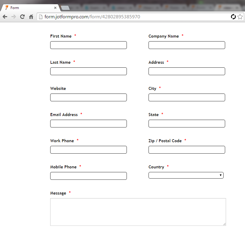
Here is what it looks like on both Firefox and Chrome on my desktop:
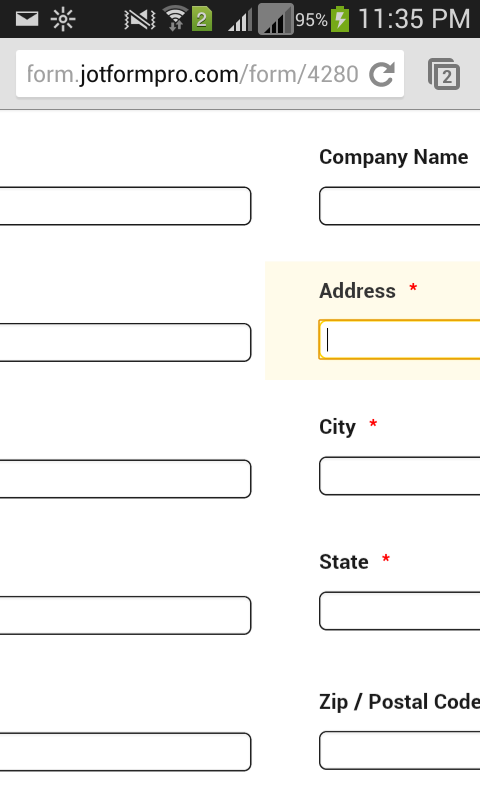
And here's what it looks like on both IE and Chrome on mobile:
I'm not sure why we are experiencing such different outcomes.
-
Kiran Support Team LeadReplied on October 8, 2014 at 2:40 PM
@JoeysAngyl,
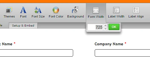
I am able to view jedcadorna's version in two columns both on browser and mobile. Have you tried cloning her form to your account by following http://www.jotform.com/help/42-How-to-clone-an-existing-form-from-a-URL. If you are still viewing in one column, could you try increasing the form width to 725 or more and see if it resolves the issue.
Please let us know if you need further assistance. We will be happy to assist you.
-
JoeysAngylReplied on October 8, 2014 at 2:50 PM
When I view her link directly in my phone it seems to work, but something is being lost in translation between jotform and squarespace because once I put it into squarespace and view it through my site there, the above images that I posted are what happens.
I'm sorry I wasn't clear on that.
-
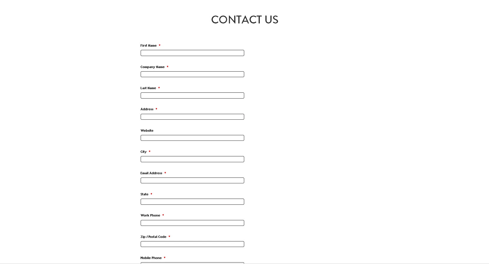
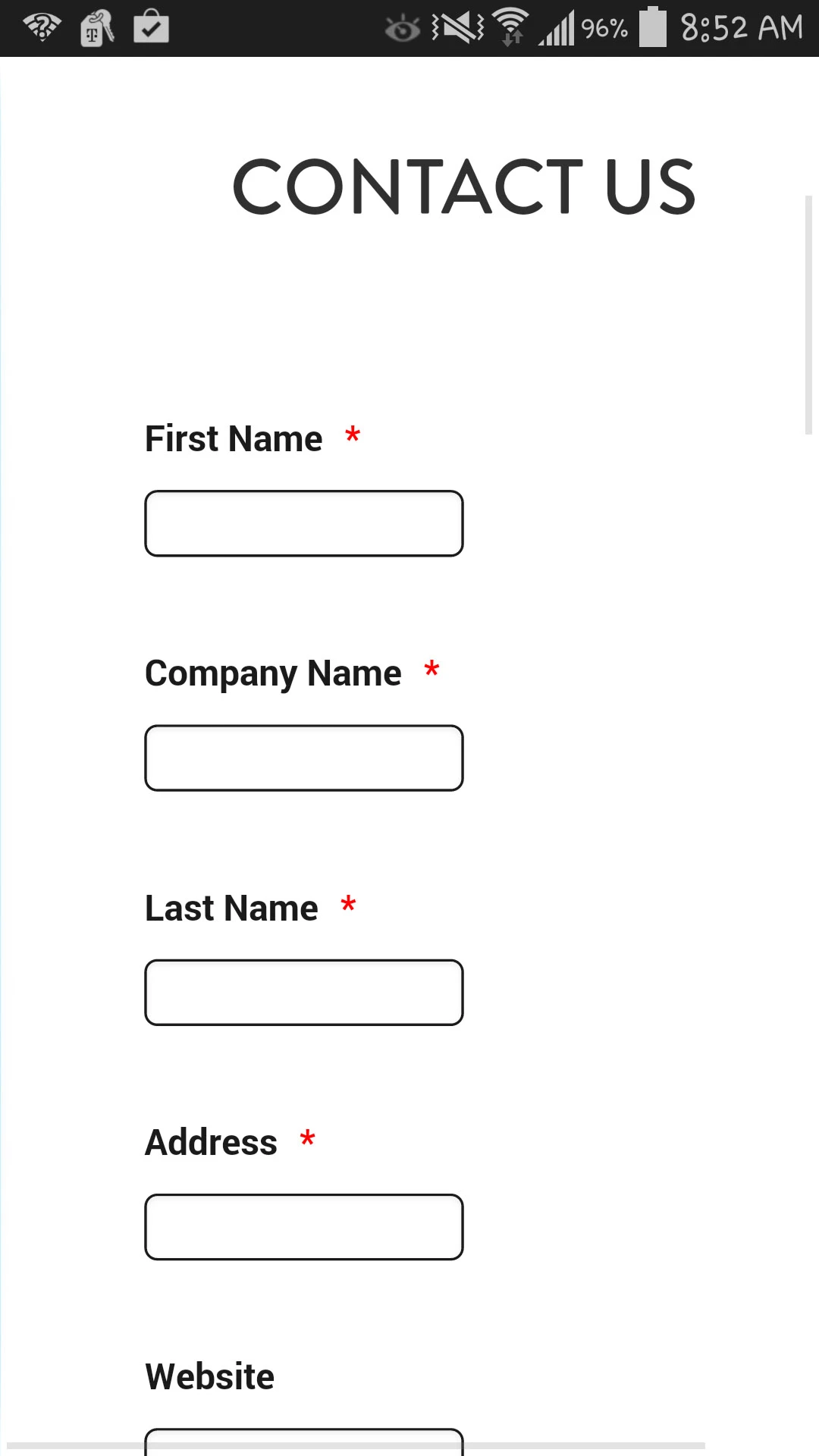
JoeysAngylReplied on October 8, 2014 at 3:15 PM
Alright, so instead of putting using it as an iframe into the code section of squarespace, I use the source coding, and this is what I get when viewing it on mobile:
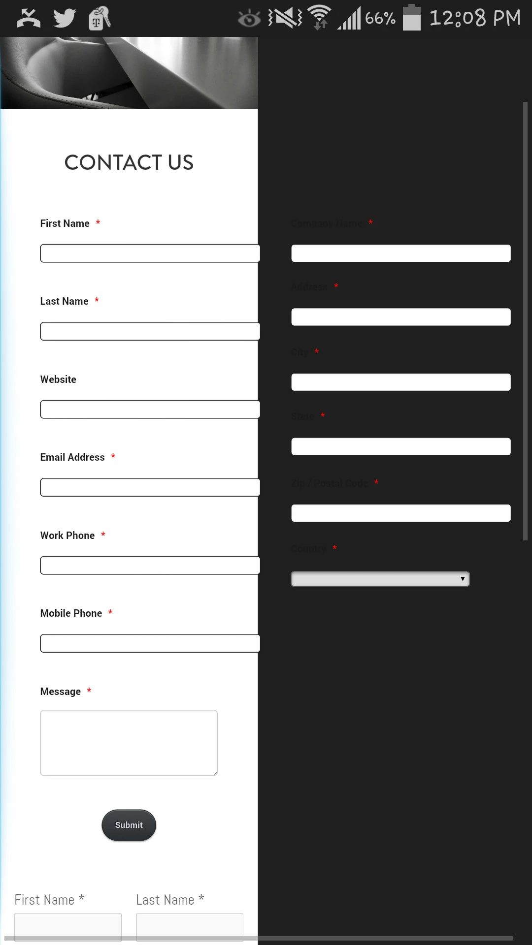
The end of the white background is actually supposed to be the cutoff for the webpage. So, while the code is technically working, it is expanding the width of the entire webpage which unfortunately is a new problem.
Currently we are using some wonky coding for a temporary contact form as you can see with the First Name and Last Name at the bottom of the included image. Is it at all possible to get the fields to have similar placement and width as the two fields at the bottom without affecting the form layout on the desktop version?
I'm sorry I'm being difficult.
-
Kiran Support Team LeadReplied on October 8, 2014 at 5:46 PM
The white background is cut off due to the squarespace template is adjusting itself to fit in the mobile view, but not JotForm.
Generally, the columns are positioned automatically when the form is split into columns. Please go through the guide on Field positioning. While viewing on mobile devices, the fields are positioned from left to right in each row and in top to bottom order.
Could you let us know the result by embedding in iframe method?
- Templates
- Integrations
- INTEGRATIONS
- See 100+ integrations
- FEATURED INTEGRATIONS
 PayPal
- Slack
- Google Sheets
- Mailchimp
- Zoom
- Dropbox
- Google Calendar
- Hubspot
- Salesforce
- See more Integrations
- Products
- PRODUCTS
- Form Builder
- Jotform Enterprise
- Jotform Apps
- Store Builder
- Jotform Tables
- Jotform Inbox
- Jotform Mobile App
- Jotform Approvals
- Report Builder
- Smart PDF Forms
- PDF Editor
- Jotform Sign
- Jotform for Salesforce Discover Now
- Support

