
-
UGOLFMEDIAAsked on October 24, 2014 at 7:10 PM
I have a form (PGA/LPGA Inquiry Form) and I just cannot seem to get it to be responsive. It does respond in the sense that the fields move down and on top of each other but it shoots over the right hand side on my IPhone and on my IPad in Portrait view. It's ok on a desktop and landscape view on a Tablet.
I am pretty certain it is a basic error on my part but I would be most grateful if you could take a look and see what I'm doing wrong.
Many thanks
Brian
-
CharlieReplied on October 24, 2014 at 8:08 PM
Hi Brian,
Have you tried using this widget, Mobile Responsive? This should automatically fix the display of your form when viewed in a mobile device.
Also is the problem you are referring to is the button below? Because in my end when viewed on iPhone display the buttons' width expands that shoots the page to have a large space on the right side?
1. The submit and clear button expands.

2. You can fix this by adding this custom CSS code in the CSS panel found in the new JotForm Form Designer under Form styles.
.form-buttons-wrapper {
max-width : 200px;
}

Let us know if this works, or if you are referring to another issue that I missed.
Thank you.
-
UGOLFMEDIAReplied on October 25, 2014 at 7:17 AM
Hi Charlie
Thanks for your reply.
I tried the CSS first but it didn't make any difference and so then deleted that and tried the Mobile Responsive widget. that has corrected matters as far as the IPhone display is concerned.
However I now have an issue with a handful of things and hope you can help.
[1] Why are all the text boxes spread right across the form width?
[2] On all of the Check Box questions the options are always sitting below the tick box when I want them to sit to the right as shown in the Jot Form construction page. This is the same on all devices.
[3] As an alternative I placed a Drop Down box to see if that helped. This is about two thirds of the way down and titled "Do you require our Mobile Pages Construction services" and you will see that whilst it is better it is still suffering from the box stretching right across the form width.
[4] From a design point of view is it possible to move the side borders in a little as they're too close to the left edge of the form.
I realise that some of these issues are perhaps the form theme and perhaps I should try another theme or remove the theme altogether and just provide a colored background.
I will look forward to your reply.
Kind regards
Brian
-
BenReplied on October 25, 2014 at 7:35 AM
Hi Brian,
I took a look at your jotform and the reason why they got to look like that is because a style on your jotform is forcing them to be on a new line. So instead of being right next to the other field, they are moved down or up from their counterpart.
What I would suggest is to embed your jotform into iFrame. iFrame embed method is the best if you are looking for cross devices compatibility and should resolve many of the issues you have mentioned.
Once you do that, do let us know if there are still some that are present and we will be glad to assist you in resolving them.
Best Regards,
Ben -
UGOLFMEDIAReplied on October 25, 2014 at 9:29 AM
Hi Ben
Thanks a lot the IFrame method certainly put most of the issues to bed. The only one remaining now is that the margins need to be set somehow so that it starts a little bit in from the edge. I was going to break out of the theme and preferably use a transparent background as the background of the webpage is graded and so would never get that spot on. However I thought I would ask you direct what you thought about resolving the margins issue first and then I will try a transparent background which I used once before but can't quite remember what I do so if you could let me know that as well that would be cool.
Cheers
Brian
-
jonathanReplied on October 25, 2014 at 7:09 PM
Hi Brian,
Can you please describe more how you wanted the margin to start a little bit from the edge?
I see the jotform in your website like this...
I could not understand yet what changes you wanted to do.
If you can describe more, we will see what we can suggest.
Thanks.
-
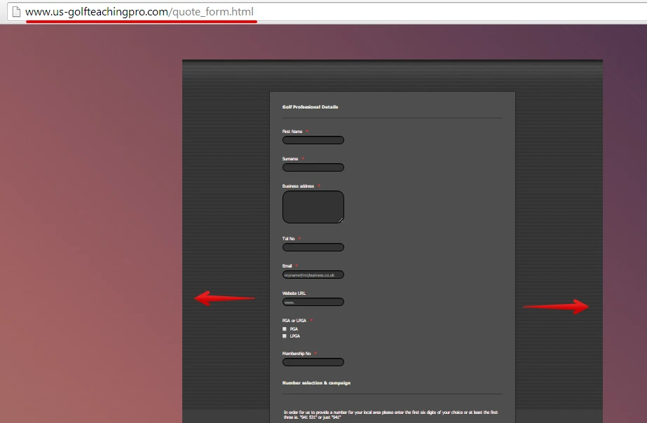
UGOLFMEDIAReplied on October 26, 2014 at 4:47 AM
Hi Jonathan
Your misunderstandings are entirely my fault. I should have explained that it was on my IPhone that there was the issue of the margins. I've uploaded three screenshots where you can readily see the problem where the margins are right up against the edge. My thinking was if there is nothing you can do about this in the CSS or wherever then perhaps by making the background of the form transparent, and probably having to remove the theme, that the issue will disappear visually although still being there but hidden!
J
ust another quick question. In using the new form designer am I right in thinking that you lose the ability to make the text box sizes different individually. It is just that it looks really bad to for instance on one of the images I've attached where the question is "ENTER DIGITS" where this would be a maximum of seven characters but it stretches to around 30 I think!I will look forward to hearing from you.
Cheers
Brian


-
BenReplied on October 26, 2014 at 6:07 AM
Hi Brian,
I have moved your question about our new Form Designer to a new thread where we will answer your questions and provide you with assistance on how to accomplish what you are after.
This way there will be no confusion in what we are doing here :)
You can find the new thread here: http://www.jotform.com/answers/449358
My thinking was if there is nothing you can do about this in the CSS or wherever then perhaps by making the background of the form transparent
Here is the CSS that will move the elements from the page:
@media screen and (max-width:768px)
{
div.form-all > ul.form-section
{
padding-left:5px;
}
}It is set to alter only when the size is under 768px, so other styles do not get affected by it. You can see here how to inject it to your jotform.
Do let us know how that works for you and if you need to increase the distance a bit more, just change the bold number in the above code.
Best Regards,
Ben
- Templates
- Integrations
- INTEGRATIONS
- See 100+ integrations
- FEATURED INTEGRATIONS
 PayPal
- Slack
- Google Sheets
- Mailchimp
- Zoom
- Dropbox
- Google Calendar
- Hubspot
- Salesforce
- See more Integrations
- Products
- PRODUCTS
- Form Builder
- Jotform Enterprise
- Jotform Apps
- Store Builder
- Jotform Tables
- Jotform Inbox
- Jotform Mobile App
- Jotform Approvals
- Report Builder
- Smart PDF Forms
- PDF Editor
- Jotform Sign
- Jotform for Salesforce Discover Now
- Support