


-
glandoreghycAsked on October 31, 2014 at 10:36 AM
Please take a look at (test Environment)
http://www.reenoserve.com/ghyc/onlineForms.html
The heading of the form has too much vertical spacing, between it and the Form start and between the Form header and the Section header inserted by myself in the web page creation.
How do i get rid of this spacing please?
I have tried you use your advanced Form designer to remove the padding etc but it doe snot appear to make any difference.
Thx
John
-
BenReplied on October 31, 2014 at 11:37 AM
Hi John,
Please try injecting this CSS code to your jotform:
form.jotform-form {
margin-top: -40px;
padding-top: 0;
}It should eliminate the space above the jotform.
Do let us know how it goes.
Best Regards,
Ben -
glandoreghycReplied on November 4, 2014 at 5:46 AM
I do not understand why but i replied to this thread about three days ago and it is not showing up.
My comment was that yes i now have greatly reduced space above teh Form header, but how to i reduce the spacing from below the Form header please?
Thx
John
-
glandoreghycReplied on November 4, 2014 at 6:57 AM
Hello,
Further to my last response, i have now noticed another more urgent issue, that i believe has only started to occur since w aded the CSS you suggested.
Please take a look at
http://www.reenoserve.com/ghyc/onlineForms.html
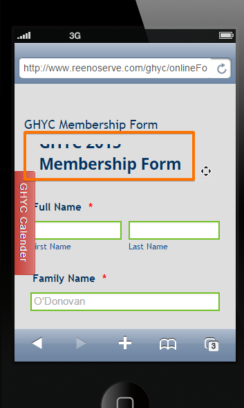
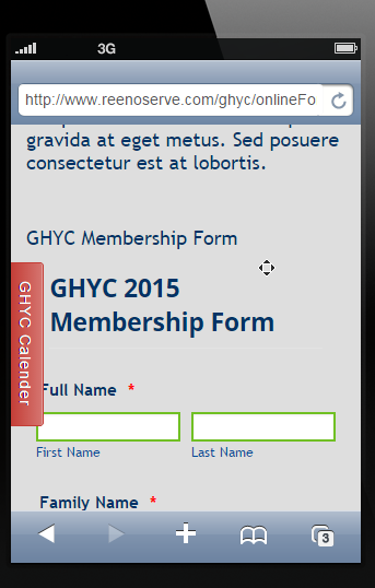
ON an iPhone or similar (OK on iPad) and you will note that most of the From heading is totally missing. you get to see some of this if you reduce the browser window on a desktop.
THx
John
-
jedcadornaReplied on November 4, 2014 at 8:43 AM
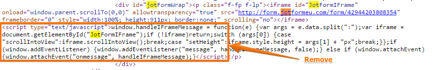
To remove the space below try to remove the tag and anything in between that tag in your iframe embed code. Then adjust the height, this will set a fix height for your Jotform when viewed on your page.
About the view on Iphone I see what you mean.
Try changing the margin-top to -20px instead of -40px. This is now how it looks on Iphone.
-
glandoreghycReplied on November 4, 2014 at 11:59 AM
Hello,
If i change the -40 to -20 then i am nearly back where i started this thread... I am trying to remove all the unwanted line spaces before and after the Form header ...
Also if i make the height fixed doesn't that limit the responsiveness of the form??
Thx
John
-
BenReplied on November 4, 2014 at 12:30 PM
Hi John,
OK, you should leave the CSS I had mentioned at the start and add one more CSS rule to resolve this:
@media screen and (max-width:450px)
{
form.jotform-form { margin-top:0px; }
}This will handle all cases so that your jotform is shown properly every time.
In case it is needed, this is the entire CSS code (with the one above)
form.jotform-form {
margin-top: -40px;
padding-bottom: 0px;
padding-top: 0px;
}
@media screen and (max-width:450px)
{
form.jotform-form { margin-top:0px; }
}Do let us know how it goes.
Best Regards,
Ben -
glandoreghycReplied on November 4, 2014 at 2:40 PM
OK, Progress
Thank You, However, Whereas the iPhone in Portrait mode is now OK, iPhone in Landscape is not, the Form header is not recognisable.
What is concerning me is that JotForm indicate that if you configure the form using the Responsive option, then it will be Responsive, my situation obviously suggests that the Responsive option in JotFrom is not working 100%.
I am working with iPad (retina) and an iPhone 5S, what about all the other smart phone configurations, how do i ensure that the responsive JotForm Form will display correctly please. This is very important to me and the client.
Thx
John
-
BenReplied on November 4, 2014 at 4:07 PM
Hi John,
What I can suggest is to add Mobile Responsive widget to your jotform which should make it more responsive.
Do try it out and let us know how it goes for you.
Best Regards,
Ben -
BenReplied on November 4, 2014 at 4:11 PM
Hi,
If that does not help could you please try this CSS code as well?
@media screen and (max-device-width:736px)
{
form.jotform-form { margin-top:0px; }
}Best Regards,
Ben -
glandoreghycReplied on November 4, 2014 at 4:24 PM
Hello
The Mobile Responsive widget is already added.
John
-
CharlieReplied on November 4, 2014 at 6:38 PM
Hi John,
Are you still having problems with the landscape view of the form?
The mobile responsive widget works properly when the form is viewed in its standalone URL. When the form is embedded, the website should also be mobile responsive.
To further assist you, can you provide us a screenshot of what you are seeing in your end?
We'll wait for your response.
Thank you.
-
glandoreghycReplied on November 5, 2014 at 3:34 AM
OK, Let me see if i can do a recap
Before i complained about the additional spaces above and below the Form Title, the form was displayed correctly in all responsive displays that i viewed. and this did not make any difference if i used the simple Embed or the iFrame version.
The rest of the site is fully responsive as can be seen, and let me say this is a test site to verify positional issues of certain elements in a responsive environment before i start the real work.
So including the CSS from Ben the issues where always the same i would get a certain amount of "Clipping" of the title of the first field name depending on the CSS either on the Smart phone or the tablet.
I tried inserting various padding into the Wrapper element that holds the HTML MarkUp within the design of the Page, and that did not change the end result in any way...... which would imply that the "Clipping" is actually within the element that is coming directly from JotForm.
At this point i removed all the CSS.
And as you can see now all the "clipping" issues have gone.... however i am back to the additional spacing above the title of the first Field in the Form.
I have removed the Form Title to reduce the amount of Blank space in the page, but i am still left with the unwanted spaces above the Title field of the first Input field in the form, and using your new beta design service i have removed all the Padding and line spacing from the form.
There must be a simpler way to remove this unnecessary line spacing?
Thx
John
-
jonathanReplied on November 5, 2014 at 6:12 AM
Hi John,
I was able to see what you meant on the 'too much space on top' when I checked on your http://www.reenoserve.com/ghyc/onlineForms.html

Kindly correct me if I am instead describing the wrong issue.
If this is then, please try adding back the CSS code that was originally suggested. This one
.form-all {
margin-top: -40px;
padding-top: 0;
}Adjust the number if needed. The more negative the number the more the whole form should shift upward..
Here is the screenshot on how it was suppose to be on -60px;

Hope this help. Please inform us if still not resolve.
Thanks.
-
glandoreghycReplied on November 5, 2014 at 6:20 AM
Hello,
Thank You, I am no expert, but when i enter this CSS code it starts to conflict with the Responsive CSS especially when you get to Smart Phones and Tablets and that is when the "clipping" started.
The CSS parameters that are input by this method are constant, so they may well work with Desktops, but the Formula does nto work on smaller displays.
Thx
John
-
glandoreghycReplied on November 5, 2014 at 6:50 AM
Apologies,
Forgot to answer one of your questions.
YEs you are describing the correct issue .
Thx
John
-
jonathanReplied on November 5, 2014 at 8:17 AM
Hi John,
Will you be able to share to us a screenshot on how it looks in actual on your mobile browser with the suggested CSS codes added? Follow this guide to include screenshot in your message.
Try adding the last CSS code suggested by our colleague instead. This one
@media screen and (max-device-width:736px)
{
form.jotform-form { margin-top:0px; }
}We will wait for your update.
Thanks.
-
glandoreghycReplied on November 6, 2014 at 4:45 AM
Firstly,
Apologies for the delay in this response.
You advised to add the CSS identified in your last response i assume you meant in addition to the initial CSS as indicated by Ben below
orm.jotform-form {
margin-top: -40px;
padding-top: 0;
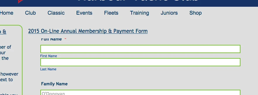
}OK when i did this the impact of your CSS stopped the clipping on the Smart Phone device, however it did not stop the effect on other devices like Tablets. An example is shown in Screenshot 1 attached. You can see the top of the Name of the first Field name has been "Clipped" this screen shot is from my desktop Browser with a reduced window, i am not sure how to take a screen shot on an iPhone or iPad.
I thens tarted to experiment with the number of px's to set in the margin and found that -30px seemed to work at an acceptable level. So the code i am now using is identified in Screen shot 2.
Please note that the CSS has a real time impact on the displayable Form using the Beta Form Designer, not something i think you want to happen.
However i still think this is a long winded way to resolve the issue when it would seem more appropriate for JotForm to remove the additional lines in the form design layout, as there is no indication of these additional lines when you are designing the form
Thanks
John


-
Welvin Support Team LeadReplied on November 6, 2014 at 7:37 AM
Hi John,
Please kindly check your form now. If you check the custom CSS codes, I have added three media queries, one for small screen devices, one for iPad and similar and one for desktop/laptops. Please let me know if the issue is still there.
Thank you!
-
glandoreghycReplied on November 6, 2014 at 9:52 AM
-
Welvin Support Team LeadReplied on November 6, 2014 at 10:23 AM
Hi John,
It's our pleasure to help you! So can you please confirm if the original issue is now resolved?
With regards to your last question, I moved it to a new thread. Please check it here: http://www.jotform.com/answers/455186. That seems to be a new question and we can only answer one question per thread. This is to avoid some confusions.
Thank you!
-
glandoreghycReplied on November 6, 2014 at 12:11 PM
Hello,
Absolutely, thanks for your patience on this one.
Perfectly understood about the new question and creating a new thread..
Thx
John
-
BenReplied on November 6, 2014 at 12:59 PM
Hi John,
I am glad to hear that everything is resolved. We will be working with you on your new thread to come to the same finish :)
Best Regards,
Ben -
glandoreghycReplied on November 9, 2014 at 5:53 AM
OK, I am very confused now.
My problems are back see the image below, this is on a normal Desktop
The last CSS code that was recommended and worked is still in place (to the best of my knowledge) and the addition to the iframe code to remove the lower spaces is also included (this was part of another thread resolution)
I have moved the relevant page on the test site as i need to progress with my development so the link is now.
http://www.reenoserve.com/ghyc/Forms/index.html
What has happened since Friday to make these changes please?
Thx
john

-
BenReplied on November 9, 2014 at 7:06 AM
Hi John,
I can only presume that you have entered Form Designer again and that it made the changes to the CSS code once again only this time making its code more important.
What I would like you to do is to find this code:
form.jotform-form {
margin-top: -40px;
padding-bottom: 0px;
padding-top: 0px;
}and change it into:
form.jotform-form {
margin-top: -40px;
padding-bottom: 0px;
padding-top: 0px !important;
}Now, I am not sure if you still have -40px above, but that is just used as a reference to which part of the code should be changed.
When you find it just add !important behind padding-top:0px so that it gets the highest priority.
After testing do let us know how it goes for you.
PS: This should bring the submit button up as well so it will not be clipped any more.
Best Regards,
Ben -
glandoreghycReplied on November 9, 2014 at 7:24 AM
Ben,
The Code you suggested was subsequently changed by Welvin, which did appear to work and left me with a strange issue to do with Hover text and the form displayed on an iPhone, which was the subject of a different thread.
The problem i am having now is that the display format is broken for the Desktop view but seems to be fine in the Smartphone (not including the issue with Hover text) and Tablet environment
Please see Welvins code in the attached Screenshot.
Thanks
John

-
glandoreghycReplied on November 9, 2014 at 1:24 PM
Hello,
Sorry but i respect what you are saying but something has happened to this form since Friday PM, the setting I was working on with Welvin solved my problem and allowed me to work with your Form Design feature (Beta) as the code you have just suggested when inserted wiped out the first few fields in my Form when using the Form Design feature. The only issue i had after inserting Welvins code was that the Lower part of the form had a lot of unnecessary spaces and Ben provided the fix for that which was to insert (-209) into the iFrame embedded code.
The new code, a combination of Welvins and the code you have just suggested does go some way to resolve the issue but i had to play around with the values in your code for example originally -30px seemed to be OK except for the smart phones etc not it is down to -15px to get to the same result as last Friday.
Also Ben's fix for the lower line spaces does work at the same level where -209 in the iFrame used to work it is now at around -150px
So what has Jot From done to the Form Design since Friday???? and is it worth persevering with Form Design ????
Not a happy camper at the moment i am afraid, and i have been using your service for nearly 3 years now.
John
-
abajan Jotform SupportReplied on November 9, 2014 at 4:29 PM
John,
We're really sorry about this state of affairs, especially in light of the fact that you've been with us for so long, but let me assure you that our team will work on this until it's resolved to your satisfaction.
I'm wondering if the issue at the top of the jotform wouldn't be better dealt with by including the heading (2015 On-Line Annual Membership & Payment Form) on the actual form instead of on the web page. Of course, that won't fix everything but it should stop any variable spacing issues between the heading and the rest of the jotform.
Wayne -
glandoreghycReplied on November 9, 2014 at 5:01 PM
Hello,
Yes , that is what i started with, but after a while i realised that the page heading that i create outside JotForm was a better overall solution.
The Initial Top of Page/Leading spacing challenges still exist.
You are correct that it would stop potential spacing issues between the Heading and the Top of the JotForm, however it still does not fix the issue of the space at the top of the Form, so if i had another Element in my page design above the Jot Form, i would still end up with unnecessary and wasteful linespaces, between it and the JotForm
Thanks for your interest
John
-
Welvin Support Team LeadReplied on November 10, 2014 at 4:34 AM
Hi John,
I'm sorry for that, but I did not change the custom CSS codes that was added by the form designer. If you check it, I have added the media queries to the existing ones that fixed the alignment which you have confirmed.
Would you mind if we restore the custom CSS codes for the top alignment and deal the other issues to the other thread?
Let me just confirm, your issues when you have my custom CSS codes and the ones from Ben does solve your problem, but a new issue appears which is related to the spacing at the bottom of the form when it's embedded to your page, is this correct?
Thank you and don't worry, we'll help you to fix this. ;)
-
glandoreghycReplied on November 10, 2014 at 4:47 AM
Before i respond to your post, do you think it would be better if i started again with a clean Thread and keep a thread confined to a single problem, The confusion is my fault as intiatially i included more than one post on a single thread.
Maybe I should start over from the very beginning?
Thx
John
-
Welvin Support Team LeadReplied on November 10, 2014 at 6:00 AM
Hi John,
No worries for that. The issues are connected to each other, but we would prefer moving the new ones to a new thread. That would help us troubleshoot issues separately. So yes, please start a new thread for the other issues.
I would prefer keeping the original issue to this thread until we resolve that. I think it's just restoring the old custom CSS codes and we are good to go.
Thank you!
-
glandoreghycReplied on November 10, 2014 at 6:17 AM
Welvin,
Ok this thread shall stay active and we will start over so to speak so i have done the following:
Using the Form designer i have removed ALL CSS that was installed in the last few days.
And you can view the Form online here:
http://www.reenoserve.com/ghyc/Forms/index.html
Reference the other issue in regard to unwanted line spaces at the end of the Jot form, that thread is open here:
http://www.jotformeu.com/answers/455186-Limit-the-amount-of-spaces-at-the-end-of-the-form?entrymessage=10732640770
And in order to get that back to where i started i have removed a suggested edit to the Actual iFrame code
So now the form as displayed in the iink above has unacceptable line spacing above and below the Form
The last Thread is linked to a problem on iPhone where Hover Text on one field is distorting the Display and that issue has never been fixed and is still present if you view via an iPhone 5S, the thread for this problem is at :-
http://www.jotformeu.com/answers/455456-Responsive-Form-and-Hover-Text?&updatemessage=10732640770
I await your instructions.
Thank You
John
-
Welvin Support Team LeadReplied on November 10, 2014 at 8:02 AM
Hi John,
Can you please check now? iPhone 5, iPad and Desktop TOP views for the link: http://www.reenoserve.com/ghyc/Forms/index.html.
I changed something in the form designer and added back the custom CSS codes with small edits for desktop view. The old codes are still here as a backup.
Thanks
-
BenReplied on November 10, 2014 at 8:35 AM
Hi John,
I hope that you will not mind me suggesting this, but this is what I would like to do to make it work for you.
Could you please finish everything on the jotform that you wanted and ignore the padding on it just for now.
I presume that this padding is made when you clicked on "Make this form responsive" option in the Form Designer and that if you remove it, it should not have them any more.
Now there are other ways to make it responsive as well such as our Mobile Responsive widget.
In either case, once you make all the changes to the jotform that you would want please update us on it here and we will help you with any issues that are present, such as spacing above and under the jotform.
I suggest this because this will allow you to finish everything on your jotform and we can give you CSS code that would make the change in the end, because each CSS code is depending on certain things in your jotform so today's CSS might not be good for tomorrow's jotform (if there were any changes made on it).
Best Regards,
Ben -
glandoreghycReplied on November 10, 2014 at 8:57 AM
Welvin,
I note your changes and i have checked on My iPhone and iPad devices both in portrait and in landscape, along with my Desktop (which has a large screen), and the display format appear to be acceptable.
If i change the browser screen size ( to about 1200px wide) on my desktop the format "Breaks", which woudl appear to be an issue as some people out there will not have large displays on their desktops, and I am not sure about other Smartphones or Tablets
The other issue i have noted is within JotForm standard Design view (not the beta Form Designer), the top two fields are missing?
You say you changed something within the Form Designer..... what as i have another 10 forms to get working on this site????
Thx
John
-
glandoreghycReplied on November 10, 2014 at 9:01 AM
Ben,
Thank You for your response, a couple of things.
1. This form is finished as far as i am concerned it has been up and active for over two years now, the only reason i have these issues is that i am making the web site Responsive.
2. I have another 10 or so forms that i will need to do the same manipulation with as soon as i understand how to fix the problems here
3. I activated the Make Responsive on the Form designer around last Thursday prior to all these issues i have had in regard to this thread.
Thx
John
-
CharlieReplied on November 10, 2014 at 10:05 AM
Hi John,
It seems that the padding and spaces on this page seems to work fine right now, http://www.reenoserve.com/ghyc/Forms/index.html.
Regarding the 1200px limit, let us know if you see some problems when displayed on it. Also, I would like to suggest exploring to other options like adding the Mobile Responsive Widget and un-tick or unable the "Mobile Responsive" you have on the JotForm Form Designer to avoid conflict on the CSS code.
Regards.
-
glandoreghycReplied on November 10, 2014 at 10:16 AM
Hello,
I am getting issues at 1200px, you can see the result in the attached , Field name is "clipped" , i cannot say it is precisely 1200 i am not sure how to add a ruler to chrome ....but it is close. The form is reformatted i assume by your Responsive option
In regard to the recommendation to change to the Responsive Widget is this the preferred method please?
Thx
John
-
CharlieReplied on November 10, 2014 at 10:39 AM
Hi John,
Thanks for informing us. In my part, it with a screen resolution of 1024x780, it works fine. If you changed the width by setting a width in the Chrome using some web developer setup, you can try refreshing the page or clearing your form's cache. The mobile responsive widget should also fix this kind of problems.

Regarding your concern about the mobile responsive, because that option is available in the new JotForm Form Designer, we usually recommend it, but if it conflicts the custom css code that you have we can still resort to other options like using the widget.
Hope this helps.
Thank you.
- Templates
- Integrations
- INTEGRATIONS
- See 100+ integrations
- FEATURED INTEGRATIONS
 PayPal
- Slack
- Google Sheets
- Mailchimp
- Zoom
- Dropbox
- Google Calendar
- Hubspot
- Salesforce
- See more Integrations
- Products
- PRODUCTS
- Form Builder
- Jotform Enterprise
- Jotform Apps
- Store Builder
- Jotform Tables
- Jotform Inbox
- Jotform Mobile App
- Jotform Approvals
- Report Builder
- Smart PDF Forms
- PDF Editor
- Jotform Sign
- Jotform for Salesforce Discover Now
- Support


