


-
GKaufhausAsked on November 9, 2014 at 7:13 AM
I have several forms on my website and all work fine with a computer. When testing if they do show correctly on mobile devices, the web editor I have to use shows a black screen and no form.
I followed all the advices. I made one of the forms (I left the others as I originally build them in to see the difference) responsive. I inserted the mobile device widget and used the iFrame Code. Nothing helped. Now I am lost.
The original form style I used can be found here: http://issues-and-views.com/Tattoos/MyTattooStory.html
The form I tried to tried to make working on mobile devices is here: http://issues-and-views.com/contact.html. Looks quite ugly, right?
Please let me explain that the homepage builder of my provider does not give me much space doing things as I like to. I am not easily able to just write my own html page, but I am able to insert a code.
Unfortunately, I do not own a mobile device to check it myself. I only can see what the web editor is showing so I have to trust that it shows what is seen on a mobile.
Thank you for your help.
 Page URL: http://issues-and-views.com/contact.html
 -
GKaufhausReplied on November 9, 2014 at 3:31 PM
No, unfortunately I do not have any Smartphone access. I only see that the form does not really fit on the screen, so I guess it is too wide. But I think I can work around it.
Would you be so kind to test this http://issues-and-views.com/contact.html as it is my contact form that also can be used. Here, I used the iFrame method to embedd it. The other one I used another method.
Thank you so much for your help!
-
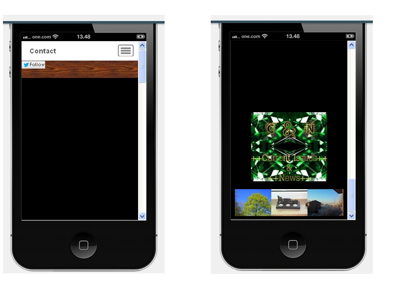
gori-mathewReplied on November 9, 2014 at 11:51 PM
Hi,
We really apologize for the inconvenience caused,As per your request I have tested your form and I am happy to inform you that the form displays fine both on a mobile emulator and mobile device as shown in the screenshot below:

Please feel free to contact us if you need any further assistance. We will be happy to help.Cheers!
- Templates
- Integrations
- INTEGRATIONS
- See 100+ integrations
- FEATURED INTEGRATIONS
 PayPal
- Slack
- Google Sheets
- Mailchimp
- Zoom
- Dropbox
- Google Calendar
- Hubspot
- Salesforce
- See more Integrations
- Products
- PRODUCTS
- Form Builder
- Jotform Enterprise
- Jotform Apps
- Store Builder
- Jotform Tables
- Jotform Inbox
- Jotform Mobile App
- Jotform Approvals
- Report Builder
- Smart PDF Forms
- PDF Editor
- Jotform Sign
- Jotform for Salesforce Discover Now
- Support

