


-
ahmedaallamAsked on November 12, 2014 at 10:47 PM
Hi,
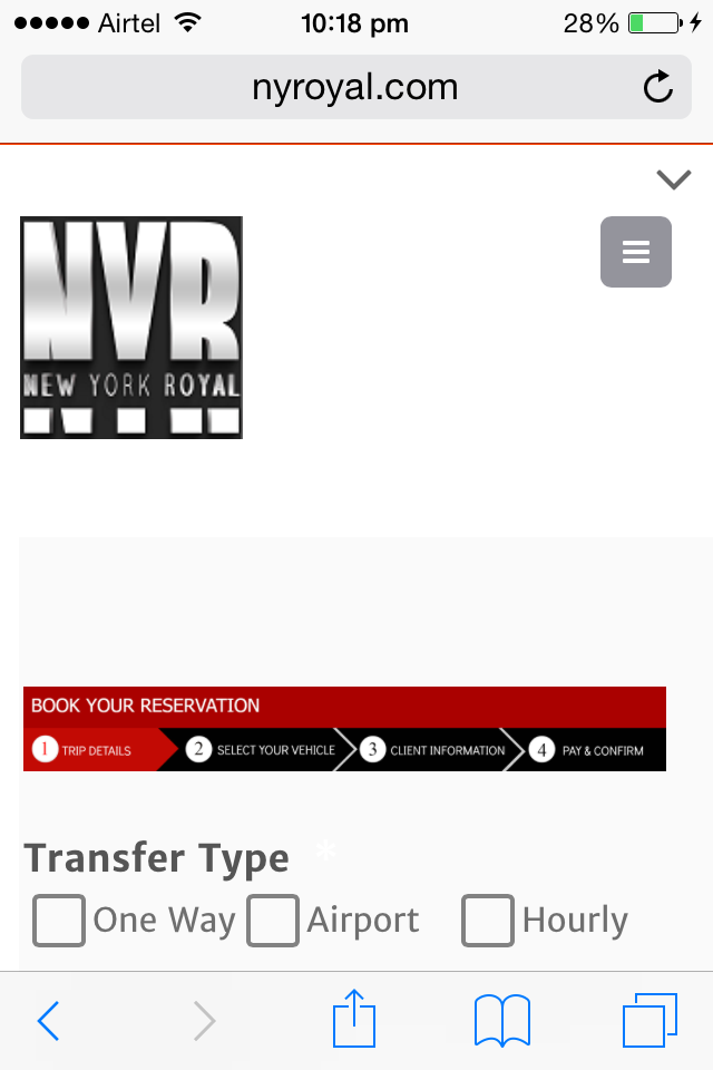
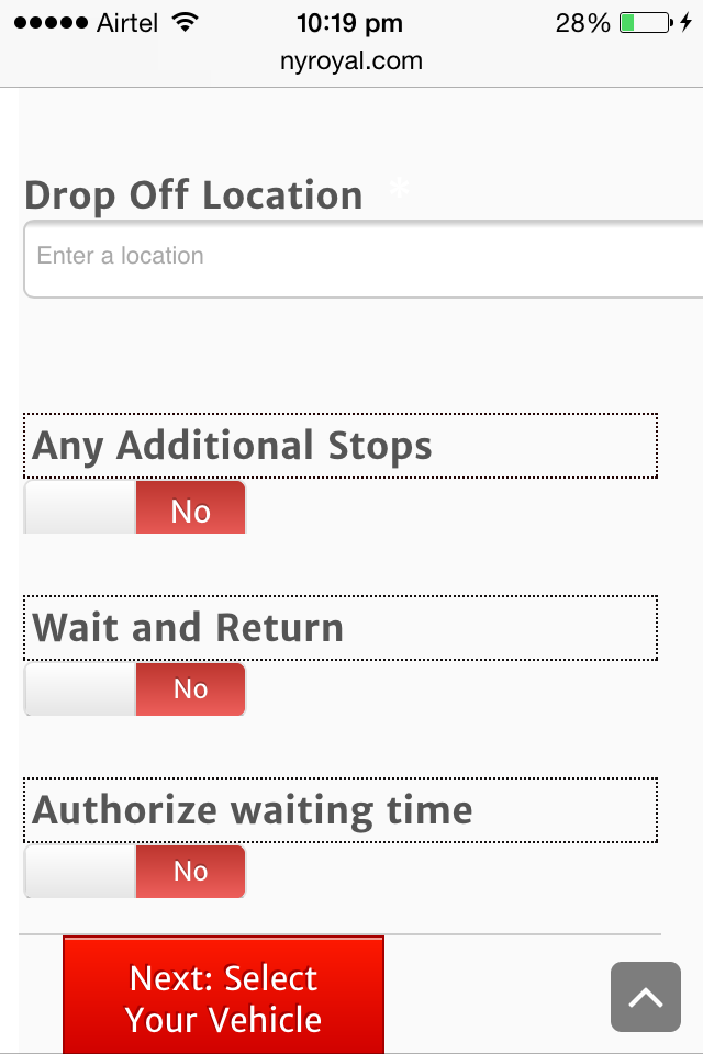
The form is responsive and the template is responsive too, i can view it clearly on IPad as an IOS and also on Android phones but not on IPhone although i am using the last version (Iphone 6).
http://www.nyroyal.com/reservation/
http://form.jotform.us/form/42854152064149?
please advise,
Page URL: http://www.nyroyal.com/reservation/ -
Ashwin JotForm SupportReplied on November 13, 2014 at 2:42 AM
Hello ahmedaallam,
Please inject the following custom css code in your form and see if that solves your problem:
@media only screen and (max-device-width : 480px){
html.supernova {
width: 80% !important;
margin-left: 0px !important;
}
}
The following guide should help you in injecting custom css code in your form: http://www.jotform.com/help/117-How-to-Inject-Custom-CSS-Codes
Hope this helps.
Do get back to us if the issue persists.
Thank you!
-
ahmedaallamReplied on November 13, 2014 at 11:16 AM
Hello Ashwin_d,
Thank you so much but it does not work, unfortunately.
let me know what else i should try please.
-
Ashwin JotForm SupportReplied on November 13, 2014 at 11:53 AM
Hello ahmedaallam,
I made few changes in the above css code and added mobile responsive widget in your form. I did check your webpage in my iPhone device 4S and it appears correctly. Please check the screenshot below:
Please share a screenshot of how your webpage appears in iPhone 6. The following guide should help you in uploading image in your forum post: https://www.jotform.com/answers/277033
We will wait for your response.
Thank you!
- Templates
- Integrations
- INTEGRATIONS
- See 100+ integrations
- FEATURED INTEGRATIONS
 PayPal
- Slack
- Google Sheets
- Mailchimp
- Zoom
- Dropbox
- Google Calendar
- Hubspot
- Salesforce
- See more Integrations
- Products
- PRODUCTS
- Form Builder
- Jotform Enterprise
- Jotform Apps
- Store Builder
- Jotform Tables
- Jotform Inbox
- Jotform Mobile App
- Jotform Approvals
- Report Builder
- Smart PDF Forms
- PDF Editor
- Jotform Sign
- Jotform for Salesforce Discover Now
- Support

