


-
members1Asked on December 8, 2014 at 8:46 AM
Is it not possible to provide a CSS code which will be perfect for both Firefox and Google and IE?
______________________
Hi val;
CASE 1: (FIREFOX and IE)
.form-line-error input,
.form-line-error textarea,
.form-validation-error {
border: 2px solid #FF3030 !important;
-moz-box-shadow: 0 0 0 #FF3030 !important;
-webkit-box-shadow: 0 0 0 #FF3030 !important;
box-shadow: 0 0 0 #FF3030 !important;
padding: 0 !important;
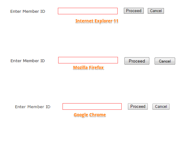
}If you minutely check the form after click on proceed then you can see that when this red border appears then the size of the input field increases (it will be easy for you if you see the position of the buttons). But this problem is not appears in Google chrome.
CASE 2: (Google)
.form-input .form-error-message,
.form-input-wide .form-error-message {
visibility:hidden !important;
}
.form-line-error input,
.form-line-error textarea,
.form-validation-error {
border: 1px solid #FF3030 !important;
-moz-box-shadow: 0 0 0 #FF3030 !important;
-webkit-box-shadow: 0 0 0 #FF3030 !important;
box-shadow: 0 0 0 #FF3030 !important;
padding: 0px !important;
}
.form-required {
color: transparent !important;
}
.form-line-error {
background: none repeat scroll 0 0;
}
#input_1{
width: 182px;
height: 21px;
padding: 0px !important;
}
If you minutely check the form after click on proceed then you can see that when this red border appears then the size of the input field shrink (it will be easy for you if you see the position of the buttons). But this problem is not appears in FF and IE.
-
JanReplied on December 8, 2014 at 9:27 AM
Hi,
I understand that you want them to work properly on all of the browsers. Well, this is something we cannot control due to a fact that each browsers have their own default styling. So far designers and developers are creating fixes or hacks in order to make css works properly on a specific browser. They use css resets or normalize css.
Normally you will see this prefix on the selectors: -webkit-, -moz-, -ms- and -o-.
Safari and Chrome // -webkit-
Mozilla Firefox // -moz-
Microsoft // -ms-
Opera // -o-
Hope this helps. Thank you.
-
members1Replied on December 8, 2014 at 9:54 AM
Hi jan;
thanks for your reply.
Safari and Chrome // -webkit-
Mozilla Firefox // -moz-
Microsoft // -ms-
Opera // -o-
But I am sorry .... I can not understand what you want to say. do you mean that I should replace -webkit- by Safary and Chrome and so on.... Please confirm me. AND if there is no solution about this problem then please confirm me also.
-
CarinaReplied on December 8, 2014 at 11:17 AM
Unfortunately as my colleague mentioned it is not possible to provide one unique solution for all browsers as they behave in different ways.
So unfortunately sometimes we need to specify the same css code for different browsers like:
-moz-box-shadow: 0 0 0 #FF3030 !important;
-webkit-box-shadow: 0 0 0 #FF3030 !important;
This is the same feature but -moz- is for Firefox and the -webkit- is to make sure it displays correctly on Safari and Chrome.
So it is necessary to use both versions so it displays correctly on the different browsers. Regarding the border size I will run further tests to get the code it is needed to solve this situation on different browsers.
Let us know if we can assist you further.
-
members1Replied on December 9, 2014 at 12:25 AM
Hi Carina;
I have used finally this CSS code and now I am able to solve *the increasing and shrinking problem related with height of the text box. I have added the GREEN SHADED area of this CSS code and it works. But I am not able to solve *the increasing and shrinking problem related with width of the text box. It is my request that if it is possible then please help me to solve this matter.
* when this red border appears then the size of the input field increases/decrease depending on the browser (it will be easy for you if you see the position of the buttons). http://www.jotform.me/form/43254872974466
textarea:focus, input:focus{
outline: 0;
}
.form-input .form-error-message,.form-input-wide .form-error-message {visibility:hidden !important;}.form-line-error input,.form-line-error textarea,.form-validation-error {
height:17px !important;border:1px; solid #FF3030 !important;-moz-box-shadow: 0 0 0 #FF3030 !important;-webkit-box-shadow: 0 0 0 #FF3030 !important;box-shadow: 0 0 0 #FF3030 !important;}.form-required {color: transparent !important;}.form-line-error {background: none repeat scroll 0 0;}#input_1{width: 188px; height: 15px; !important;}.form-submit-reset{
font-size:0;
}.form-submit-reset:after {
content: "Cancel";
font-size: 12px;
}
-
Welvin Support Team LeadReplied on December 9, 2014 at 8:08 AM
But I am not able to solve *the increasing and shrinking problem related with width of the text box. It is my request that if it is possible then please help me to solve this matter.
-Unfortunately, I don't see any problem to the textboxes. The required field error don't change the field widths. Here's a screenshot:
I'm using Windows 7 PC.
I'm trying to take a video, but I have a problem using Jing now. Will follow up for the link if it's successful.
If you can send us a screenshot of the problem, we'll be happy to check it further.
Thanks
-
members1Replied on December 9, 2014 at 8:31 AM
Hi Welvin;
I am using Windows 8.1 PC... so. I have no idea what occur in 7.
Actually at first when the red border appear in the text box then the size (Height and width) both changes but after working on the provided CSS code when I implement it then only the problem related with the height is solved but the width problem is not solved. AND THIS PROBLEM APPEARS ONLY IN FF AND GOOGLE.
## It is a little change, please check it minutely.
(it will be easy for you if you see the position of the buttons). http://www.jotform.me/form/43254872974466


-
JanReplied on December 9, 2014 at 12:09 PM
Hi,
I understand your issue regarding the width. This is both in Google Chrome.

Please add this custom CSS code in your form.
.form-validation-error { width: 190px !important; }
The original width of the input is 188px. But when you click it, the :focus outlined happened even though you set it to 0. It is 1px each side so that is 2px. So when the box is empty, the .form-validation-error activates. I put it on 190px so the width will remain the same.
Hope this helps. Thanks!
Jan
-
members1Replied on December 9, 2014 at 12:59 PM
Hi,
Thank you very much....now it is working..................... :)
I am very grateful to you for your excellent wonderful support.
-
Welvin Support Team LeadReplied on December 9, 2014 at 2:00 PM
You are welcome and it's our pleasure to help you! Please do not hesitate to get back to us if you need further assistance.
Thank you for using Jotform!
- Templates
- Integrations
- INTEGRATIONS
- See 100+ integrations
- FEATURED INTEGRATIONS
 PayPal
- Slack
- Google Sheets
- Mailchimp
- Zoom
- Dropbox
- Google Calendar
- Hubspot
- Salesforce
- See more Integrations
- Products
- PRODUCTS
- Form Builder
- Jotform Enterprise
- Jotform Apps
- Store Builder
- Jotform Tables
- Jotform Inbox
- Jotform Mobile App
- Jotform Approvals
- Report Builder
- Smart PDF Forms
- PDF Editor
- Jotform Sign
- Jotform for Salesforce Discover Now
- Support


