


-
crashtackleAsked on December 8, 2014 at 8:50 AM
Hello,
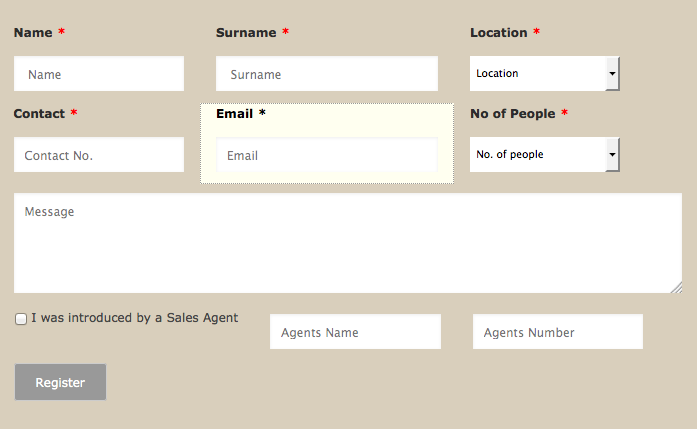
I have selected for the form to be responsive, but it does not look right on the pc... it should look like the picture attached...
but it looks different live - see link...
 Page URL: http://www.pearls.co.za/
 -
CharlieReplied on December 8, 2014 at 9:30 AM
Hi,
Can you change settings shown below to "No".
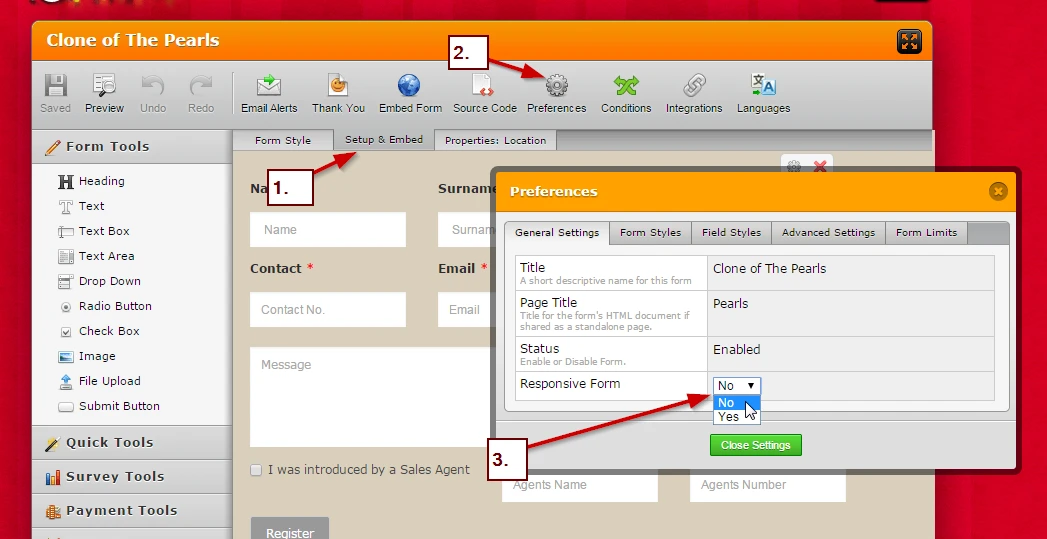
This should make your form responsive based from the mobile devices minimum width, and the default form layout should stay when viewed on a desktop.
Please note: leave the settings on the Form Designer, only change the settings shown above.
Let us know if you need further assistance on this.
Thank you.
-
crashtackleReplied on December 8, 2014 at 2:51 PM
Hello,
I have done that. Now it is not being responsive on smart phone. Looks great on ipad and PC.
-
BenReplied on December 8, 2014 at 4:27 PM
Hi,
I would suggest in this case to add our Mobile Responsive widget to your jotform to see if it will look properly for you now.
You can add it by following these steps: How to Add a Widget to your Form
Best Regards,
Ben
- Templates
- Integrations
- INTEGRATIONS
- See 100+ integrations
- FEATURED INTEGRATIONS
 PayPal
- Slack
- Google Sheets
- Mailchimp
- Zoom
- Dropbox
- Google Calendar
- Hubspot
- Salesforce
- See more Integrations
- Products
- PRODUCTS
- Form Builder
- Jotform Enterprise
- Jotform Apps
- Store Builder
- Jotform Tables
- Jotform Inbox
- Jotform Mobile App
- Jotform Approvals
- Report Builder
- Smart PDF Forms
- PDF Editor
- Jotform Sign
- Jotform for Salesforce Discover Now
- Support

