


-
kausewayAsked on December 8, 2014 at 9:13 AM
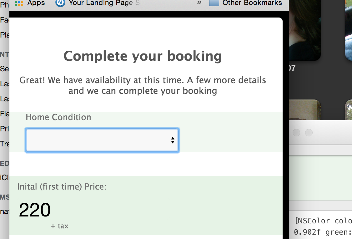
Ok so this is super picky. But I worked hard to build this form that looks great on PC or responsive. Somehow, something happened when you view it in mobile view (or shrink your PC browser window width all the way down).
This black background appears and the form is slightly scrollable left to right. Again, it is being a bit picky but I really dont want to see a black background jump up on mobile. Do you know what might be causing this? Obviously making it white would help but would be better if mobile view was 100% and not scrollable.
-
kausewayReplied on December 8, 2014 at 9:20 AM

Actual the form is slightly scrollable before going to mobile view. See the thin blue border top and right. I would like that to go away. But when you shrink it enough that blue turns to black.
-
valReplied on December 8, 2014 at 10:02 AM
Hi kauseway,
Please try remove your width "600px" on your "form-all" elements.
Find this code and remove it.
width: 600px;
Thanks.
-
kausewayReplied on December 8, 2014 at 10:12 AM
I didnt see that under form all in the css. ON the design tab I tried taking away 600 max and it did nothing.
-
valReplied on December 8, 2014 at 10:53 AM
Hi kauseway,
If you have added this to your site could you please share with us your site link or try this option add margin in your left/right.
Put this on your ".form-all"
margin: 0 10px 0 10px;
like this
.form-all {
margin: 0 10px 0 10px;
}
Thanks.
-
kausewayReplied on December 8, 2014 at 12:00 PM
That makes it worse. The black is now on the left? I removed it.
-
CharlieReplied on December 8, 2014 at 2:01 PM
Hi,
Upon checking it your form. I believe because you have indicated a lot of CSS styling, and has a specific style for the media screen of min-width 480px, below that there's no more background color that supports that display, that's why it turns to black.
In my sample form, the black is not anymore present. But it does have a weird border on it.
http://form.jotformpro.com/form/43414831734958

I changed the min-width to 250px to cater the display size of the device. You also have a lot of specific displays set up, which probably makes it hard for the form to be responsive.
Let me know what you think.
Thank you.
- Templates
- Integrations
- INTEGRATIONS
- See 100+ integrations
- FEATURED INTEGRATIONS
 PayPal
- Slack
- Google Sheets
- Mailchimp
- Zoom
- Dropbox
- Google Calendar
- Hubspot
- Salesforce
- See more Integrations
- Products
- PRODUCTS
- Form Builder
- Jotform Enterprise
- Jotform Apps
- Store Builder
- Jotform Tables
- Jotform Inbox
- Jotform Mobile App
- Jotform Approvals
- Report Builder
- Smart PDF Forms
- PDF Editor
- Jotform Sign
- Jotform for Salesforce Discover Now
- Support


