


-
kausewayAsked on January 1, 2015 at 7:06 PM
I would like to add radio buttons to my site. But I am also trying to make sure it fits on iphone view without scrolling. So I want it to be responsive. The form works great but once I add the radio buttons the phone view has to scroll. I noticed there was a width and height in the properties section but it did not seem to do anything.
Is there anyway I can get this to be 100% width so it will fit all screens?
http://form.jotformpro.com/form/50005155818954
-
Elton Support Team LeadReplied on January 1, 2015 at 10:14 PM
Hi,
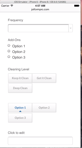
I checked your form on iPhone 6 simulator and it is not showing horizontal scroll bars. It's even working fine and responsive, maybe because the way radio buttons is setup now is arranged in two columns which reduces width which is I think much better to prevent scroll bars.
Here's a screenshot:
Let us know should you have further questions. Thank you!
-
kausewayReplied on January 1, 2015 at 11:28 PM
Yes I got it to work if I have 2 rows which doesnt look great. I want to have it 3 across but then it has scroll bars. Anyway to make it responsive and have all three buttons on 1 row? Or have the 3rd button drop down when it gets to narrow??
-
TitusNReplied on January 2, 2015 at 6:17 AM
Hello,
I'm afraid because the widget is loaded from a separate server from your form, it can be hard to make it respond to the form width.
May I suggest adjusting the three buttons such that it fits both mobile and desktop screens?
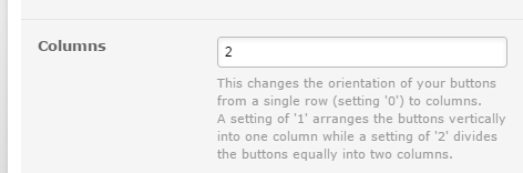
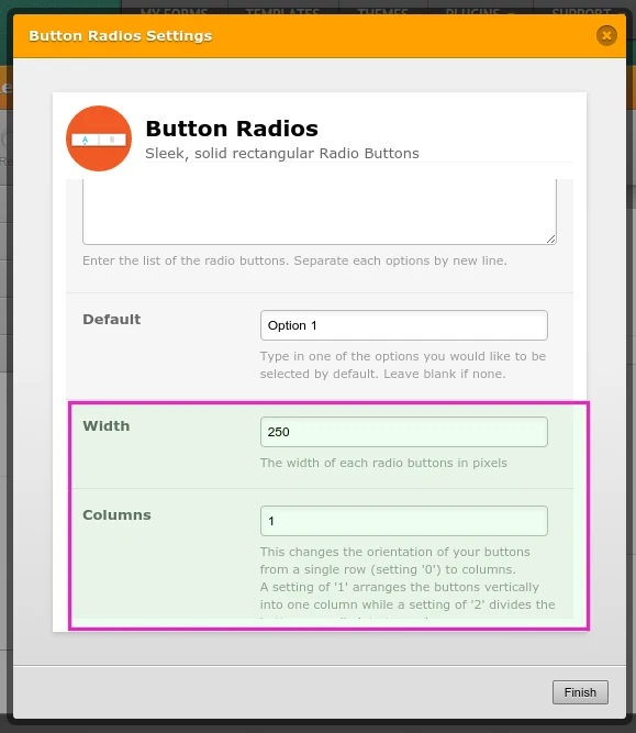
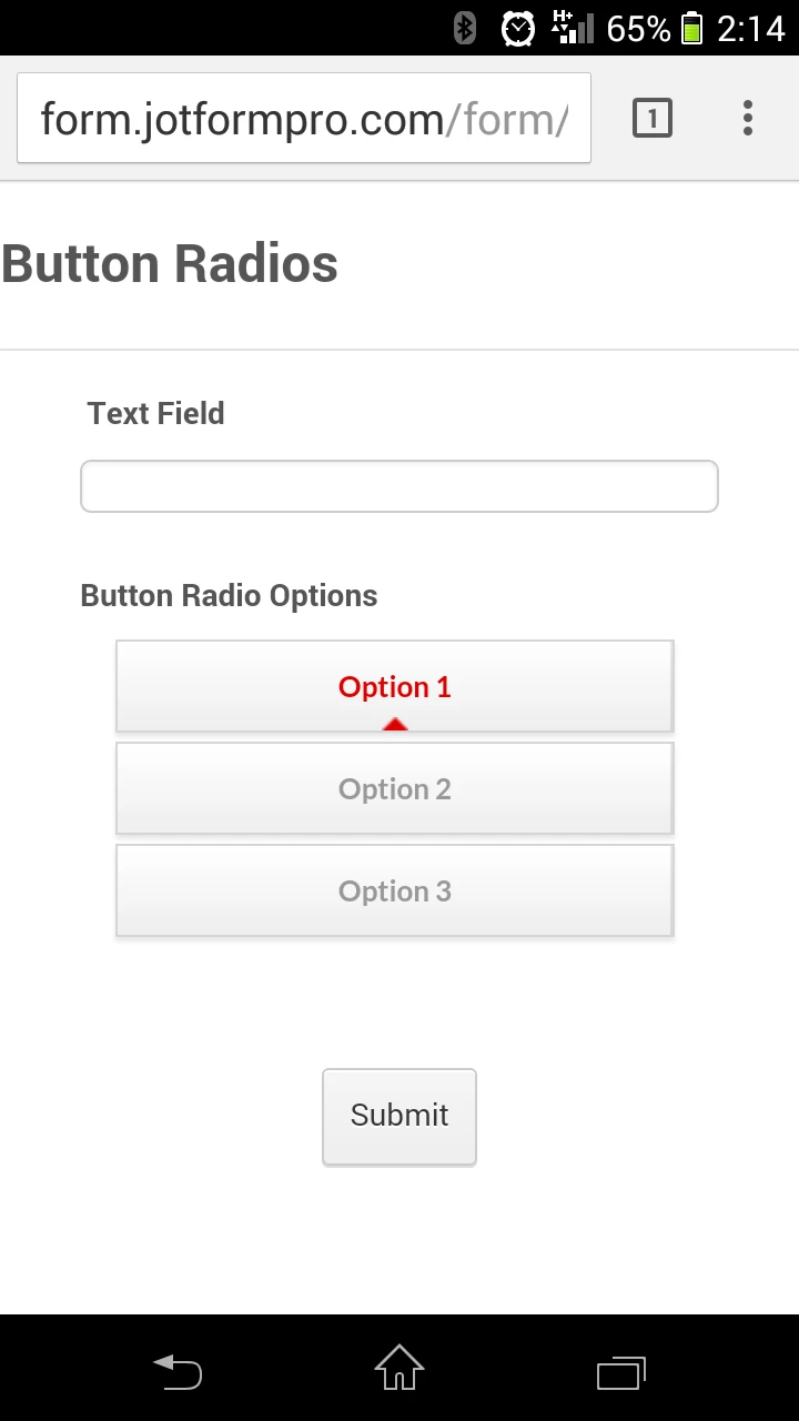
1. Arrange the buttons into one Column and set the width to 250px:
2. Set the Label on Top, and align the button radios to the center of the form:

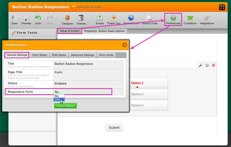
3. Then set your form to be mobile responsive:
http://form.jotformpro.com/form/50012628416951?
Does that help?
Please let us know.
- Templates
- Integrations
- INTEGRATIONS
- See 100+ integrations
- FEATURED INTEGRATIONS
 PayPal
- Slack
- Google Sheets
- Mailchimp
- Zoom
- Dropbox
- Google Calendar
- Hubspot
- Salesforce
- See more Integrations
- Products
- PRODUCTS
- Form Builder
- Jotform Enterprise
- Jotform Apps
- Store Builder
- Jotform Tables
- Jotform Inbox
- Jotform Mobile App
- Jotform Approvals
- Report Builder
- Smart PDF Forms
- PDF Editor
- Jotform Sign
- Jotform for Salesforce Discover Now
- Support


