


-
baysidejournalAsked on January 5, 2015 at 3:56 AM
I m using the wonderful looking and easily created form which i m using to take feedback from my users. Bayside Journal <www.baysidejournal.com> is my website. It works completely fine on the laptop screens but the on smartphones it doesn't open properly and the user is unable to fill the form.
Basically it is not acting responsive.
Can you help me? I m using WordPress plugin.
-
KadeJMReplied on January 5, 2015 at 10:16 AM
I've investigated your issue some more involving the feedback jotform on your website that I can confirm isn't showing displaying on mobile devices properly.
I checked this in comparison with your website to my iphone and I noticed that your jotform has "extremely wide" inputs. So currently because of that I am under the impression that this may be counteracting the it when it's viewed on mobile devices.
On your form itself I saw that you have the mobile response widget + the form responsiveness in your form preferences. You only need one or the other. One is applied as a widget and the other is applied more straight forward through the form preferences which is also associated with the theme designer.
I would suggest to try one or the other to see if that fixes it. The default option for it on my end in your form preferences made this fit better on my end but you will need to test that further within your jotform since it's embedded.
If this problem continues please let us know so we can help you further.
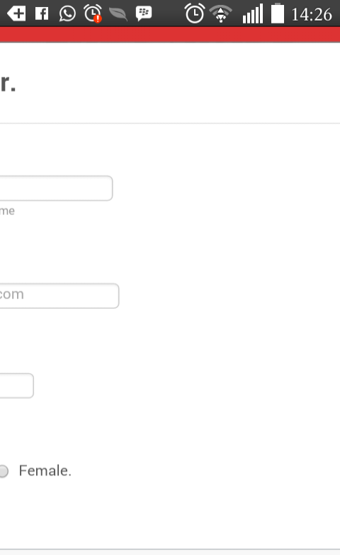
Your live jotform is extremely wide:
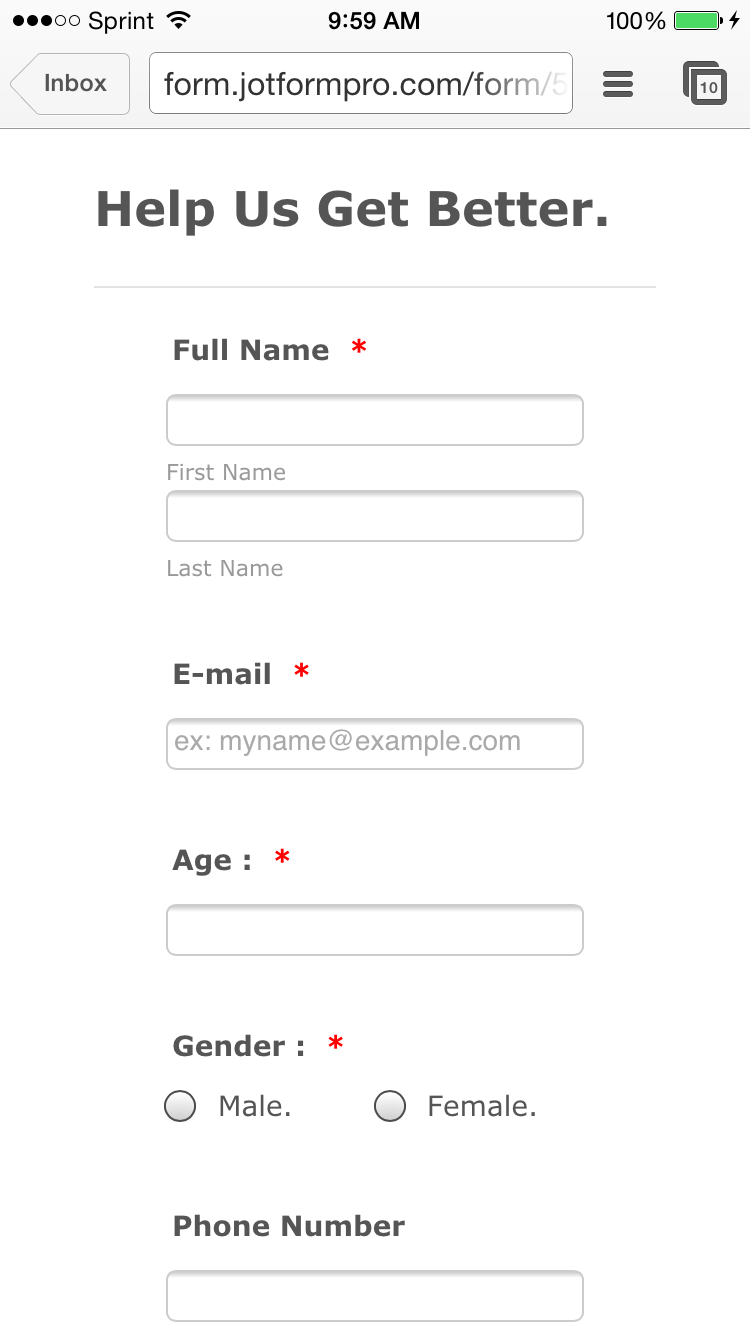
Mobile on your Website:

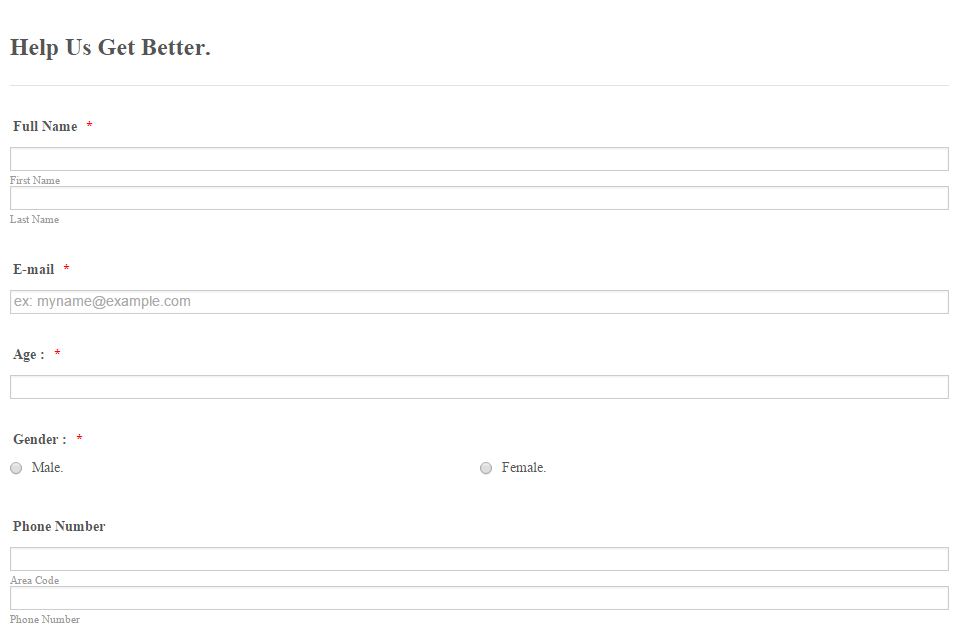
Responsiveness (In Preferences):
- Templates
- Integrations
- INTEGRATIONS
- See 100+ integrations
- FEATURED INTEGRATIONS
 PayPal
- Slack
- Google Sheets
- Mailchimp
- Zoom
- Dropbox
- Google Calendar
- Hubspot
- Salesforce
- See more Integrations
- Products
- PRODUCTS
- Form Builder
- Jotform Enterprise
- Jotform Apps
- Store Builder
- Jotform Tables
- Jotform Inbox
- Jotform Mobile App
- Jotform Approvals
- Report Builder
- Smart PDF Forms
- PDF Editor
- Jotform Sign
- Jotform for Salesforce Discover Now
- Support

