


-
ptn0301Asked on February 3, 2015 at 6:06 AM
Hi,
Our submit button is missing on an iphone 4s however it displays correctly on another iphone4?? Also an iphone 5 is fine.
These forms are vital to our business and the constant issues we have with mobile devices displaying is causing too many headaches. It might be time to call it day for us.
regards
-
Elton Support Team LeadReplied on February 3, 2015 at 11:38 AM
Hi,
I can't seem to find a Jotform on the page you have provided with us. Would you mind giving us directions to where we can view the Jotform so we can check and inspect it here? This would help us identify the problem.
We'll await your reply. Thank you!
-
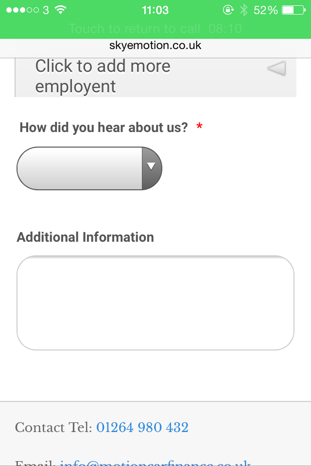
ptn0301Replied on February 18, 2015 at 6:22 AM
HI sorry for delay.
We have another form ( found here http://www.skyemotion.co.uk/personal-loans.html ). In it are expandable items such as 1 form collapse and some hidden fields with conditions.
When they are all open it pushes the the items down and the disappear....
It doest expand the webpage as the form gets larger due to uncompressing the items??
screen shot attached.
Regards
Paul
.PNG)
-
BenReplied on February 18, 2015 at 11:11 AM
I see the issue.
Please add the following right above the jotform iframe:
<style type="text/css">
media screen and (max-width: 480) {
#JotFormIFrame {
min-height: 4822px;
}
}
</style>This should resolve your issue with it being cut at the bottom, while it would only be applied when viewed over mobile device.
Do let us know how it goes.
-
ptn0301Replied on February 18, 2015 at 5:55 PM
When you say right above do you mean something like this. . .
<style type="text/css">
media screen and (max-width: 480) {
#JotFormIFrame {
min-height: 4822px;
}
}
</style><iframe id="JotFormIFrame" onDISABLEDload="window.parent.scrollTo(0,0)" allowtransparency="true" src="https://secure.jotformpro.com/form/...........
rest of code .
-
David JotForm Support ManagerReplied on February 18, 2015 at 8:59 PM
That is correct, did it solve the issue?
-
ptn0301Replied on February 19, 2015 at 4:52 AM
Thanks for reply but no. The bottom half of the form is still missing when all expandable fields are open.
-
Ashwin JotForm SupportReplied on February 19, 2015 at 9:43 AM
Hello ptn0301,
Have you tried enabling the scrolling of your iFrame emebd code? Please sue the following iFrame embed code and see if this solves your problem:
<iframe id="JotFormIFrame" onDISABLEDload="window.parent.scrollTo(0,0)" allowtransparency="true" src="https://secure.jotformpro.com/form/50131869571962" frameborder="0" style="width: 100%; height: 2702px; border: none;" scrolling="yes"></iframe>
Thank you!
-
mypachisReplied on March 10, 2015 at 7:52 PM
I was able to make this work by giving each registration form iFrame a unique class and then adding the following to my css file.
The only downside is that you need to create unique classes for each registration form if you have more than one.
@media (max-width: 480px) {
.registration-form-iframe {
min-height: 4650px;
}
}
-
SeanReplied on March 10, 2015 at 9:54 PM
I can see that the issue is now resolved. I checked your form on the iPhone 4S and it displays just fine. I am glad that you came up with a solution to make this work.
If you ever need further assistance from us, don't hesitate to ask. We will always be here for your support.
- Templates
- Integrations
- INTEGRATIONS
- See 100+ integrations
- FEATURED INTEGRATIONS
 PayPal
- Slack
- Google Sheets
- Mailchimp
- Zoom
- Dropbox
- Google Calendar
- Hubspot
- Salesforce
- See more Integrations
- Products
- PRODUCTS
- Form Builder
- Jotform Enterprise
- Jotform Apps
- Store Builder
- Jotform Tables
- Jotform Inbox
- Jotform Mobile App
- Jotform Approvals
- Report Builder
- Smart PDF Forms
- PDF Editor
- Jotform Sign
- Jotform for Salesforce Discover Now
- Support


.PNG)


