


-
travis1Asked on February 11, 2015 at 3:56 PM
Hello there, I need some quick help please.
I have several sites that collect car insurance quotes.
Here is what I need to accomplish:
They enter two pieces of info: Name and Zip and then below that is a wide button that says "Get Rates"
Once they click that button, they are taken to the rest of the questions (that were hidden from them originally)
At the bottom of the remainder questions, they will hit a wide button like the first that says "Quote Me"
This will take them to a thank you page, and send the data to me.
-Where I need help:
I have tried to do this with a "page break" as well as a collapsable form. Both look extremely ugly and I have not been able to get them centered or make them look good. They are too wide, or the words don't fit etc... just seems REALLY buggy.
I use the code I have on a wordpress site, and it looks "decent" at best. But the buttons DO NOT show up on our mobile site for some reason.
I also have a weebly site, which again looks decent, but none of that form shows up on mobile at all.
About 50% of my customers are on mobile, thank you so much for your quick reply. We have been with you guys for a few years now.
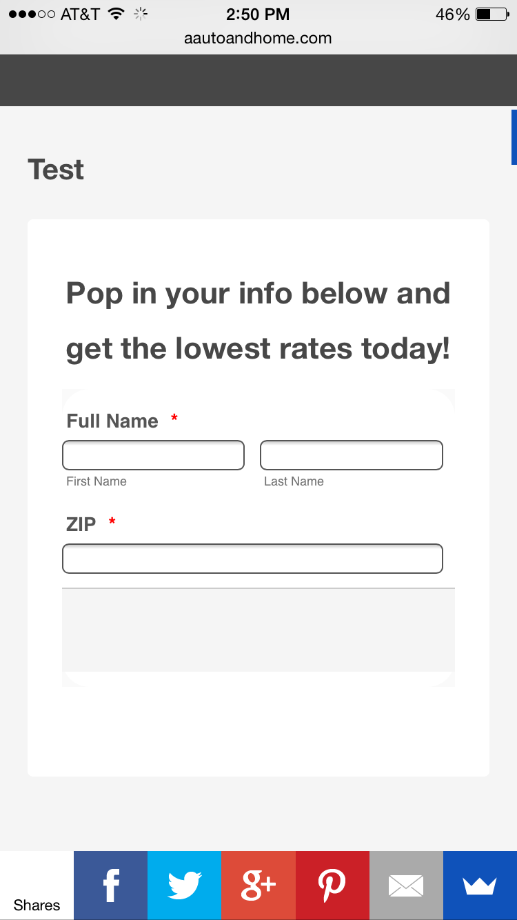 Page URL: http://aautoandhome.com/test-2/
 -
SeanReplied on February 11, 2015 at 9:50 PM
I viewed your form on a mobile device I was able to replicate your issue. The collapse field that was added really does not go well with the form. I cloned your form, replace the collapse field with a page break field and added some CSS codes to address the display issues. Base of my checks it appears that the buttons for the page break field was too large so they were not displayed on mobile devices. I injected the CSS codes below:
#form-pagebreak-next_20{
margin-left: 50px !important;
}.form-all .form-pagebreak-back-container, .form-all .form-pagebreak-next-container {
padding: 10px 0 !important;
}I also made changes to the width and height of the buttons in the page break field through the form designer interface.
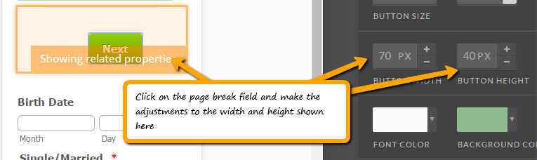
Here is my cloned form with the modifications made:
http://form.jotformpro.com/form/50416633363956?
You can clone my form via URL if your follow this guide. I hope this helps. Feel free to contact us if further assistance is needed.
Cheers!
- Templates
- Integrations
- INTEGRATIONS
- See 100+ integrations
- FEATURED INTEGRATIONS
 PayPal
- Slack
- Google Sheets
- Mailchimp
- Zoom
- Dropbox
- Google Calendar
- Hubspot
- Salesforce
- See more Integrations
- Products
- PRODUCTS
- Form Builder
- Jotform Enterprise
- Jotform Apps
- Store Builder
- Jotform Tables
- Jotform Inbox
- Jotform Mobile App
- Jotform Approvals
- Report Builder
- Smart PDF Forms
- PDF Editor
- Jotform Sign
- Jotform for Salesforce Discover Now
- Support

