-
eeeo_edAsked on February 19, 2015 at 9:28 PM
-
CharlieReplied on February 19, 2015 at 11:20 PM
Hi,
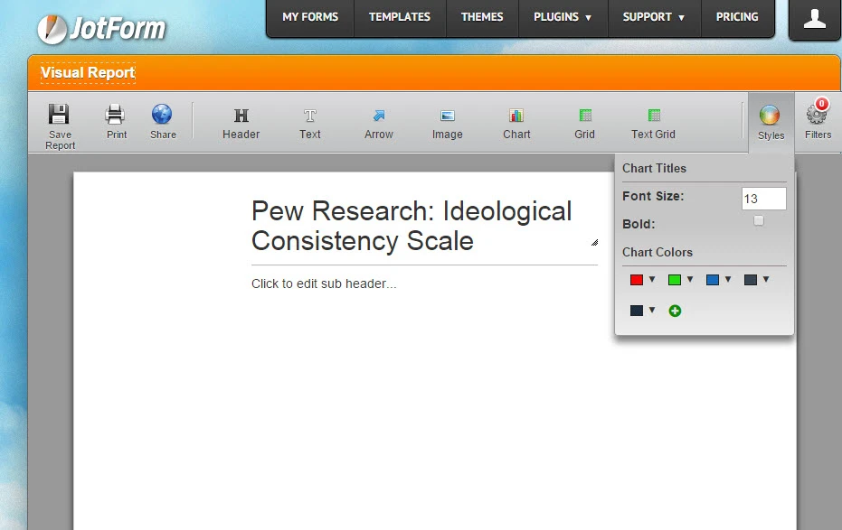
Could you try again changing the colors, here's how I did mine:

Make sure to change the color under the "Color" option. Then click the save button to save it.
Do let us know if this works the second try.
Thank you.
-
eeeo_edReplied on February 20, 2015 at 11:34 AM
1. Yes, that does work, but if I have 10 of these pie charts in a report, I have to copy and paste the colour code separately into each chart. Can you not set a default colour scheme in that top right "Style" menu?
2. Will there be any possibility of changing the colours in bar charts?
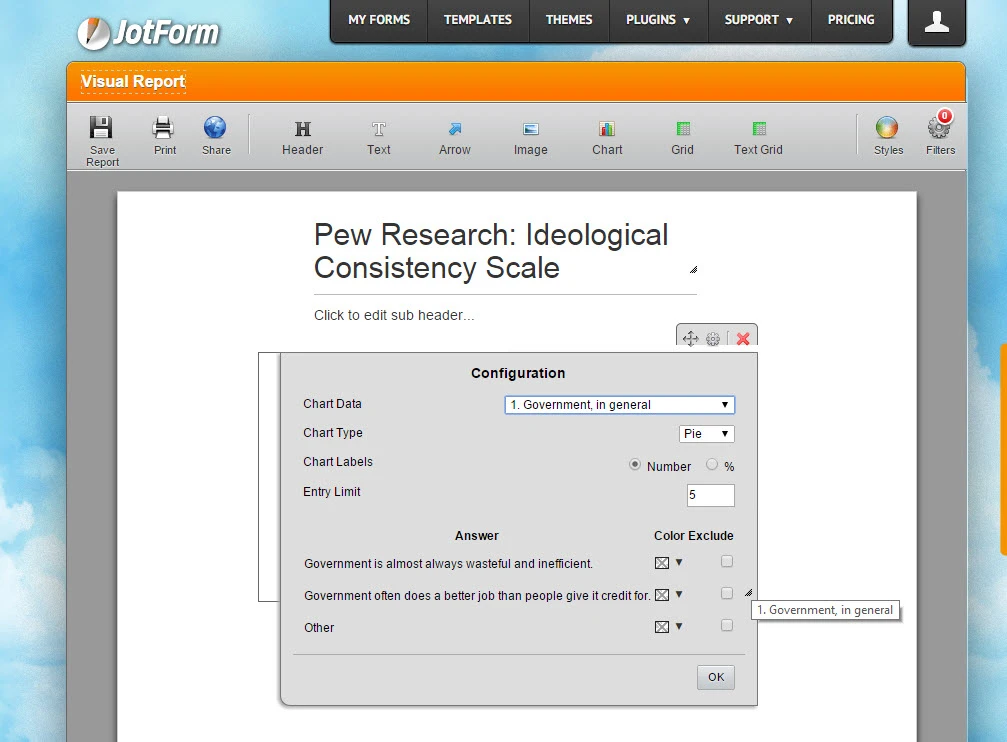
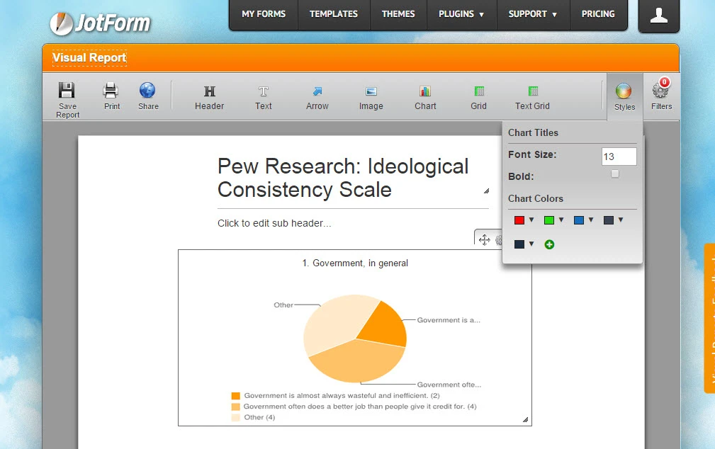
3. The labels on the pie chart that point to what each slice is called are redundant since the legend is already below each chart. Is there any way to stop them from appearing? A feature with PiktoChart and Infogram is that when you embed a chart, those labels for each slice/bar only appear when you hover over them; otherwise they are invisible. The other option those provide is to have the values appear as static values in each slice/bar.
-
CharlieReplied on February 20, 2015 at 1:14 PM
Hi,
Unfortunately, the Visual Report builder has limited options in customizing the colors in the bar chart and there is no styling theme or color theme for it. The labels cannot be edited that same way how it is presented in PiktoChart. You could try using the Google Spreadsheet integration and create charts from there, it will give more customization and advance options.
For now, what I could do is open a feature request for it to allow more customization on the Visual Report builder. Please do take note that I'm unable to provide an estimated date for when this will be implemented or be considered. But rest assure that our developers are already aware of this.
Thank you.
-
eeeo_edReplied on February 20, 2015 at 3:24 PM
-
exchangepressReplied on May 7, 2015 at 1:09 PM
-
CharlieReplied on May 7, 2015 at 1:22 PM
@exchangepress,
Unfortunately, it seems like this will not be implemented anytime sooner, but the developers are already aware of this. I've opened a separate thread for you so that we can add you in the list of people requesting this. Please refer to this link instead: http://www.jotform.com/answers/565870.
Thank you.
- Templates
- Integrations
- INTEGRATIONS
- See 100+ integrations
- FEATURED INTEGRATIONS
 PayPal
- Slack
- Google Sheets
- Mailchimp
- Zoom
- Dropbox
- Google Calendar
- Hubspot
- Salesforce
- See more Integrations
- Products
- PRODUCTS
- Form Builder
- Jotform Enterprise
- Jotform Apps
- Store Builder
- Jotform Tables
- Jotform Inbox
- Jotform Mobile App
- Jotform Approvals
- Report Builder
- Smart PDF Forms
- PDF Editor
- Jotform Sign
- Jotform for Salesforce Discover Now
- Support