
-
formvendorAsked on February 28, 2015 at 12:41 PM
(2) I have modified your tabs-list widget to make it vertical and responsive. I have it to the left of the "form-sections" of my multiple page employment application template. Part of the styling in {issue #1} included my attempts to make it all render correctly including applying {width: 70% !important; left: 20% !important;} first to .form-section, then to ul.form-section and then to .form-line, .form-input-wide, .form-pagebreak etc. I had hoped that all of the div's would adhere to their width of their containers... but for some reason they aren't.
-
Welvin Support Team LeadReplied on February 28, 2015 at 12:45 PM
Hi,
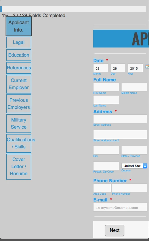
Well, I saw the changes in the form and as far as I could see it, it's working. Here's a screenshot of how I saw it:
Adding !important should override the default styling of the widget. The employment application section is not related to the widget and I'm looking if what I can do about it. I have cloned your form. Will get back to you.
Thanks
-
Welvin Support Team LeadReplied on February 28, 2015 at 12:59 PM
So, how's this form: http://www.jotformpro.com/form/50584677359975 ? This is my clone version. Kindly check.
Thanks
-
formvendorReplied on February 28, 2015 at 2:23 PM
Starting to take shape! At long last the elements are staying within their containers width! :)
With that in place- these are the issues that remain (related only to this ticket):
**There are other issues- text size, textbox size, etc. but i'll hold onto those for now**
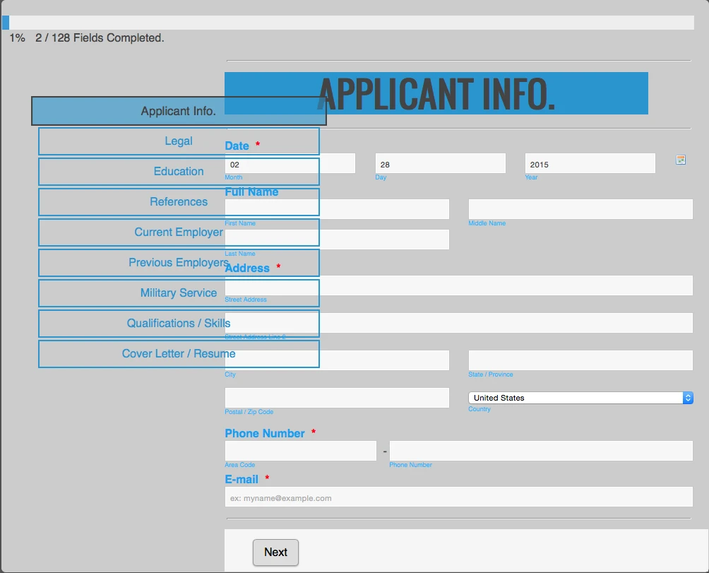
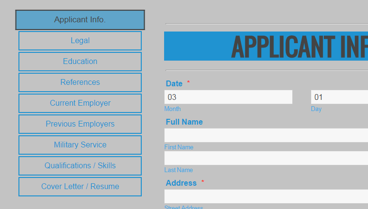
(1) While I understand that the tab menu isn't related to form-sections- for cross-browser/platform rendering - I think that it's horizontal positioning has to be relative to form-sections. Otherwise it breaks in both mobile and on a wider desktop. See below:
On Mobile
On Wide Desktop
-
formvendorReplied on February 28, 2015 at 2:31 PM
So I think they will have to be horizontally positioned relative to one another, or relative to the viewport.
But what I meant in my original question by vertically aligned is that I would like the tabs-menu and the form-section to align vertically at the top (e.g. spacing between .tabs-menu and % completion is identical to spacing between .form-section and % completion which is also identical to the language picker.
-
BenReplied on February 28, 2015 at 6:47 PM
I am not sure if I am correct, but it seems to me that you would like to have the tabs menu equally away from the progress bar as the form section is (header)?
Looking at the jotform my colleague did, this seems to be so as it is - which is why I am not sure that I understood what you would like to achieve.

It should be slightly adjusted either to the black line above or the blue rectangle under it, but it is almost aligned. Is that what you mean?
If so to which do you want it to be aligned to? To be raised to align with the black line or to be lowered to align with the blue header?
Once it is set up how it should look on the desktop we can help you set it up for other devices as well.
-
formvendorReplied on February 28, 2015 at 7:34 PM
Hey Ben,
Yes- it should line up with the black line, both in mobile and in desktop.
But here is the challenge (for which there is a separate ticket) - The "APPLICANT INFO." heading is a FitText Widget, which for some reason isn't functioning right now.
So lining the tabs up perfectly with the non-functioning FitText element will be perfect- up until that widget is actually fixed. Then the text within it and subsequently it's container will expand/contract with the viewport.
Not sure which comes first- "the chicken or the egg". Just let me know what you think we should do next.
Thank you for taking the time to respond.
- Templates
- Integrations
- INTEGRATIONS
- See 100+ integrations
- FEATURED INTEGRATIONS
 PayPal
- Slack
- Google Sheets
- Mailchimp
- Zoom
- Dropbox
- Google Calendar
- Hubspot
- Salesforce
- See more Integrations
- Products
- PRODUCTS
- Form Builder
- Jotform Enterprise
- Jotform Apps
- Store Builder
- Jotform Tables
- Jotform Inbox
- Jotform Mobile App
- Jotform Approvals
- Report Builder
- Smart PDF Forms
- PDF Editor
- Jotform Sign
- Jotform for Salesforce Discover Now
- Support