


-
rocker93rockAsked on March 9, 2015 at 12:16 AM
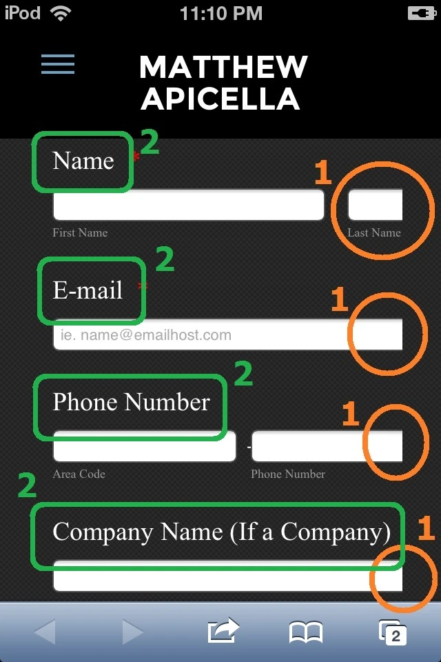
(1) Most of my form fields are cut off, and you can't scroll right or left to see the rest of the field, like Name, E-mail, Phone Number, Company Name, etc (responsive/mobile design) {see image #1}*. http://mva86.weebly.com/get-a-quote.html
(2) The font is different in mobile browser then on the desktop. The desktop version font is Tahoma, but mobile is Serif (Times New Roman, Georgia, etc) {see image #2}*. I would like the font to Tahoma, not a Serif font.
Is this a JotForm issue or Weebly issue, if JotForm, how to fix this?
* Free website from Weebly.
Screenshot, of mobile Safari and iOS.
 Page URL: http://mva86.weebly.com/get-a-quote.html
 -
Elton Support Team LeadReplied on March 9, 2015 at 4:48 AM
Hi,
Remove the float:left css property you have injected to your form. This should fixed the problem.
If you want to align the form to the left, using margin-left:0.
Example, your current CSS is this.
.form-all {
float: left;
margin-top: -28px;
margin-left: 0;
}
The fields should then look like this.
---
Regarding on the font issue, it is the iOS that does not render Tahoma. http://iosfonts.com/
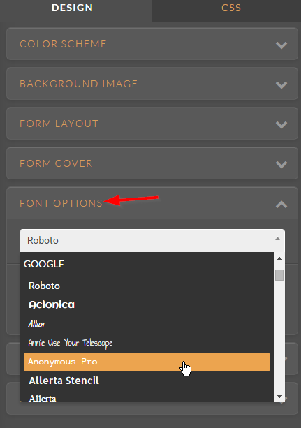
Use Arial instead of Verdana. If you want custom fonts, load your form into the form designer and select the fonts you want in the fonts section.
Hope this helps. Thank you!
-
rocker93rockReplied on March 9, 2015 at 10:16 AM
Hi EltonCris:
I tried the CSS you mentioned:
.form-all {float: left;
margin-top: -28px;
margin-left: 0;
}
but that did not work, same problem {see image #1}
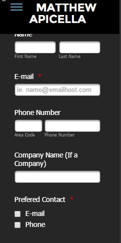
Also is there a way to make the label font smaller in mobile browsers, because some are cut off {see image #2}. Just the label, not the sub label font.
Screenshot, of mobile Safari and iOS.

Page URL:
http://mva86.weebly.com/get-a-quote.htmlemulator shows it fine
(http://www.responsinator.com/?url=http%3A%2F%2Fmva86.weebly.com%2Fget-a-quote.html)
-
Elton Support Team LeadReplied on March 9, 2015 at 11:12 AM
Ok, we'll check this further and get back to you. Stay tuned! :)
-
Elton Support Team LeadReplied on March 9, 2015 at 12:06 PM
I have fixed it for your convenience. You can check your form now.
Here's the CSS codes I used.
.form-all {margin-left: 0; margin-right: 0; margin-top: -28px;}
@media screen and (max-width:480px){
.form-all{
width:80% !important;
}
.form-line-column, .form-line {
width: 100% !important;
box-sizing: border-box !important;
-webkit-box-sizing: border-box !important;
}
.form-radio-item label, .form-checkbox-item label {
white-space:normal !important;
}
.form-textarea{
max-width:100% !important;
width:100% !important;
}
}
There is about 50 pixel cut on the right side of the form due to the margin spacing on the left side of your page which counts during the mobile rendition of the form.
Thanks!
-
rocker93rockReplied on March 9, 2015 at 2:33 PM
Hi EltonCris:
Thank you for the response.
Your code worked if responsive is turned off and I modified the code you injected (in red).
.form-all {margin-left: 0; margin-right: 0; margin-top: -28px;}@media screen and (max-width:480px){
.form-all{
width:80% !important;
}
.form-line-column, .form-line {
width: 100% !important;
box-sizing: border-box !important;
-webkit-box-sizing: border-box !important;
}
.form-radio-item label, .form-checkbox-item label {
white-space:normal !important;
}
.form-textarea{
max-width:100% !important;
width:60% !important;
}
label{
width:90% !important;
}
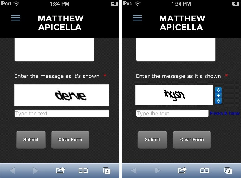
}I am still having a problem with the Captcha part not showing the entire picture and reload, audio, and question mark.
I would like it to show like the image on right, not how it is currently showing on the left {see image}.
Page URL:
http://mva86.weebly.com/get-a-quote.html -
jonathanReplied on March 9, 2015 at 3:57 PM
Thank you for taking the time to update us on the results.
As to the other issue on the Captcha field, we will resolve it here http://www.jotform.com/answers/529889
Thanks.
- Templates
- Integrations
- INTEGRATIONS
- See 100+ integrations
- FEATURED INTEGRATIONS
 PayPal
- Slack
- Google Sheets
- Mailchimp
- Zoom
- Dropbox
- Google Calendar
- Hubspot
- Salesforce
- See more Integrations
- Products
- PRODUCTS
- Form Builder
- Jotform Enterprise
- Jotform Apps
- Store Builder
- Jotform Tables
- Jotform Inbox
- Jotform Mobile App
- Jotform Approvals
- Report Builder
- Smart PDF Forms
- PDF Editor
- Jotform Sign
- Jotform for Salesforce Discover Now
- Support


