


-
axcbizAsked on March 19, 2015 at 12:08 PM
Hi everyone
If I change any item in the designer, for example the color, my layout of the form gets mashed up. Here is what I did:
1. Cleaned out any code of custom css code in the "Inject Custom CSS" Field in the forms property
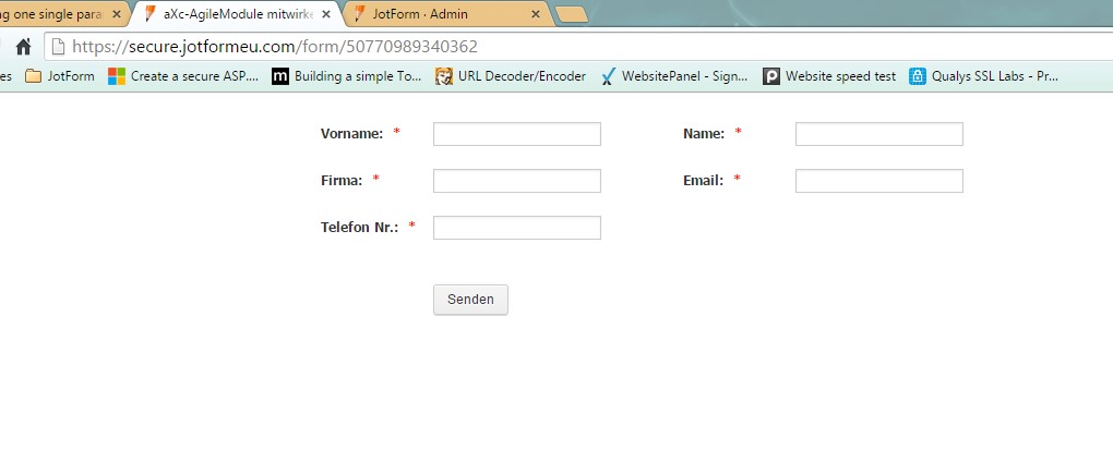
2. went into the designer and look at the preview, everything looked fine:

3. Changed the background color in the designer to red and went again into the preview. That's what I got:

Does anyone have an idea why the form is shown as above?
Furthermore I realised that after changing the bg color the "Inject Custom CSS" Field has lots of lines of CSS code included.
Many thanks for your help and best Regards,
Diego
-
raulReplied on March 19, 2015 at 1:49 PM
I'm sorry for the trouble caused to you.
By default, the form designer adds some CSS code to make the form look better on mobile devices.I've checked the current version of your form and this is how I see it.
Is this how you want your form to look like in terms of the field positioning?
If so, try to open the form in the designer again and enable the form columns.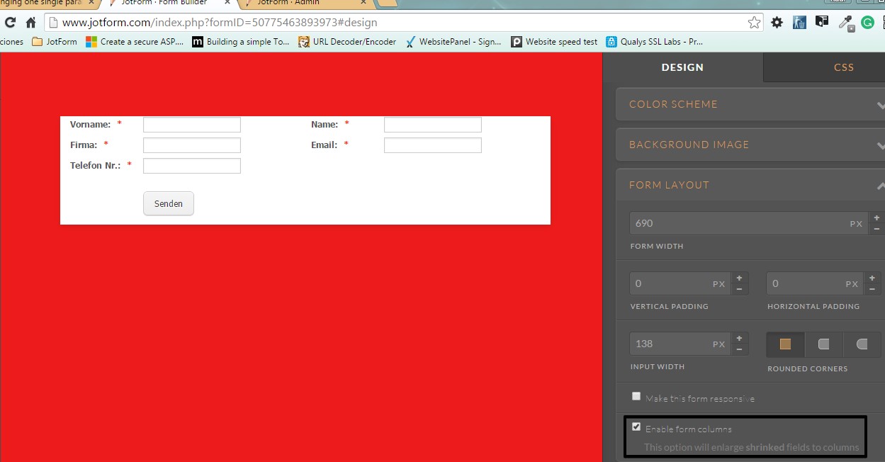
Your form should look like this:
Let us know if this is what you want to accomplish.
Thanks. -
axcbizReplied on March 20, 2015 at 5:48 AM
Hi Raul
Thanks a lot for your answer.
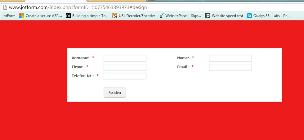
Refering to your first screenshot, yes this is actually what I would like my form to look like. So in the left "row" three fields with label names Left and on the right "row" two fileds with label names left again. If possible with less space between the two rows. Could that be achieved?
Enabling colums does unfortunately not bring any improvement, the form does still mash up the layout when viewing at it thorugh the preview in the designer as well as on the website embeded through a iFrame, see here. I'm still speaking about viewing at the form through a smartphone. Looking at it throug desktop or pad still works good.
Speaking of designing the form: At the end it should been shown with a transparent background. The red background I only choosed as an example.
In general, I realized that whenever changing anything within the designer, custom css code is automatically added to the forms property. Even if only one thing is beeing changed. Actualy it's quite a lot of code that is beeing generated.
Thanks for your further assitance and best Regards,
Diego
-
raulReplied on March 20, 2015 at 10:19 AM
Please check the following cloned version of your form: http://form.jotformpro.com/form/50783701457963
I've added the mobile responsive widget to it and set the background to transparent.
Let us know if this is how your form should look like when viewed on mobile devices, if so feel free to clone the form to your account.
-
axcbizReplied on March 20, 2015 at 11:18 AM
Hi Raul
Thanks for your answer and cloning the form. But honestly I'm expecting the form to not be a responsive form. It should been shown on any device in two "rows", the label names left from the input field, transparent background and aligned on the top conrer left. I have a seconde question open in which I was decribing that the same form does act responsive while looking at it on a smartphone although responsive option is switched of. See this question.
But actually we're drifting apart here from the original question. I'm still having problems to understand why one single change in the designer does mash up the layout of a form. To better describe here is what I did:
1. Cloned in your new form
2. Deleted the mobile responsive widget and set the options responsive form in the form properties as well as on the designer to off
3. Cleaned anything out of the form properties / Tab Formular-Stile / Field Inject Custom CSS
4. Went in the designer's preview and everything was shown as expected
5. Went back to the designer, changed ONLY the background color of the form
6. Saved the changes and got back into the preview. The result:
- The form on the mobile phone portrait mode is not shown in rows anymore
- The first input field and the last one are somehow shifted more right than the othersLooking at the form with the smartphone I got the same result. In the Propertie / Formular-Stiel / Field Inject Custom CSS I now fiund quite a big code snipet and if I delete it, the form is shown again correctly, but the changes in the background color are made undone as well.
So my question is: Why does one single change in the designer change the "layout" of the form? That actually makes no sense to me. I would rather expect that a change in the desinger would only add custom css code that refer only to the changes made.
Thanks for looking at it again and I'm looking forward to your answer.
Best Regards,
Diego
-
raulReplied on March 20, 2015 at 12:51 PM
As I mentioned earlier the form designer add some custom CSS code in the form automatically every time you save any changes in it. However, as you already noticed it can be removed if you want to.
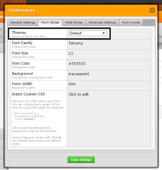
Since you don't want your form to be responsive please try to change the theme of your form to the Default theme since the SuperNova theme is set to be responsive.
I suggest you to make the changes within the form builder since if you open the form in the form designer the CSS code will be added again automatically. I've updated the cloned version of your form by removing the mobile responsive widget and the form looks the same way regardless the width of the screen.
You should be able to make any changes to your form either using the properties on the form builder or injecting custom CSS and we're always here to help if needed.
-
axcbizReplied on March 23, 2015 at 6:45 AM
Hi Raul
Thanks for your reply and your information. I reimported your form (http://form.jotformpro.com/form/50783701457963) and checked it on my smartphone. Here's what I got in portrait mode:

An here how it looks like in landscape mode:

To me it seems as if the form still is repsonsive and some input fields do look different when switching between portrait and landscape view.
Anyhow, for the moment that's fine for me. For further steps regarding a "none responsive" design I hook up in my other question.
If I would need further assitance I would come back to this again.
Thanks a lot and best regards,
Diego
-
raulReplied on March 23, 2015 at 9:40 AM
Ok, you're welcome.
We'll be here in case you need our help again.
Best Regards.
- Templates
- Integrations
- INTEGRATIONS
- See 100+ integrations
- FEATURED INTEGRATIONS
 PayPal
- Slack
- Google Sheets
- Mailchimp
- Zoom
- Dropbox
- Google Calendar
- Hubspot
- Salesforce
- See more Integrations
- Products
- PRODUCTS
- Form Builder
- Jotform Enterprise
- Jotform Apps
- Store Builder
- Jotform Tables
- Jotform Inbox
- Jotform Mobile App
- Jotform Approvals
- Report Builder
- Smart PDF Forms
- PDF Editor
- Jotform Sign
- Jotform for Salesforce Discover Now
- Support


