


-
astanchfield13Asked on March 20, 2015 at 1:23 PM
I have designed a site that I would like to look the same on mobile devices the same as web browsers. The webpage is finally displaying exactly how I like however when I view it on iPhone the iframe is extremely larger. how do I control this?
Here is a link to my dev page.
http://ssworkshop247.com/_new_template/

-
CarinaReplied on March 20, 2015 at 2:58 PM
Please try adding this css code:
@media screen and (max-width: 320px) {
.form-all {
max-width:310px;
}
iframe {
max-width:310px;
}
Let us know if we can assist you further.
-
astanchfield13Replied on March 20, 2015 at 3:04 PM
That just strip all the css i did in design view.

-
MikeReplied on March 20, 2015 at 4:28 PM
Have you already fixed the layout? The form looks pretty similar to the desktop version on iPhone.

-
astanchfield13Replied on March 20, 2015 at 4:43 PM
I have not. What I am trying to accomplish is the same (or Similar) height on the iPhone. As you can see on the iPhone the height is double as opposed to the iframe on the desktop which is 250px. I basically want them to be identical if possible.
-
MikeReplied on March 20, 2015 at 6:12 PM
I have added the following CSS to your form in order to remove the extra space on mobile devices. The form height should be almost the same on iPhone now.
@media screen and (max-width: 480px), screen and (max-device-width: 768px) and (orientation: portrait), screen and (max-device-width: 415px) and (orientation: landscape) {
.form-line {
padding: 0;
}
div.form-header-group {
margin: 0 !important;
}
}
@media only screen and (max-device-width: 550px) {
.form-submit-button, .form-submit-reset {
font-size: 10px;
line-height: 12px;
}
}
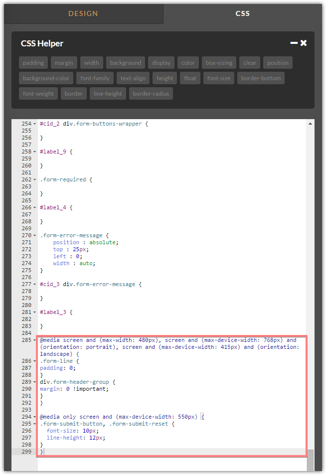
Thank you.
-
astanchfield13Replied on March 20, 2015 at 6:42 PM
That Worked!!!! Thanks!!!!
- Templates
- Integrations
- INTEGRATIONS
- See 100+ integrations
- FEATURED INTEGRATIONS
 PayPal
- Slack
- Google Sheets
- Mailchimp
- Zoom
- Dropbox
- Google Calendar
- Hubspot
- Salesforce
- See more Integrations
- Products
- PRODUCTS
- Form Builder
- Jotform Enterprise
- Jotform Apps
- Store Builder
- Jotform Tables
- Jotform Inbox
- Jotform Mobile App
- Jotform Approvals
- Report Builder
- Smart PDF Forms
- PDF Editor
- Jotform Sign
- Jotform for Salesforce Discover Now
- Support


